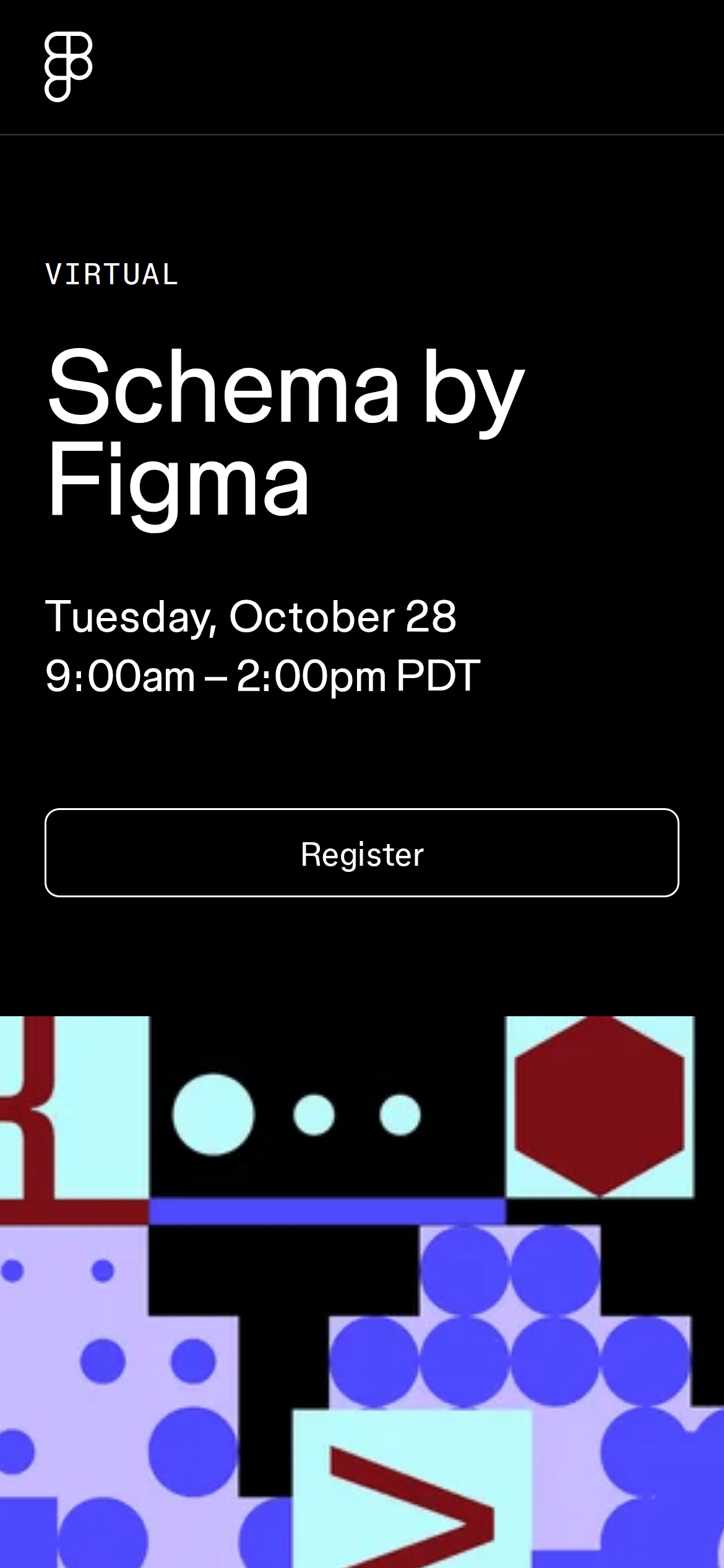
A high-profile tech conference landing page that blends premium editorial aesthetics with playful, vibrant design accents.
02
Color
#FFFFFFInk
#000000BG
#E3E3E3Muted
rgba(255, 255, 255, 0.16)Line
Stark, high-contrast dark mode base that allows vibrant geometric shapes and colorful portrait backgrounds to stand out without competing for attention.
03
Typography
grotesque-sans · humanist-sans · monospace
display56px · 400
heading32px · 700
subhead24px · 400
body18px · 400
caption16px · 400
label13px · 400
Use uppercase letter-spacing for small category labels to create clear hierarchy. · Maintain tight negative letter-spacing on large display text to ensure high-impact presence. · Prefer regular and medium weights for clean readability on the dark background.
04
Spacing
4px
8px
16px
24px
32px
48px
64px
96px
120px
The layout utilizes generous padding in major sections (e.g., 120px vertical) combined with a consistent 24px gutter system to create a spacious, breathable structure.
05
Surfaces
sm · 2px
md · 0px
lg · 20px
pill · 999px
Thin 1px borders are used for primary action buttons and dividers, often utilizing rgba(255, 255, 255, 0.16) for subtle separation.
rgb(128, 128, 128) 0px 0px 5px 0px
06
Layout
1280container
12columns
24pxgutter
768 / 1024breakpoints
The page uses a large, centered container for desktop that shifts to a mobile-first layout with significantly reduced horizontal padding.
07
Motion & Interaction
200msmicro
300mssmall
500msmedium
cubic-bezier(0.25, 0.1, 0.25, 1)easing
Standard background-color, border-color, and color transitions over 0.2s for interactive elements. · Transform-based animations using 0.3s ease-in-out for hovering or focusing states.
Subtle 0.2s transition on background-color, border-color, or color to provide immediate visual feedback. · Elements with pointer cursors trigger standard 0.2s to 0.3s easing transitions.
08
Components
buttonLarge, transparent ghost buttons with white borders and rounded corners.
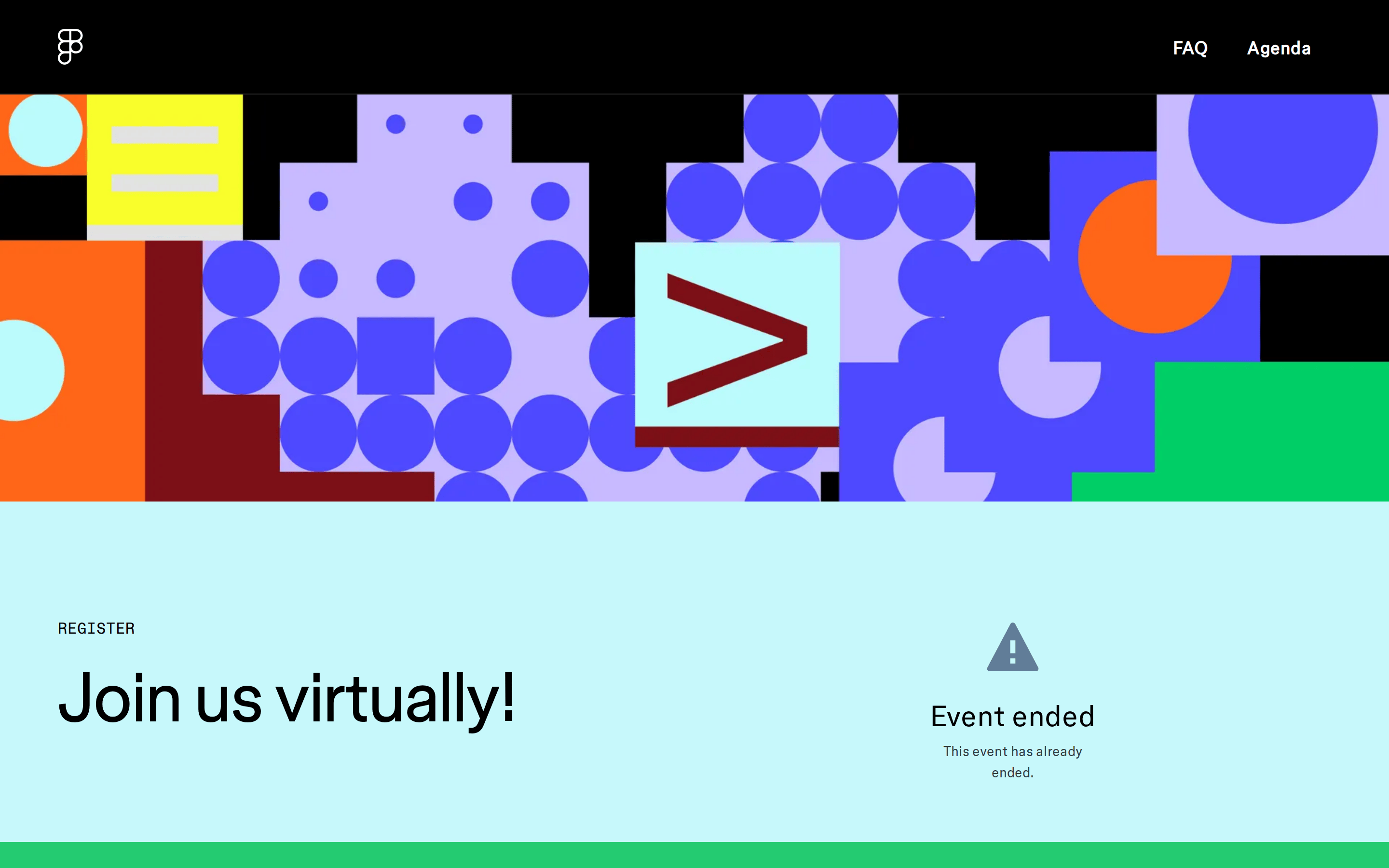
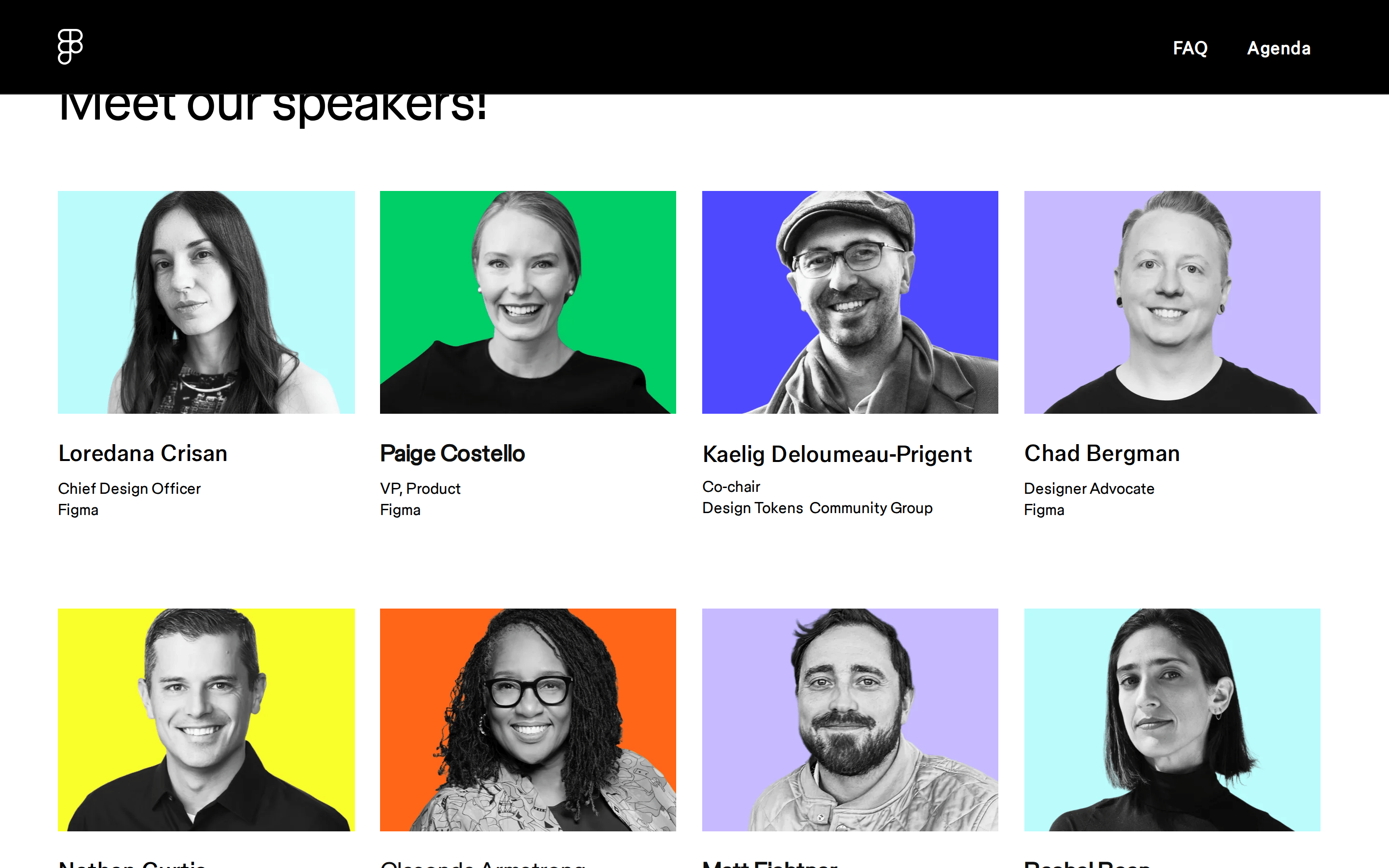
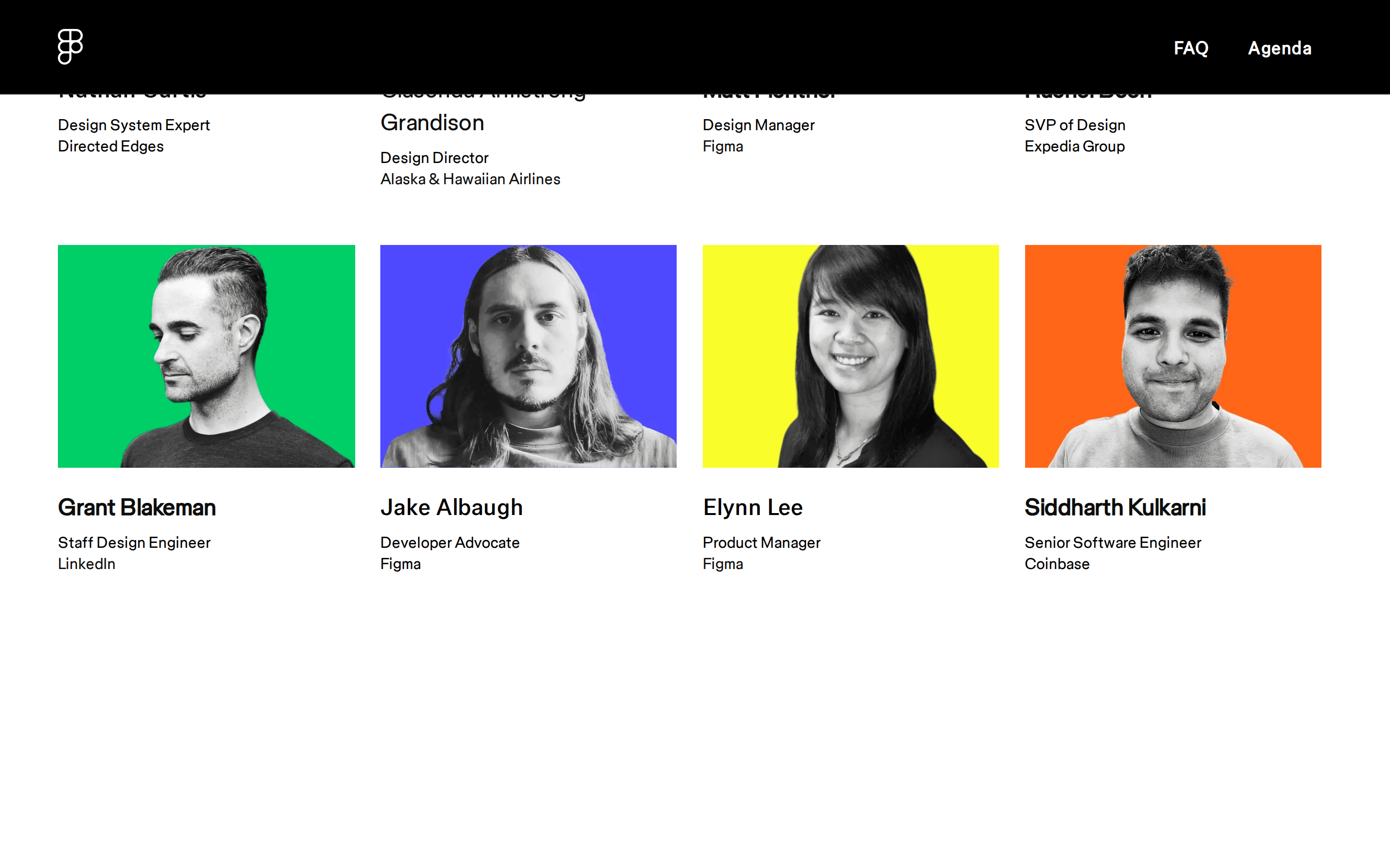
cardGrid-based speaker cards featuring grayscale portrait photography overlaid on solid, vibrant, saturated color blocks.
chipNone visible.
inputNone visible.
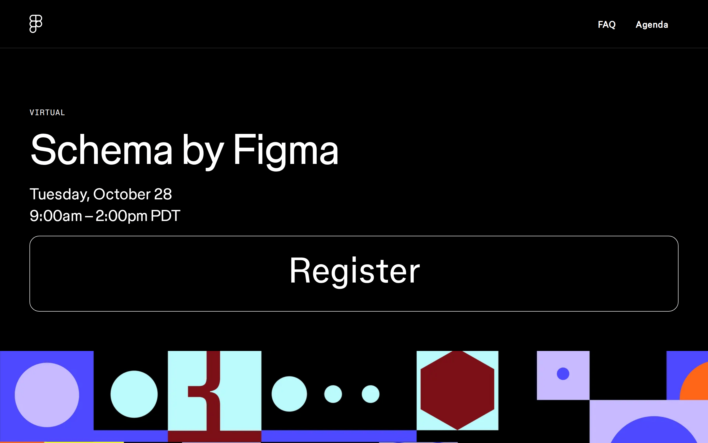
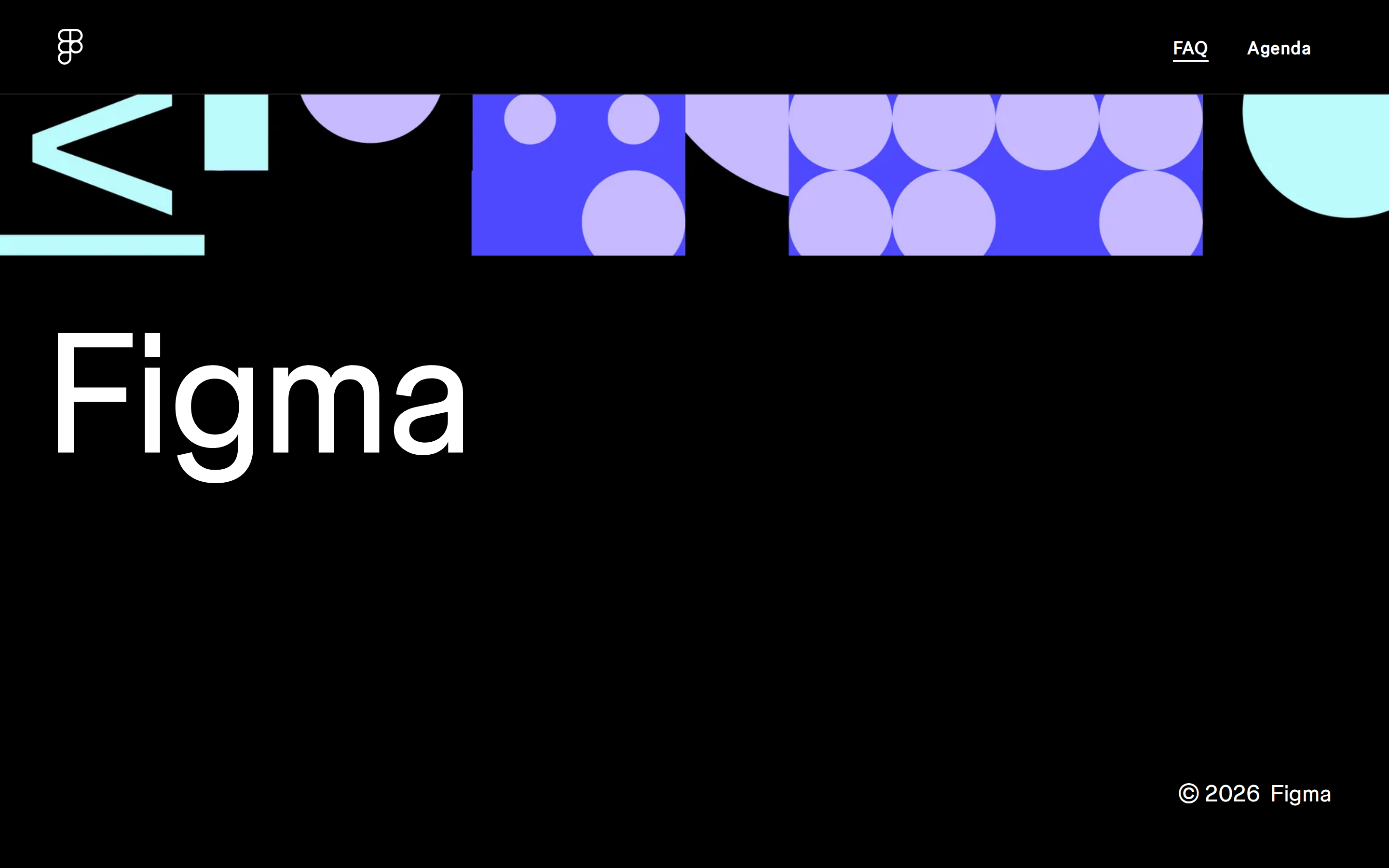
heroA dominant dark section featuring massive typography, minimal event details, and a prominent geometric illustration strip.
09
Voice & Don'ts
ToneProfessional, authoritative, yet approachable and creative.
HeadlinesLarge, bold, and impactful sans-serif text that commands immediate attention.
CTAsMinimalist, transparent ghost buttons with large, clear typography that blends seamlessly with the UI.
Don't use a white background — screenshot shows a predominantly black (#000000) background for the main layout.
Don't use complex or organic shapes — screenshot shows strict geometric primitives like circles, squares, and hexagons.
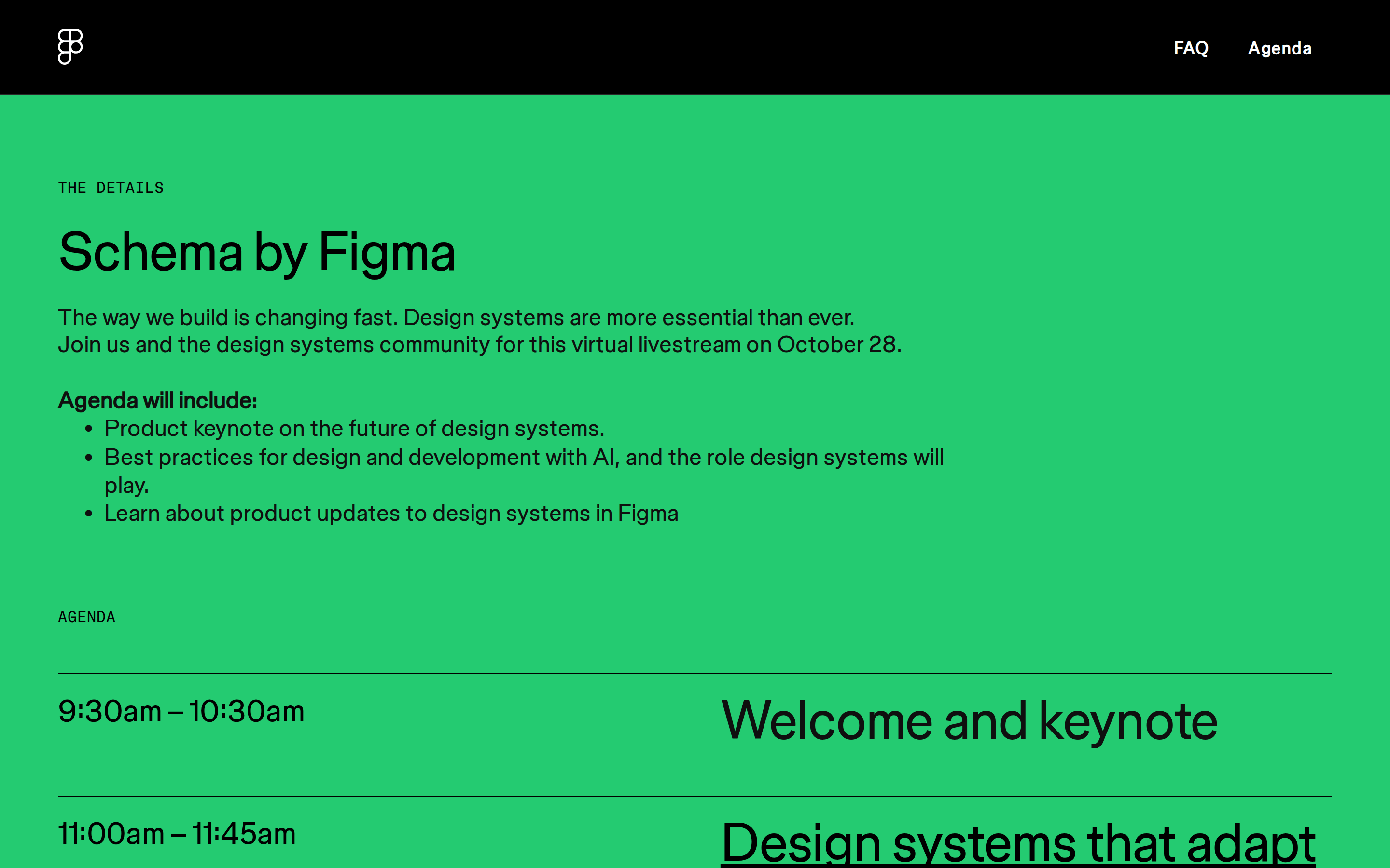
Don't use dense paragraph text — screenshot shows clear, short, and highly readable typographic blocks.
Don't apply solid white backgrounds to portrait photography — screenshot shows grayscale photos layered over vibrant solid color blocks.
Don't use heavy shadow systems — screenshot shows very minimal, almost flat layering with at most a single subtle gray shadow.
Don't use playful rounded or bubbly typography — screenshot shows strict, clean grotesque and humanist sans-serif font categories.
Avoid: Avoid overly corporate or sterile language.
Avoid: Avoid using highly decorative or distracting serif fonts.
Avoid: Avoid cluttering the interface with excessive secondary elements or dense text blocks.
Captured from the live site · real computed styles
11
System prompt
Design the event landing page for Schema by Figma with a premium, editorial dark-mode aesthetic. The primary background should be pure black (#000000) with crisp white (#FFFFFF) text to create high-impact contrast. Utilize a clean typography hierarchy featuring grotesque-sans for large display elements and humanist-sans for body text. The visual identity should be elevated by introducing playful, high-saturation geometric shapes and solid color blocks (like cyan, green, and purple) to frame grayscale photography. DO NOT use a white background. DO NOT use complex organic shapes. DO NOT clutter the layout with dense text blocks.
Bring this taste to your agent
Hand your AI agent a machine-readable spec of this design — tokens, type, motion, the whole DNA.