type foundryglobaltypographydesign toolkitcustom type
A pristine gallery catalog for premium typefaces.
02
Color
#000000Ink
#FFFFFFBG
#BDBDBDMuted
rgba(0,0,0,1)Line
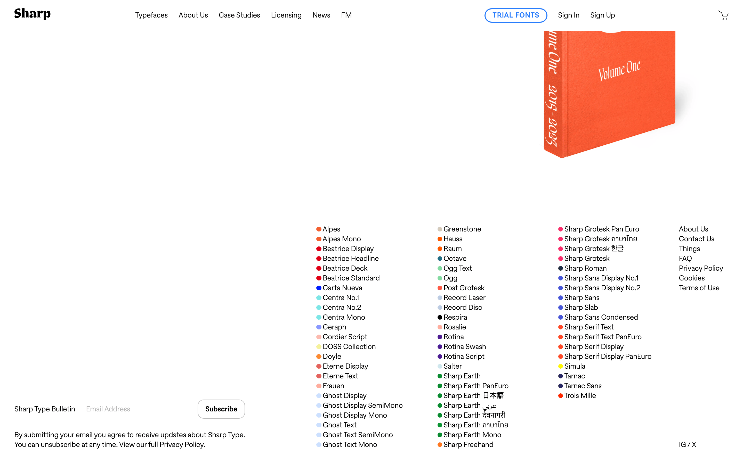
Minimalist black and white with highly saturated, varied dot indicators for typeface categorization.
03
Typography
geometric-sans · humanist-sans · monospace
display40px · 700
body21px · 400
caption14px · 400
Use bold weight (700) strictly for headings and specific highlighted words. · Maintain tight letter-spacing (negative values) for large display text. · Use a standard weight (400) for all body and navigation elements.
04
Spacing
7px
14px
21px
28px
35px
42px
49px
A 7px base unit is used consistently for padding, gaps, and margins.
05
Surfaces
sm · 2px
md · 10px
lg · 14px
pill · 999px
Thin 1px black lines are used for primary separators, while light gray (rgb(189, 189, 189)) is used for secondary borders.
rgb(128, 128, 128) 0px 0px 5px 0px
06
Layout
1440container
3columns
21pxgutter
768 / 1024breakpoints
A fluid layout that transitions from a single column on mobile to a three-column grid for the typeface catalog.
07
Motion & Interaction
220msmicro
300mssmall
400msmedium
cubic-bezier(0.4, 0.0, 0.2, 1)easing
Transitions are applied to all elements via `all 0.3s`. · Interactive elements like the navigation menu likely use right-positioned sliding panels.
Standard pointer cursor (pointer) is used across all interactive elements. · Immediate response on pointer-down for standard web interactions.
08
Components
buttonGhost button with a 2px blue border, rounded ends, and uppercase blue text.
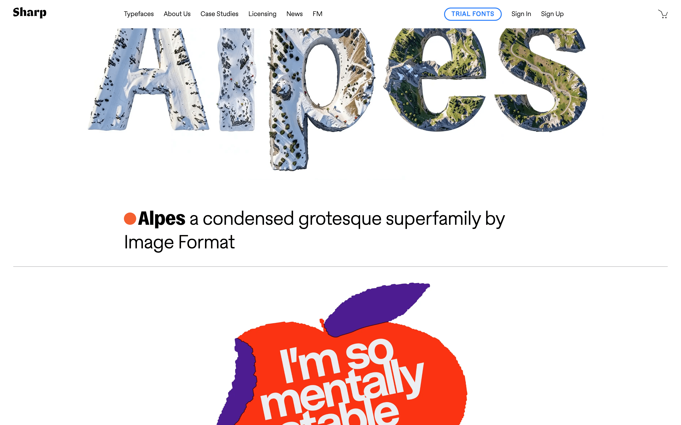
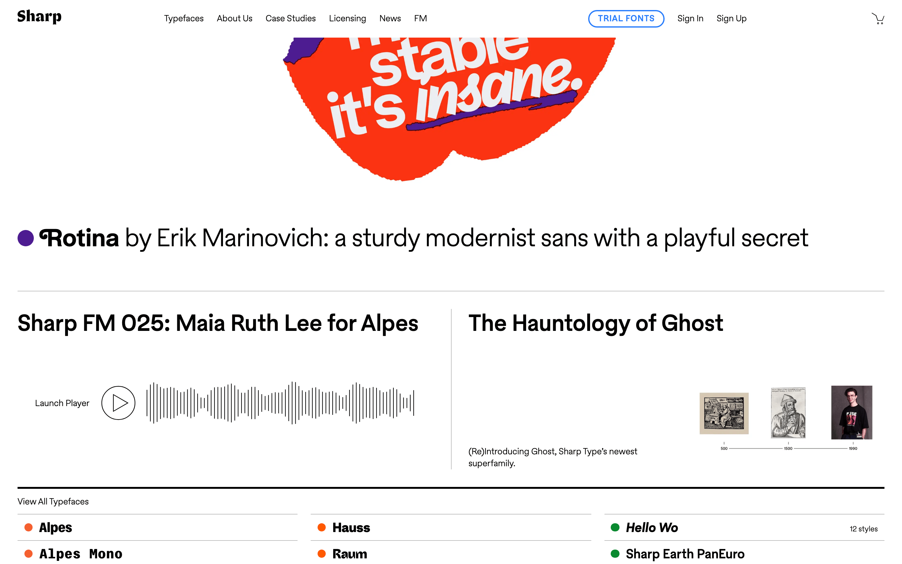
cardMinimal card-like rows for typeface listings, separated by thin lines.
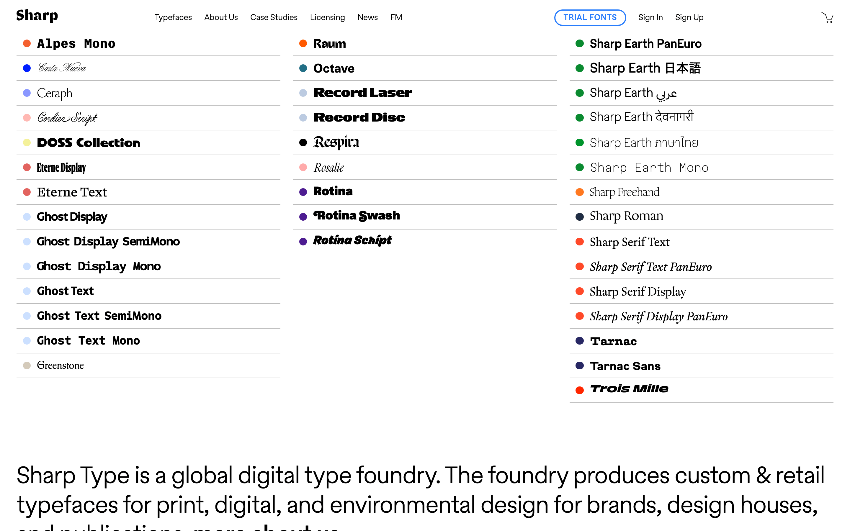
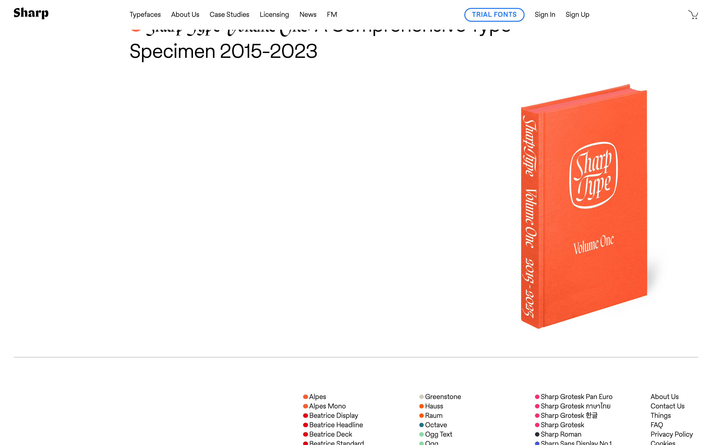
chipSmall, circular color indicators (dots) placed next to typeface names.
inputNot visible in the provided screenshots.
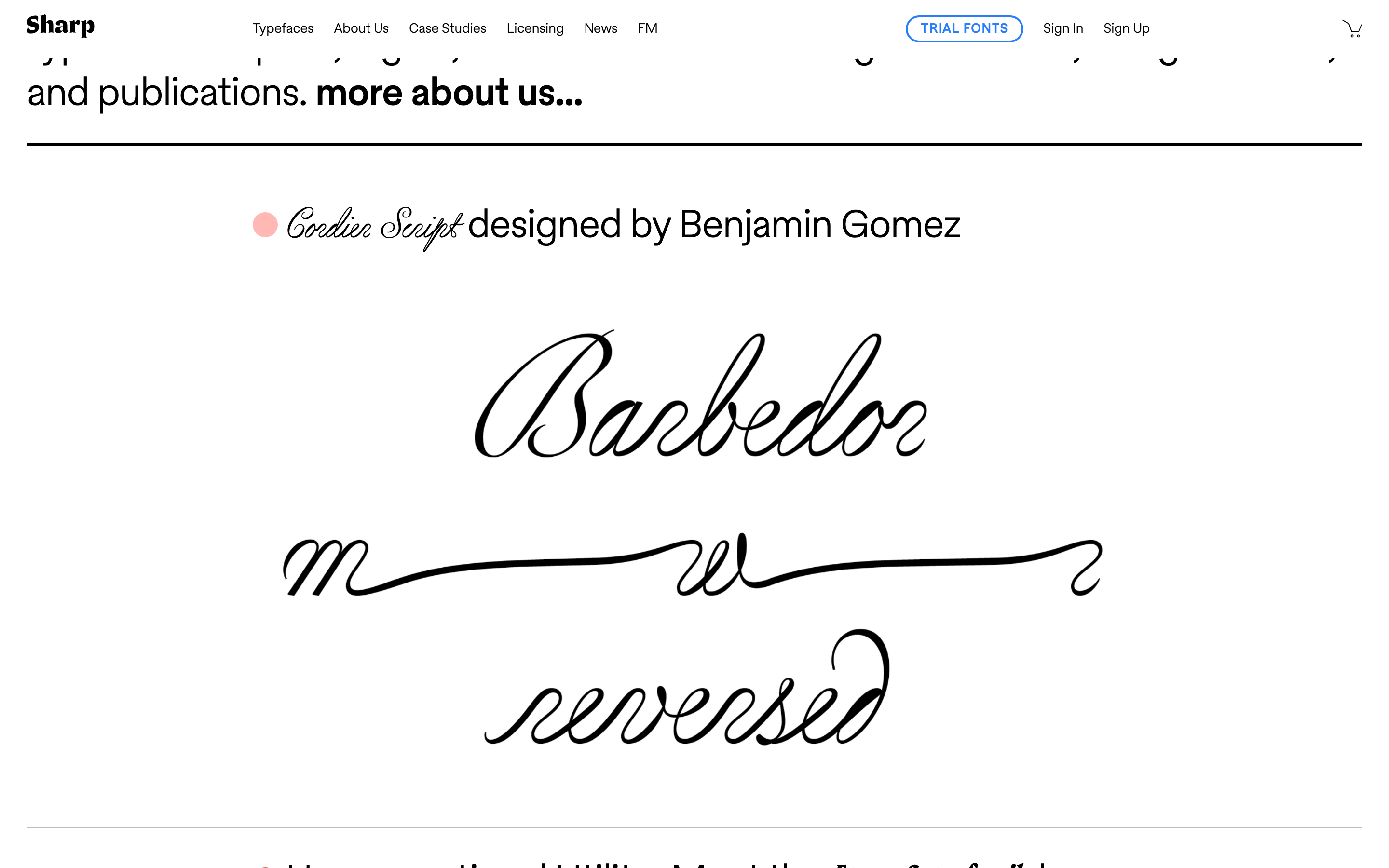
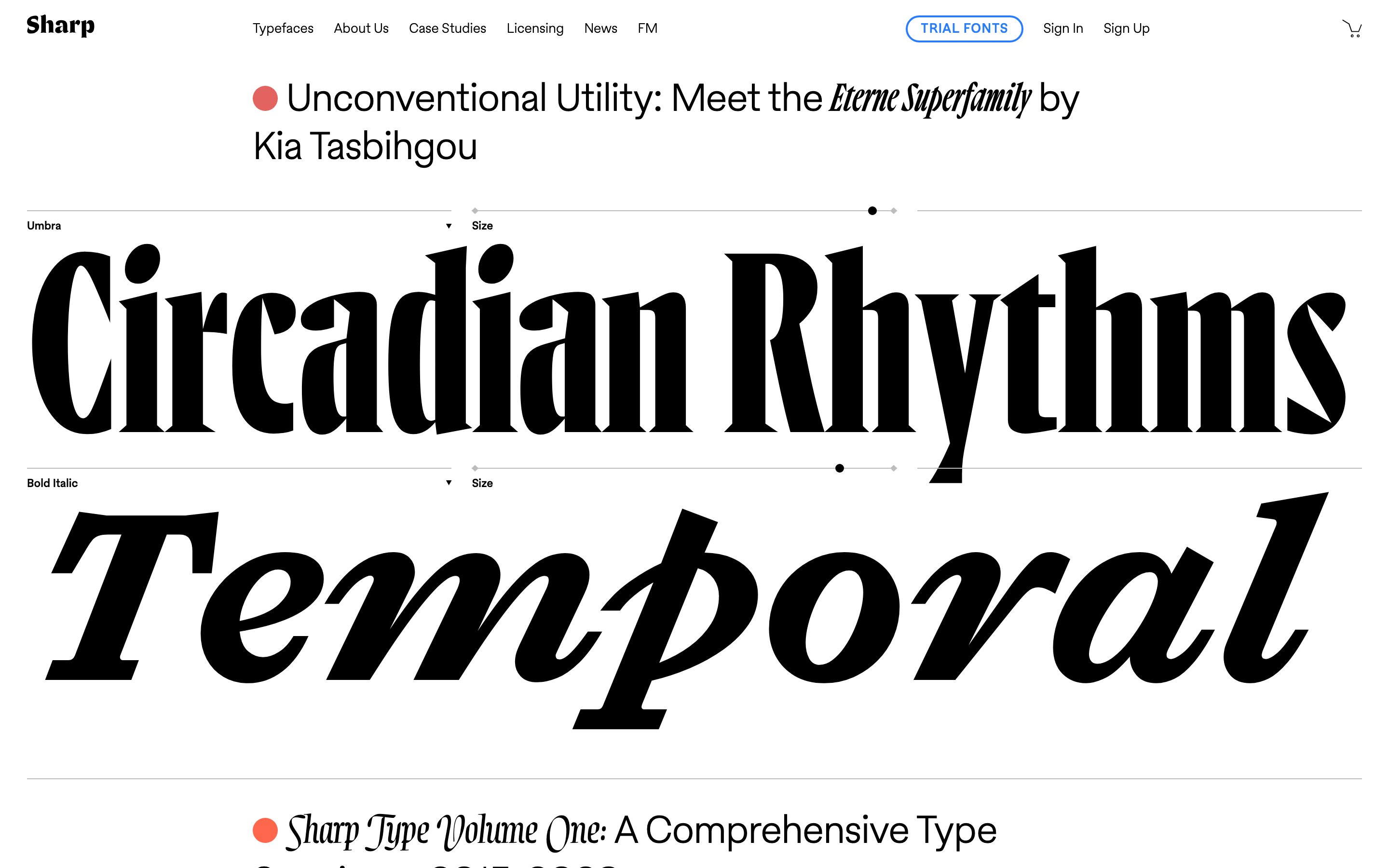
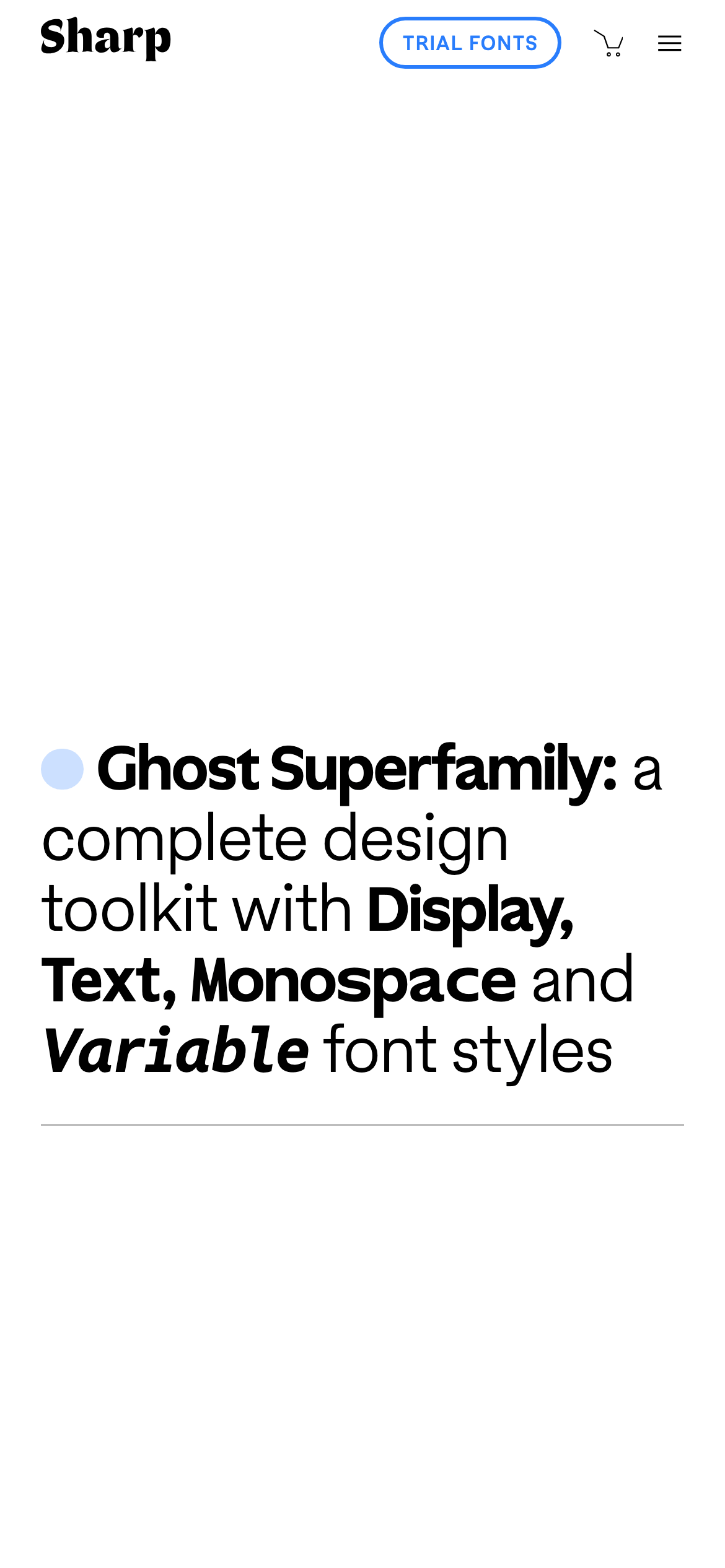
heroA minimalist hero featuring a large, descriptive headline with mixed font weights and a single colored dot.
09
Voice & Don'ts
ToneProfessional, authoritative, and minimalist.
HeadlinesClear, descriptive, and emphasizes the technical range of the typefaces.
CTAsSimple, uppercase, and visually distinct through the use of color and border.
Don't use a dominant high-chroma accent color for large backgrounds — the screenshot shows color is strictly used for small dot indicators.
Don't use dark mode or colored backgrounds — the screenshot shows a strictly white (#FFFFFF) background.
Don't use heavy drop shadows on all elements — the screenshot shows only a single, subtle shadow on one specific element.
Don't use serif fonts for the main UI or navigation — the screenshot shows a sans-serif typeface (categorized as humanist-sans) for these elements.
Don't use centered text for navigation or lists — the screenshot shows all navigation and typeface lists are strictly left-aligned.
Don't use multiple accent colors simultaneously in a single component — the screenshot shows one color per typeface entry.
Avoid: Avoid using complex gradients or heavy drop shadows.
Avoid: Avoid overly playful or casual language.
Avoid: Avoid cluttered layouts or excessive imagery that distracts from the type itself.
Captured from the live site · real computed styles
11
System prompt
This site is a sophisticated, minimalist portfolio for a global type foundry. Its design DNA is defined by an ultra-clean, high-contrast black (#000000) and white (#FFFFFF) palette, where color is used sparingly as small, saturated circular indicators next to typeface names. The typography relies on a humanist-sans for the body and a geometric-sans for display elements, featuring tight letter-spacing on headings and a 7px-based spacing rhythm. Critical design constraints include: 1) Maintain a strict monochrome base with no colored backgrounds, 2) Ensure all navigation and text remain strictly left-aligned, and 3) Use color only as a precise categorization tool via small dot indicators, never as a primary UI background.
Bring this taste to your agent
Hand your AI agent a machine-readable spec of this design — tokens, type, motion, the whole DNA.