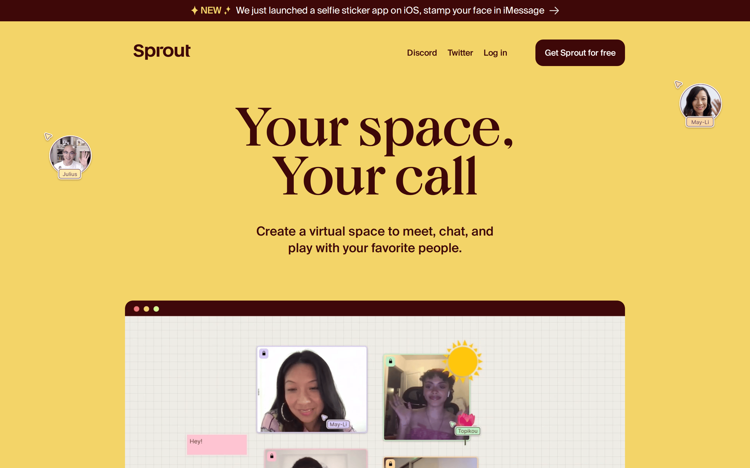
A playful, inviting digital hangout space for friends.
02
Color
#F39369Accent
#3E0808Ink
#F3D468BG
#FCF6F1BG soft
rgba(62,8,8,1.0)Line
Warm, high-contrast earth tones with a dominant mustard yellow and dark burgundy.
03
Typography
didone-serif · humanist-sans
display104px · 400
headline24px · 400
body16px · 400
Display headlines use a high-contrast didone serif with tight tracking. · Body text uses a clean humanist sans-serif. · Navigation and secondary text are smaller sans-serif weights.
04
Spacing
4px
8px
16px
24px
32px
48px
64px
96px
8px base grid with generous vertical spacing between sections (96px).
05
Surfaces
sm · 4px
md · 8px
lg · 15px
pill · 999px
1px solid rgba(62,8,8,1.0)
rgba(0, 0, 0, 0.2) 0px 4px 10px 0px
06
Layout
1280container
12columns
24pxgutter
768 / 1024breakpoints
Full-width sections with centered content containers, generous vertical padding.
07
Motion & Interaction
220msmicro
400mssmall
800msmedium
cubic-bezier(0.4, 0.0, 0.2, 1)easing
Opacity transitions on scroll (0.75s linear). · Smooth hover states on interactive elements (0.25s linear).
Cursor changes to pointer on interactive elements. · Subtle opacity or color shift.
08
Components
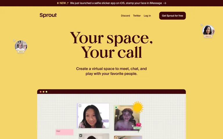
buttonDark burgundy pill-shaped button with white text and hover transitions.
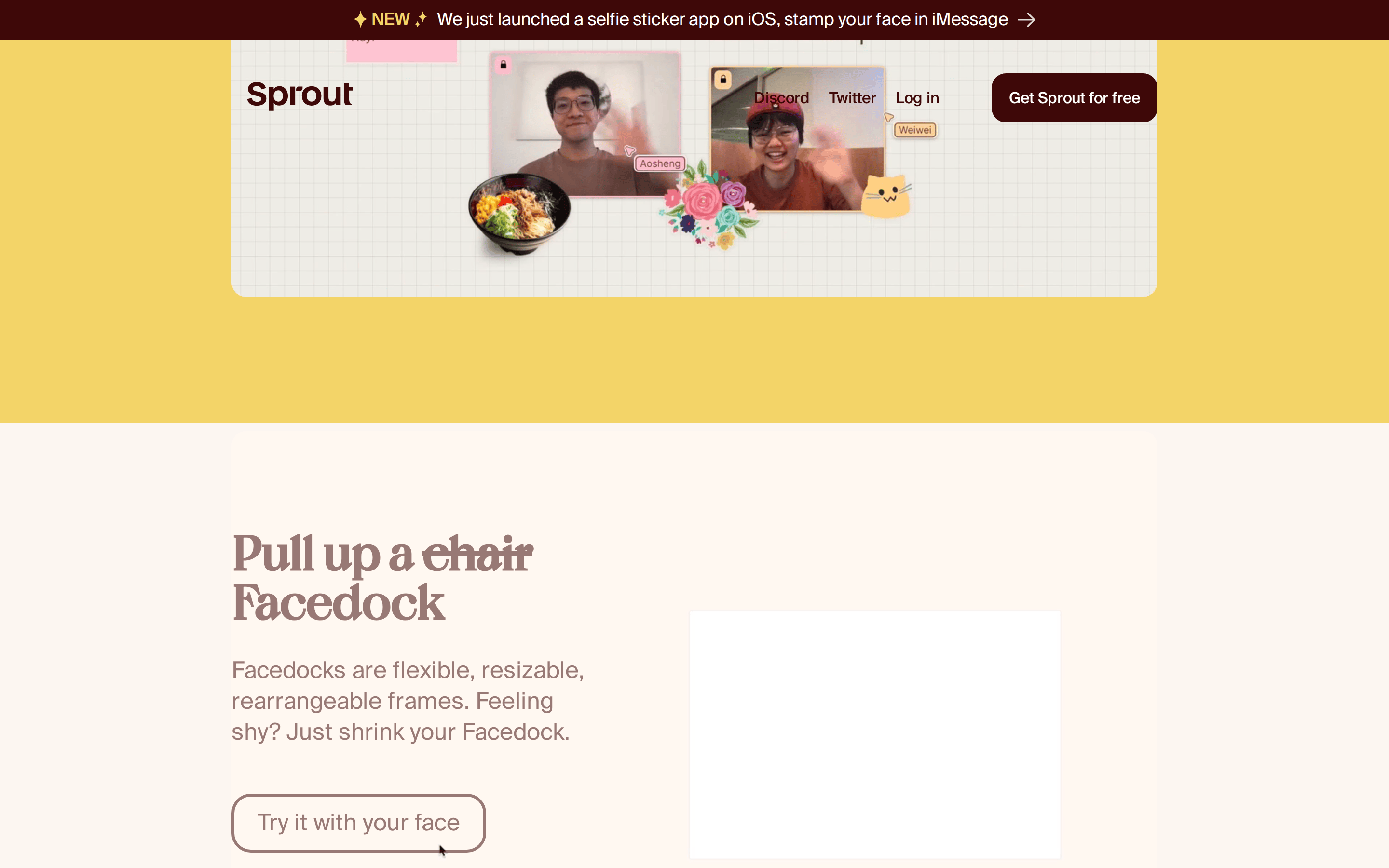
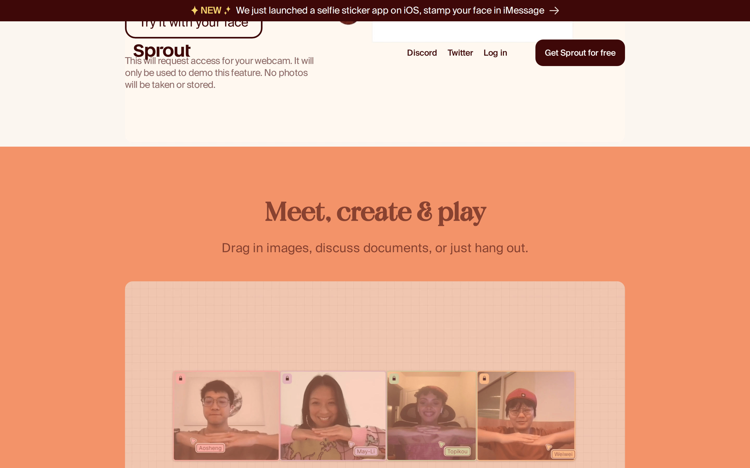
cardRounded containers (15px radius) for interface mockups and user avatars.
chipSmall, pill-shaped tags for user names (e.g., 'May-Li', 'Julius').
inputLight background with subtle borders and rounded corners.
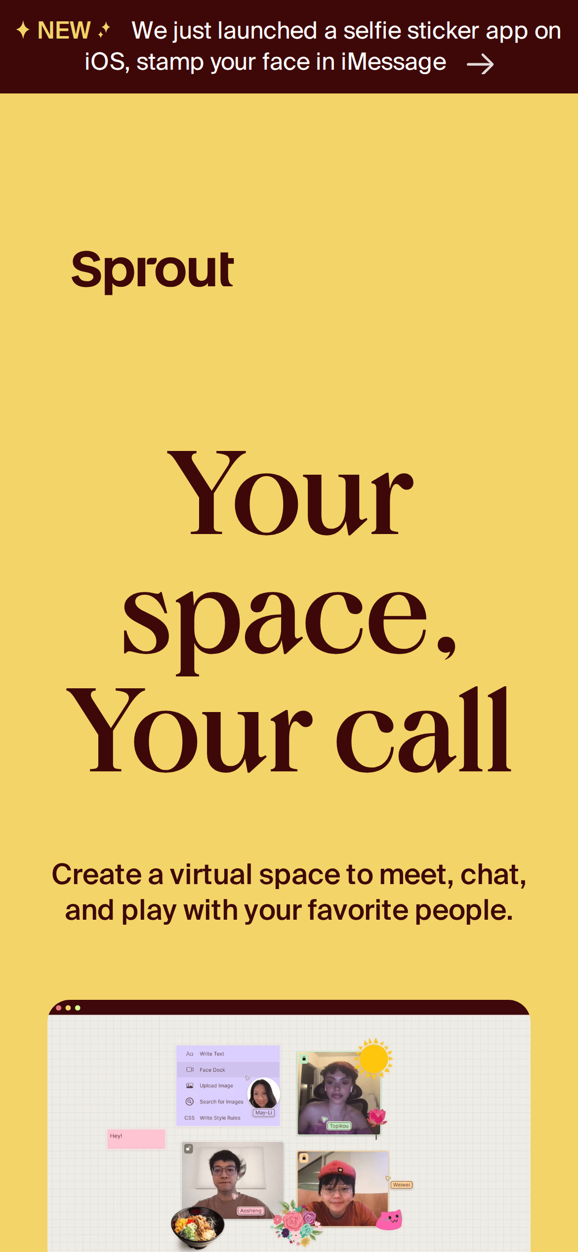
heroLarge centered text over a solid background with floating avatar elements.
09
Voice & Don'ts
ToneInviting, casual, and playful.
HeadlinesBold, short, and evocative ('Your space, Your call').
CTAsDirect and benefit-oriented ('Get Sprout for free').
don't use a cold, clinical color palette — screenshot shows a warm, dominant mustard yellow (#F3D468) and dark burgundy (#3E0808).
don't use a purely geometric sans-serif for headlines — screenshot shows a high-contrast didone serif for display text.
don't use small, cramped spacing — screenshot shows generous padding (96px) and clear visual separation between sections.
don't use sharp, 0px corners on primary containers — screenshot shows consistent use of rounded corners (15px+).
don't use a flat, gray-scale interface — screenshot shows a vibrant, high-contrast warm palette with colorful accents.
don't use dense, paragraph-heavy layouts — screenshot shows short, punchy headlines and minimal body text.
Captured from the live site · real computed styles
11
System prompt
Sprout is a playful, social platform for creating virtual hangout spaces. The design is defined by a warm, high-contrast palette of mustard yellow (#F3D468) and dark burgundy (#3E0808), with secondary whites and oranges. Typography uses a high-contrast didone serif for display headlines and a clean humanist sans-serif for body text. The layout is spacious and centered, with generous vertical padding and rounded containers. Key critical donts: don't use a cold or clinical color scheme, don't use purely geometric sans-serifs for headlines, and don't use sharp, unrounded corners on primary UI elements.
Bring this taste to your agent
Hand your AI agent a machine-readable spec of this design — tokens, type, motion, the whole DNA.