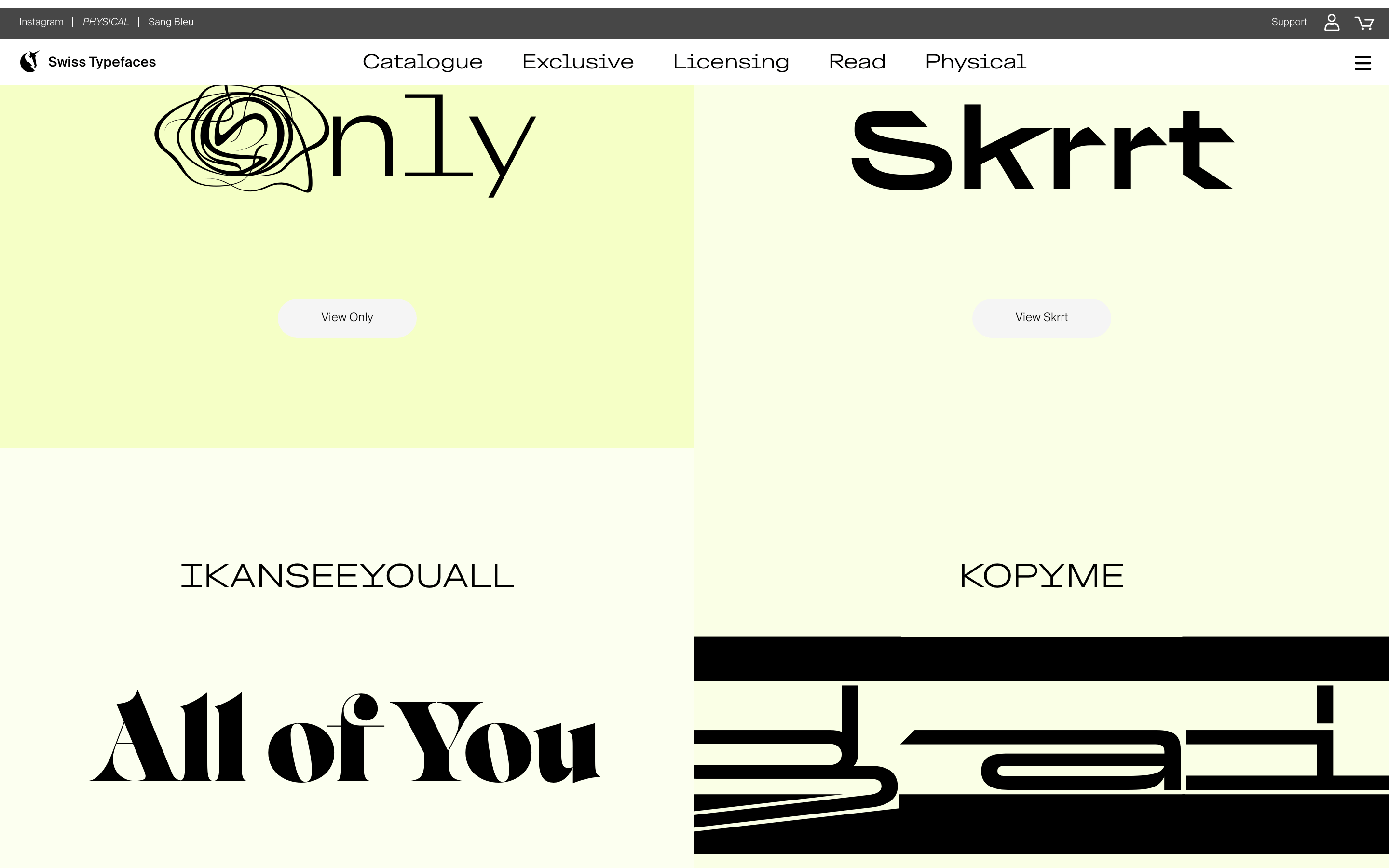
A high-end boutique for typeface craftsmanship, blending Swiss precision with expressive, modern aesthetics.
02
Color
#37f5b7Accent
#000000Ink
#707070Ink soft
#f5f5f5BG
#ffffffBG soft
#d1d1d1Muted
rgba(0, 0, 0, 0.1)Line
A predominantly achromatic palette of black, white, and light gray, allowing the typefaces themselves and vibrant accent colors to command visual attention.
03
Typography
grotesque-sans · humanist-sans · monospace
display115px · 300
body18px · 400
caption12px · 400
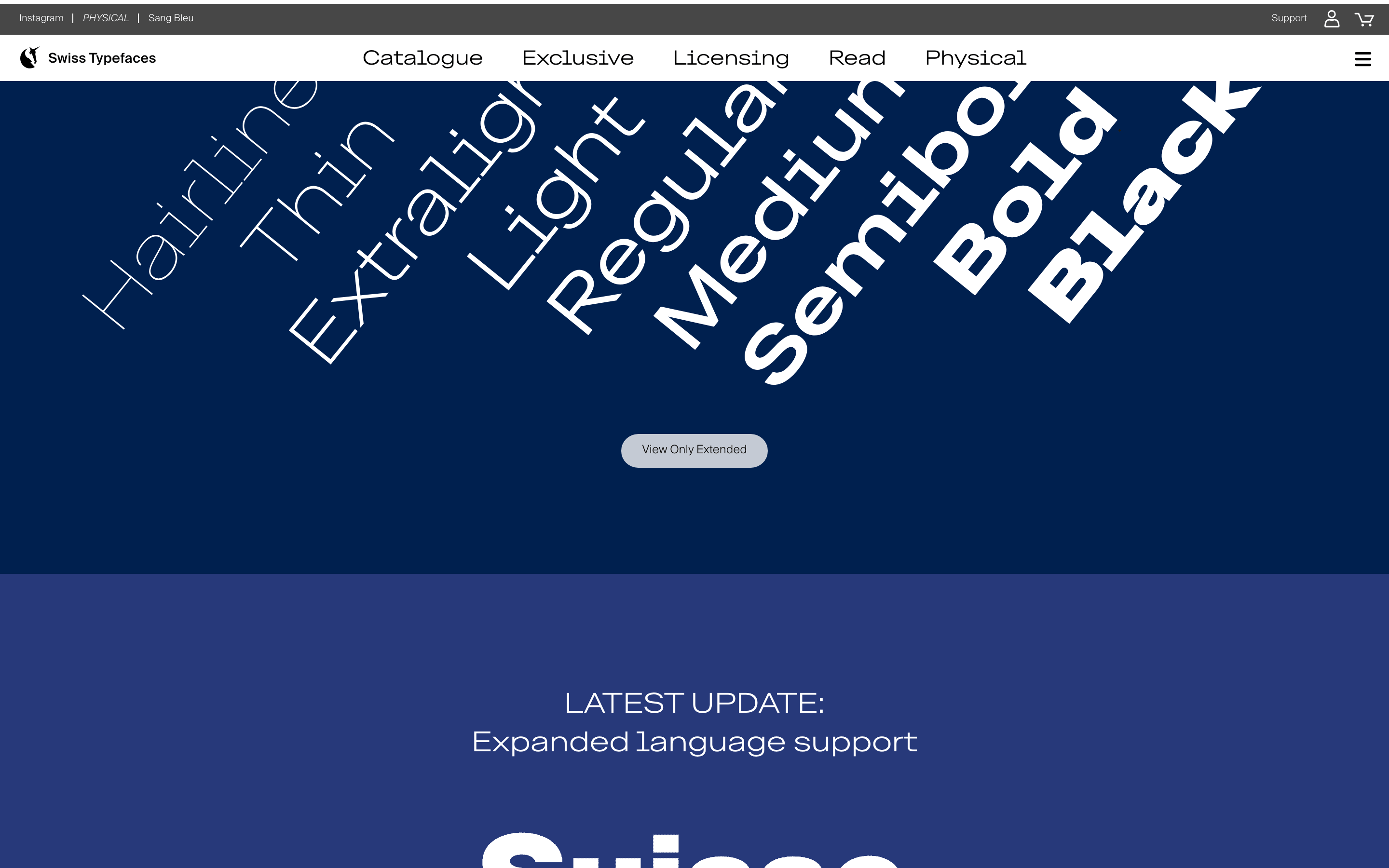
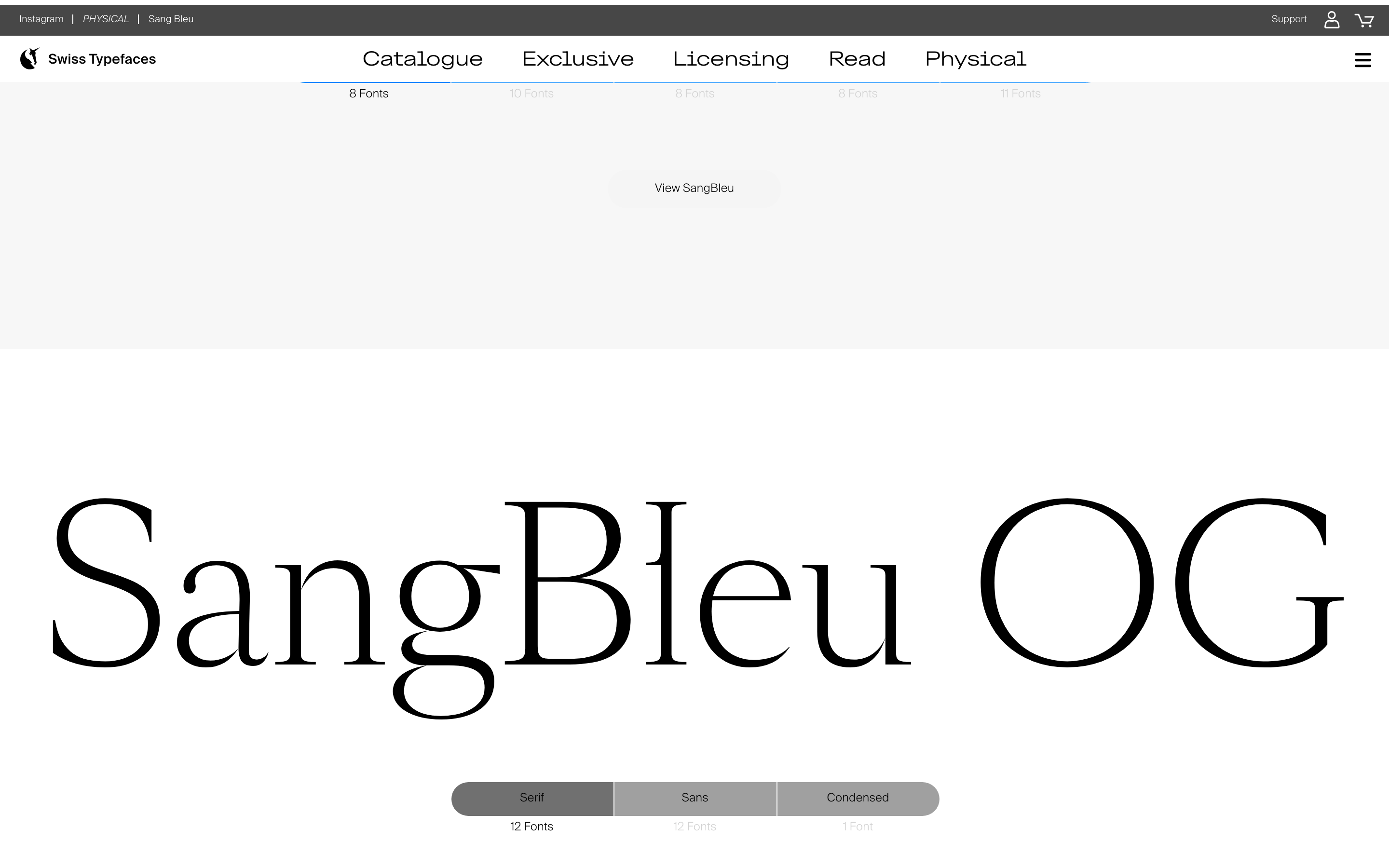
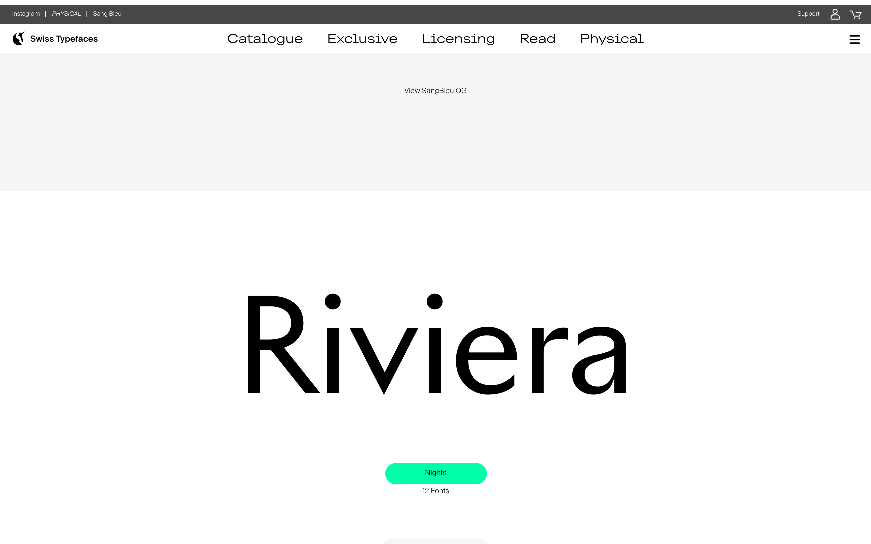
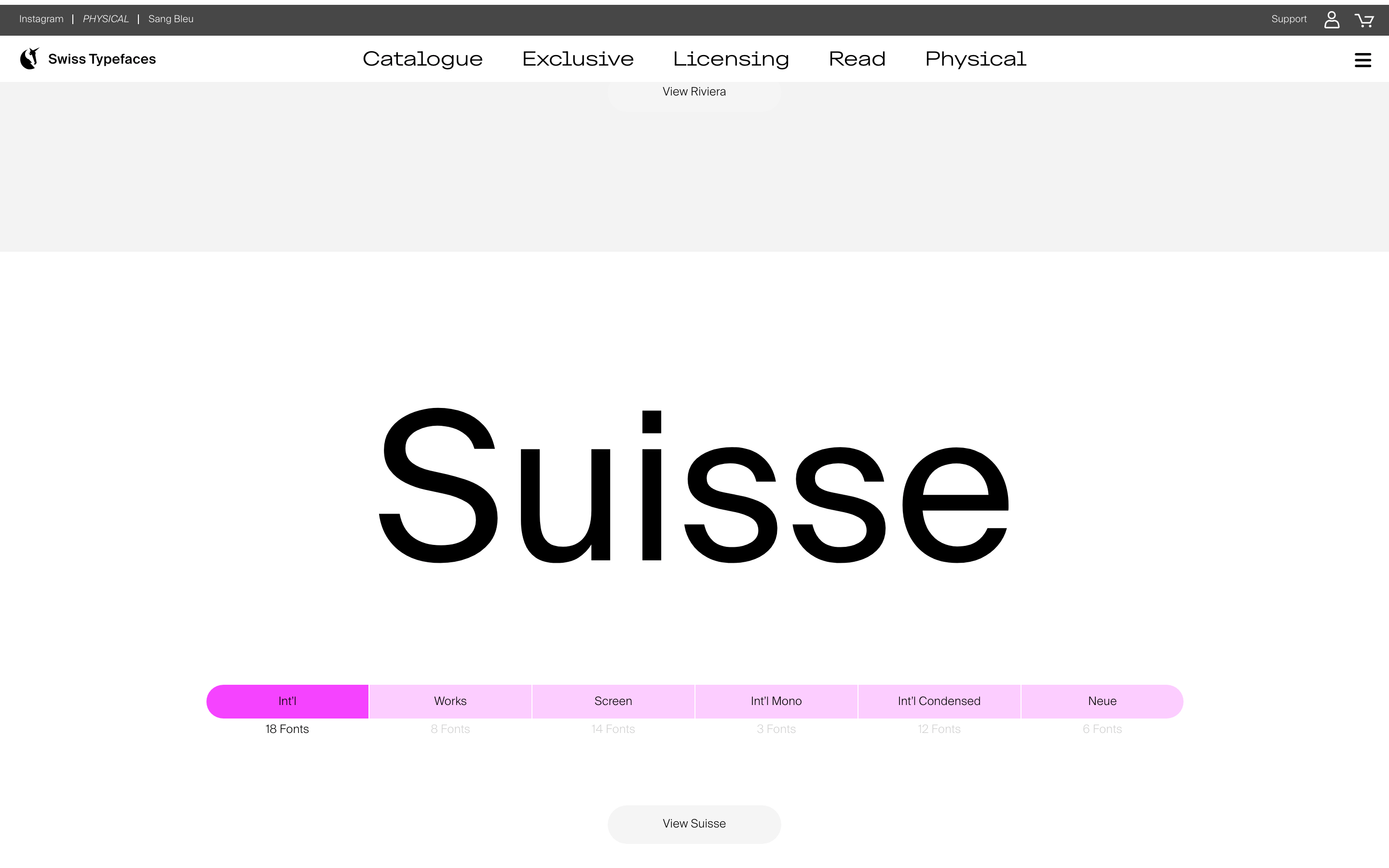
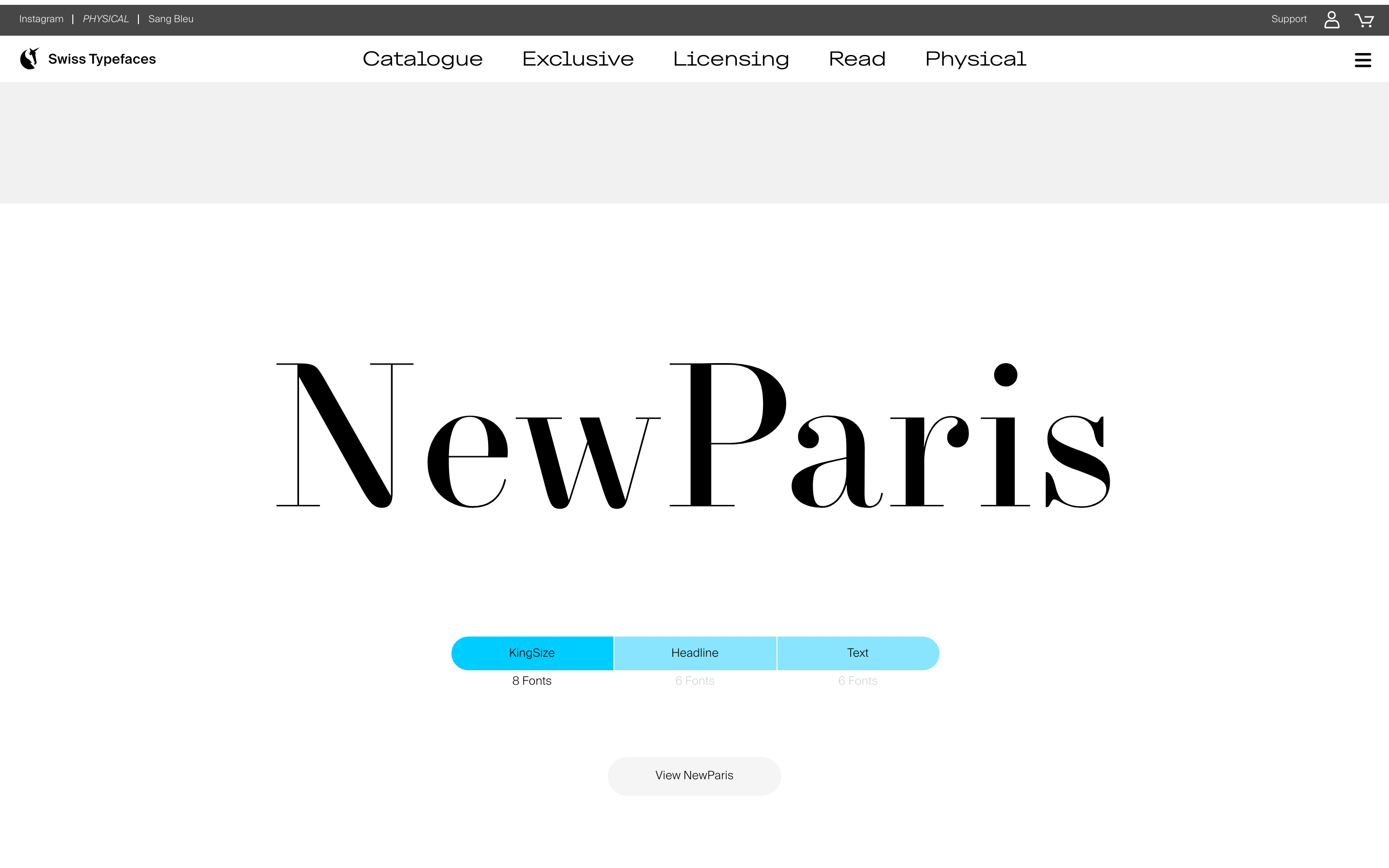
Typography is the primary visual element; scale is dramatic and expressive. · Use a clean, geometric sans-serif for UI and navigation to maintain clarity. · Weight is primarily light (300) for large display text, creating a refined look.
04
Spacing
4px
8px
16px
24px
32px
48px
64px
96px
Generous, asymmetric spacing around large typographic elements, creating a gallery-like feel with focused content areas.
05
Surfaces
sm · 3px
md · 16px
lg · 20px
pill · 999px
Clean, 1px solid borders for structural separation, with some elements using a left-border accent.
none
06
Layout
1280container
12columns
24pxgutter
768 / 1024breakpoints
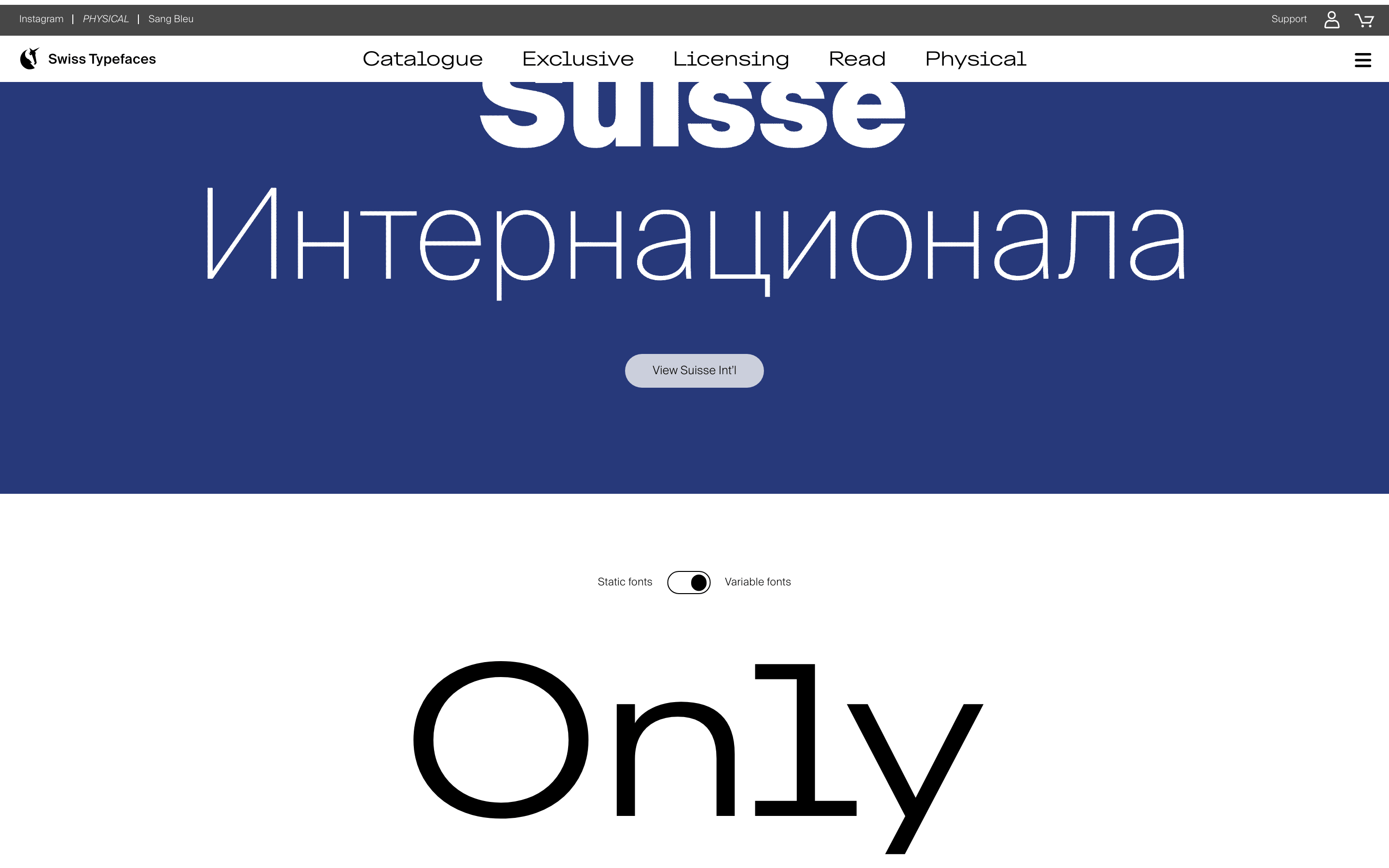
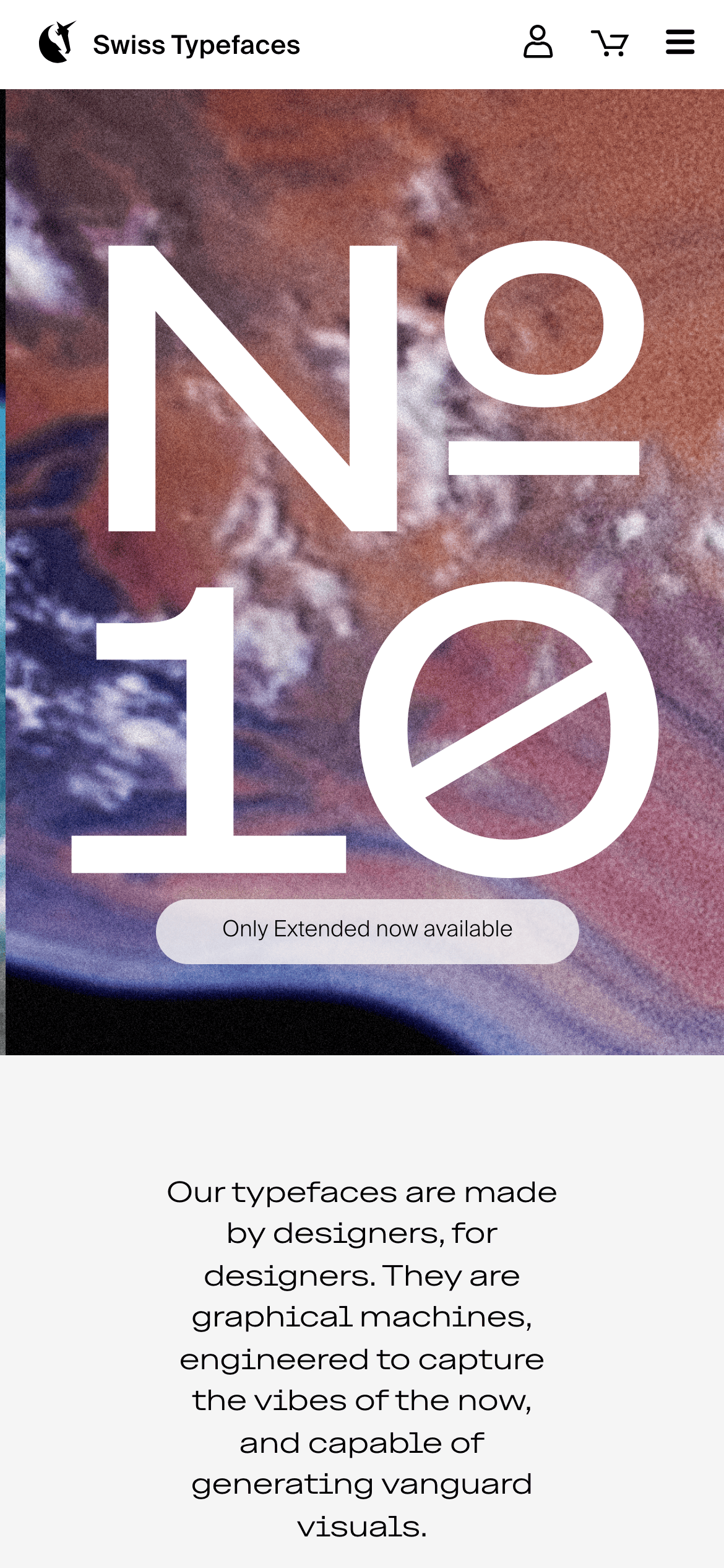
A full-width, hero-driven layout with content centered in generous containers. Typography often spans the full width of its container.
07
Motion & Interaction
120msmicro
200mssmall
400msmedium
cubic-bezier(0.25, 0.1, 0.25, 1.0)easing
Subtle opacity and visibility transitions for UI elements. · Transform transitions on hover for interactive feedback.
Subtle color transitions or opacity changes on interactive elements. · Immediate visual feedback, often through color change or slight transform.
08
Components
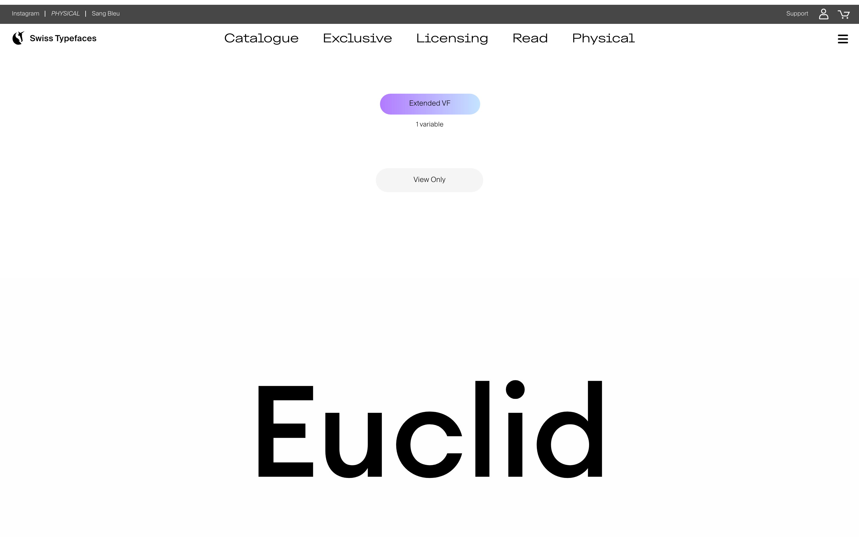
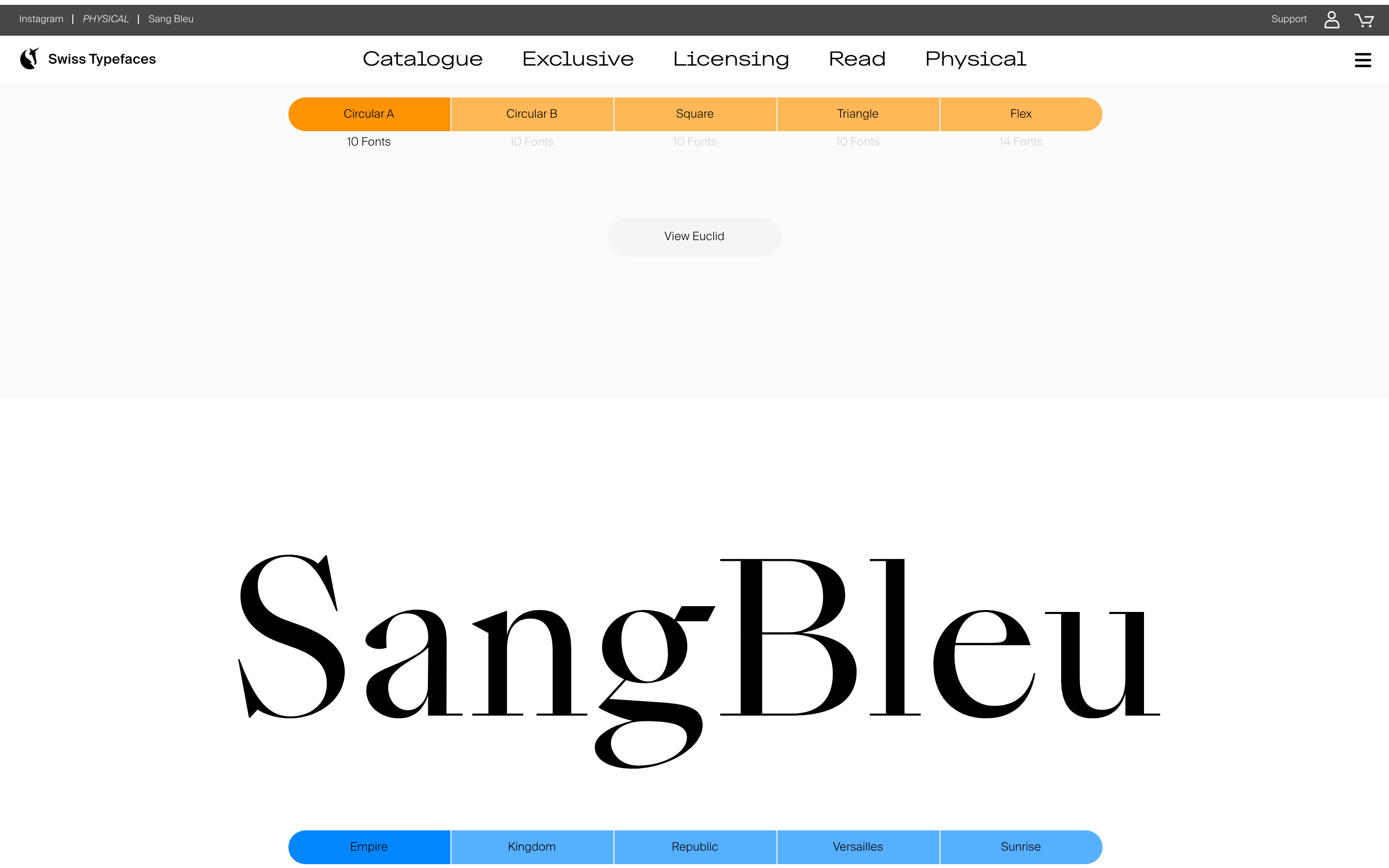
buttonMinimal, pill-shaped or slightly rounded buttons with high contrast (e.g., solid green or black).
cardClean, image-driven cards for showcasing typefaces, often with minimal borders and clear typography.
chipSimple, rounded tags or labels for categorization.
inputClean, minimalist input fields with subtle borders.
heroFull-viewport, immersive sections dominated by large, expressive typography or abstract imagery.
09
Voice & Don'ts
ToneConfident, sophisticated, and slightly artistic. Focused on craft and design philosophy.
HeadlinesBold, often oversized, and typographically expressive. Uses the foundry's own typefaces.
CTAsDirect and minimal, often using a single word or short phrase (e.g., 'Catalogue', 'Exclusive').
Don't use decorative or script fonts for UI — the screenshot shows a clean, geometric sans-serif for navigation.
Don't apply heavy drop shadows — the screenshot shows a flat design with almost no shadows.
Don't use a busy, colorful background for the entire page — the screenshot uses a light gray or white base.
Don't make buttons square or sharp-edged — the screenshot shows pills and rounded rectangles.
Don't center-align all body text — the screenshot uses a mix of center-aligned headlines and left-aligned body copy.
Don't use small, cramped spacing — the screenshot shows generous whitespace around elements.
Avoid: Avoid cluttered layouts that compete with the typography.
Avoid: Avoid overly complex or decorative UI elements that distract from the type.
Avoid: Avoid using multiple competing font families within a single view.
Captured from the live site · real computed styles
11
System prompt
This is a premium type foundry website. It uses a clean, gallery-like layout with generous whitespace to showcase expressive, oversized typography. Key colors are a light gray (#f5f5f5) background, black (#000000) text, and a vibrant mint-green accent (#37f5b7) for CTAs. Fonts are primarily clean grotesque and humanist sans-serifs (like Suisse Intl and Euclid families). Critical donts: 1) Do not use decorative fonts for UI. 2) Do not apply heavy shadows or gradients. 3) Do not clutter the layout; let the typography breathe.
Bring this taste to your agent
Hand your AI agent a machine-readable spec of this design — tokens, type, motion, the whole DNA.