A modern gallery program exploring the boundaries of visual communication.
02
Color
#000000Ink
#ffffffBG
#f5f5f5BG soft
rgba(0,0,0,1)Line
Strict monochromatic palette relying on high-contrast black and white for maximum visual impact.
03
Typography
neue-haas-grotesk
display160px · 400
heading38px · 400
body19px · 400
Use tight negative tracking for display sizes. · Maintain a uniform font weight of 400 across all scales. · Keep line heights compact for display text but generous for readability at smaller sizes.
04
Spacing
4px
8px
16px
24px
32px
48px
64px
96px
A structured 4px base grid that scales up to accommodate large typographic elements.
05
Surfaces
sm · 0px
md · 0px
lg · 0px
pill · 999px
Thin, single-pixel black lines used to separate sections and define input fields.
06
Layout
1440container
12columns
24pxgutter
768 / 1024breakpoints
A minimal, edge-to-edge grid that prioritizes massive typographic elements over traditional content blocks.
07
Motion & Interaction
220msmicro
400mssmall
800msmedium
cubic-bezier(0.42, 0, 0.58, 1)easing
Continuous horizontal marquee scrolling for repeated text. · Subtle visibility transitions on interactive elements.
Subtle opacity or color shifts. · Direct navigation or form submission.
08
Components
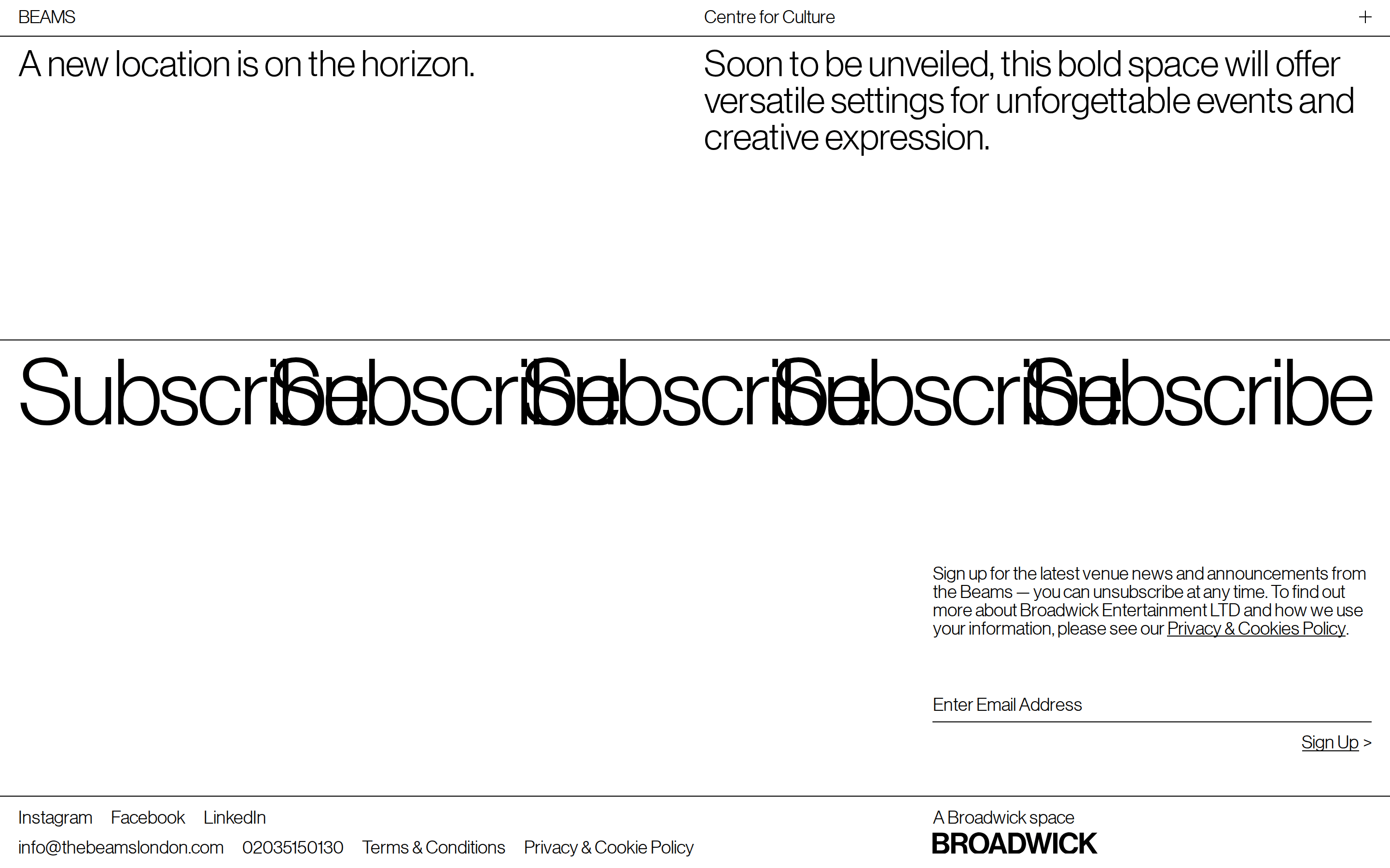
buttonMinimal text-based links with a '>' suffix.
cardNot present, layout uses full-width sections.
chipNot present.
inputSingle-line text input with a bottom border only.
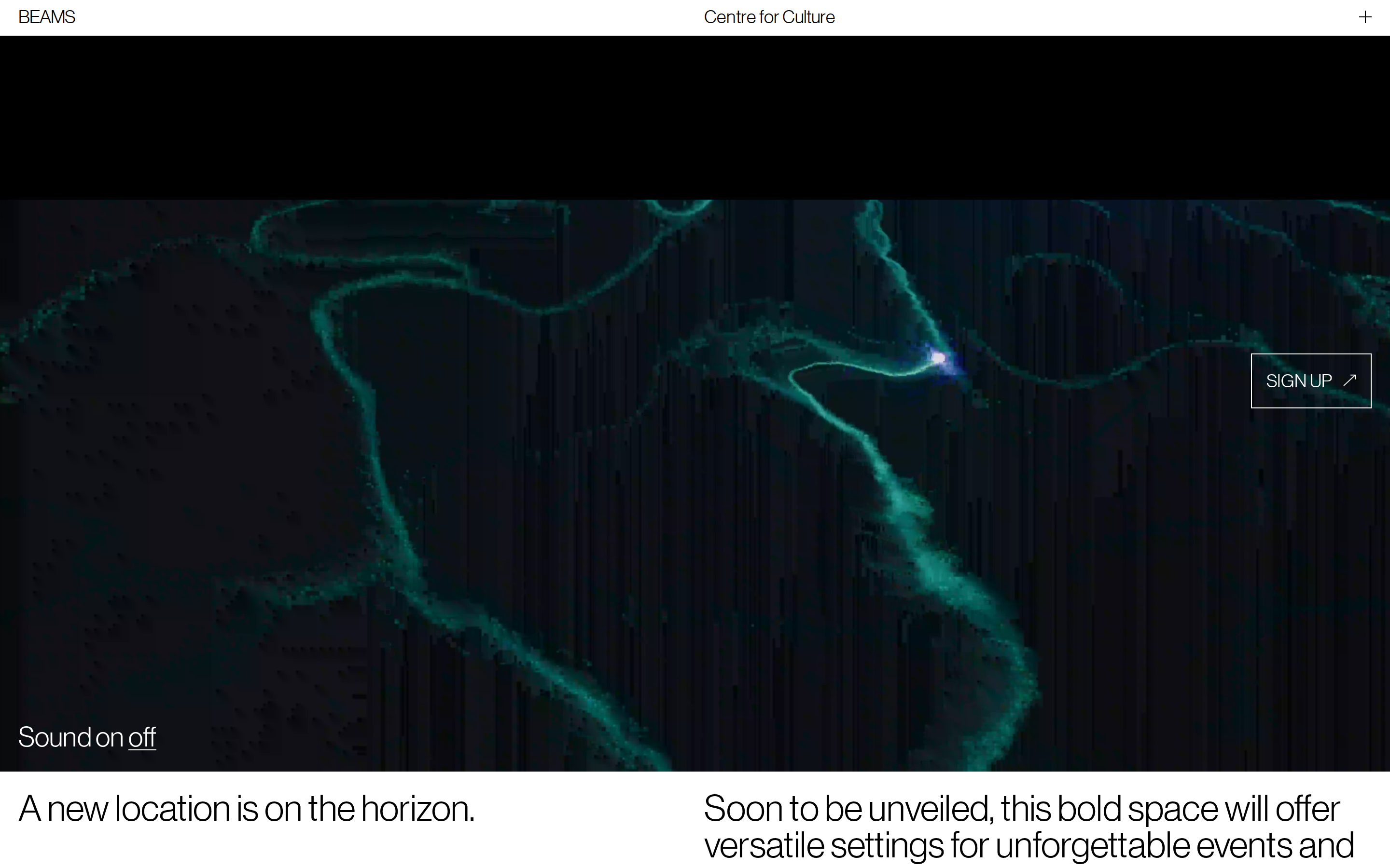
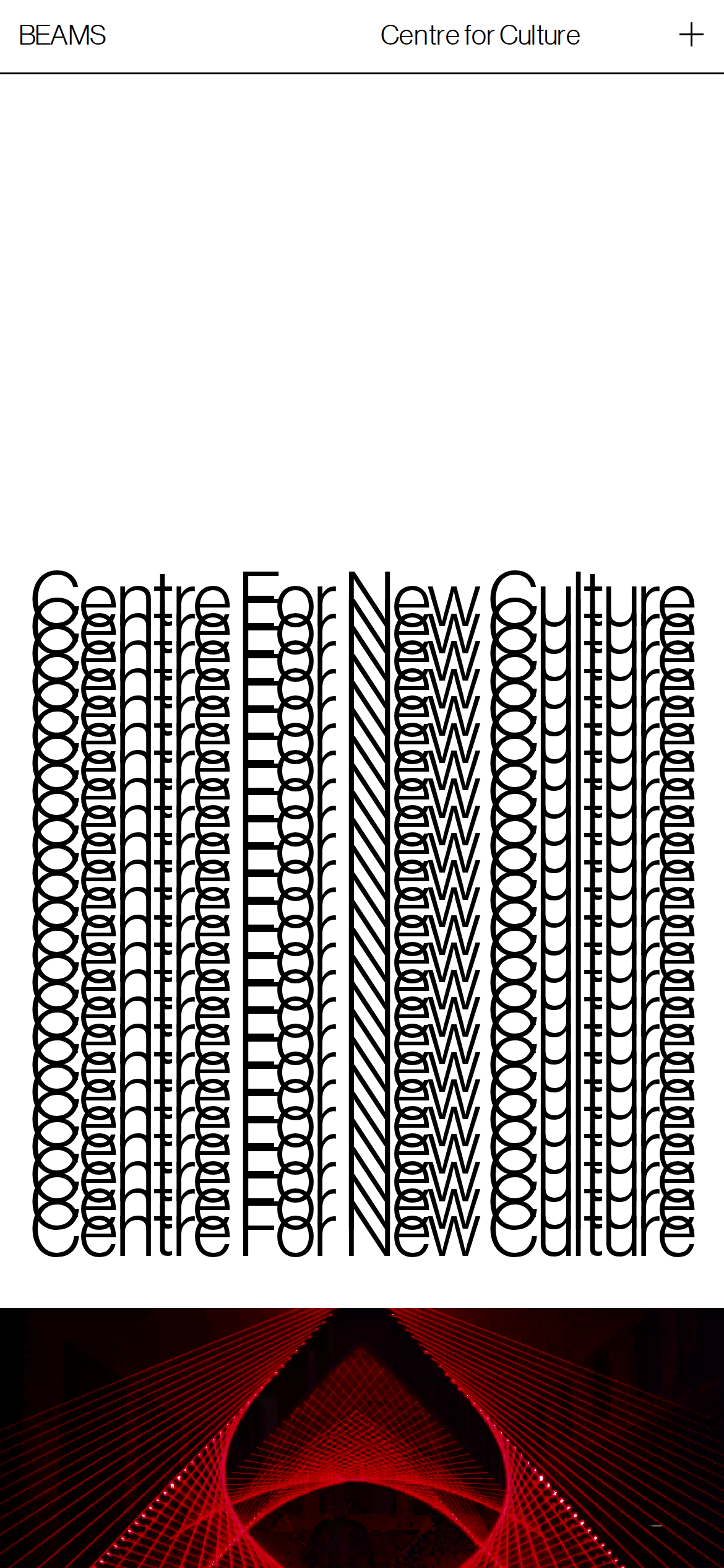
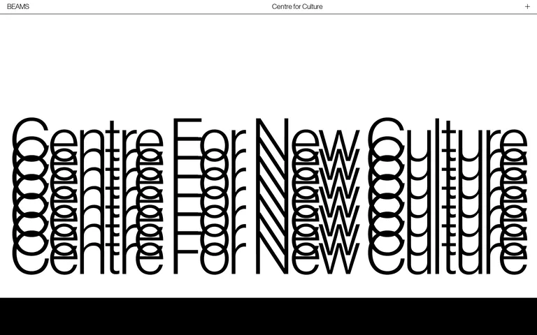
heroA massive typographic treatment where a phrase is repeated vertically to create a structural pattern.
09
Voice & Don'ts
ToneDirect, confident, and artistic.
HeadlinesBrief, impactful statements that allow the typography to do the visual work.
CTAsUnderstated and functional, using simple text links.
Don't use multiple colors — screenshot shows a strict monochromatic palette.
Don't add border-radius to elements — screenshot shows sharp, square corners.
Don't use serif fonts — screenshot shows a consistent use of Neue Haas Grotesk.
Don't use drop shadows or soft depth effects — screenshot relies on flat planes.
Don't clutter the layout with small components — screenshot uses large, open spaces.
Don't use playful or decorative iconography — screenshot uses only essential symbols like '+' and '>'.
Captured from the live site · real computed styles
11
System prompt
This site is an experimental digital presence for a cultural venue, using typography as the primary visual language. Key colors are #ffffff for the background and #000000 for ink, with a secondary #f5f5f5 background. The typography is a humanist-sans category, specifically Neue Haas Grotesk, used at massive scales with tight tracking. Critical don'ts include: do not add border-radius to any elements, do not use more than one font family, and do not introduce colorful accents or gradients.
Bring this taste to your agent
Hand your AI agent a machine-readable spec of this design — tokens, type, motion, the whole DNA.