A digital exhibition of typographic craftsmanship and linguistic diversity
02
Color
#F26522Accent
#000000Ink
#999999Ink soft
#FFFFFFBG
#F8F8F8BG soft
rgba(0,0,0,0.1)Line
High-contrast black and white foundations punctuated by vibrant, saturated accent blocks
03
Typography
humanist-sans · monospace
display40px · 700
headline20px · 400
body16px · 400
Body text uses a standard 16px base size with a 1.0 line-height · Headings use a bold 40px size with a relaxed 1.1 line-height · UI labels and secondary text use a slightly smaller 13px size · Letter-spacing is slightly increased for small caps or labels
04
Spacing
4px
8px
10px
16px
20px
24px
30px
60px
80px
Generous whitespace around major sections and a consistent 20px padding for standard content blocks
05
Surfaces
sm · 4px
md · 8px
lg · 24px
pill · 9999px
Thin 1px borders in subtle grays, primarily used for structural separation
06
Layout
1280container
12columns
24pxgutter
768 / 1024breakpoints
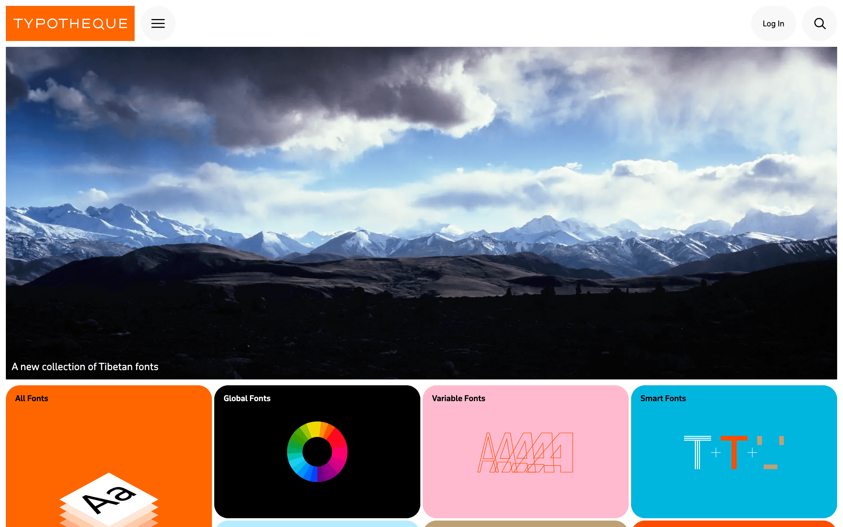
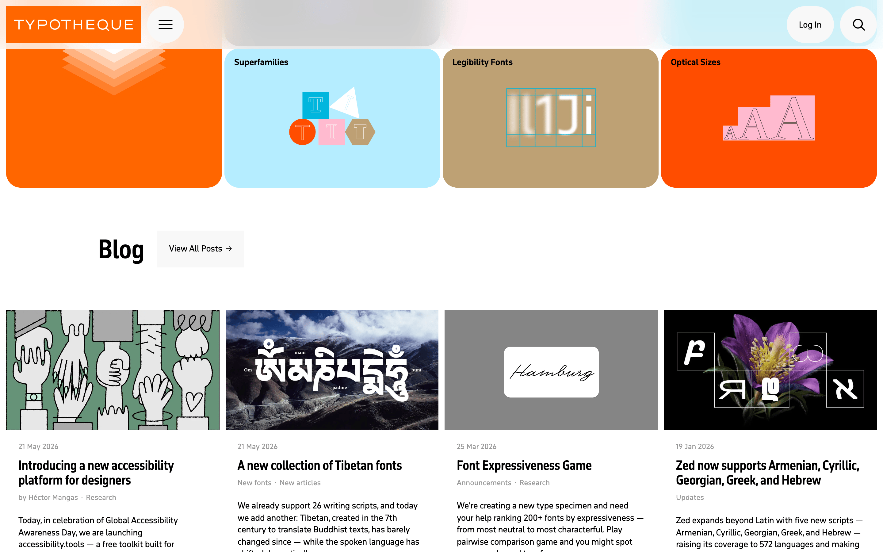
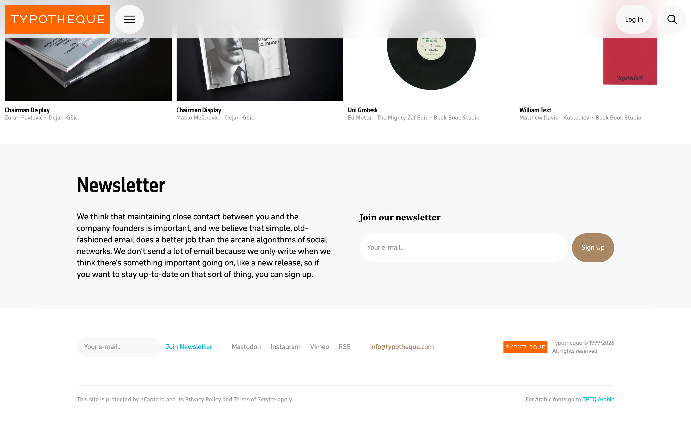
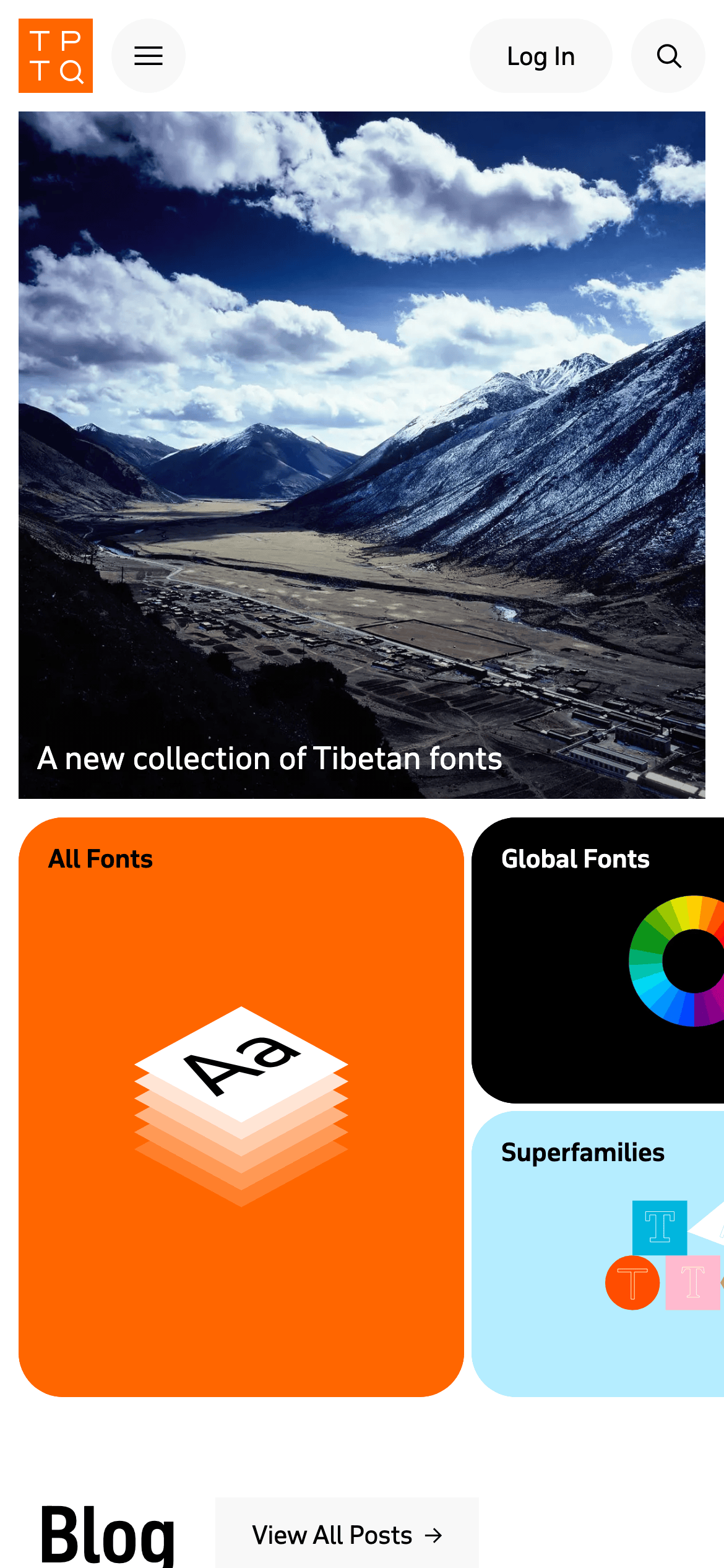
A multi-column grid for browsing font collections, featuring a full-width hero image above and large, vibrant card blocks below
07
Motion & Interaction
150msmicro
200mssmall
250msmedium
cubic-bezier(0.4, 0, 0.2, 1)easing
Smooth background color transitions on interactive elements (0.25s) · Subtle opacity and transform changes on hover (0.2s)
Background color transitions and subtle opacity adjustments · Immediate visual response or smooth transition to the linked section
08
Components
buttonPill-shaped with a 9999px border-radius, featuring both solid and transparent styles
cardLarge rectangular blocks with rounded corners (24px radius) and bold, saturated background colors
chipTall, vertical text labels used within data visualization grids
inputMinimalist search interface represented by a simple magnifying glass icon
heroA full-width, high-resolution photographic landscape with a subtle dark gradient overlay at the bottom for text legibility
09
Voice & Don'ts
ToneAuthoritative, educational, and deeply focused on global inclusivity
HeadlinesDirect, descriptive, and highly legible (e.g., 'Global Fonts', 'All Fonts')
CTAsSubtle and action-oriented, often accompanied by an arrow icon (e.g., 'Learn More →')
Don't use generic sans-serif fonts — screenshot shows a distinct humanist sans with specific character
Don't use a rigid 8px grid — screenshot shows flexible spacing using values like 10, 20, 30, and 80px
Don't make buttons rectangular — screenshot shows consistently pill-shaped buttons with a 9999px radius
Don't use large drop shadows — screenshot shows completely flat surfaces with no shadow depth
Don't use small, dense text — screenshot shows generous line-heights (1.0 to 1.3) and clear font sizing
Don't rely on just one background color — screenshot shows a mix of pure white, pure black, and vibrant saturated blocks
Avoid: Overly aggressive marketing jargon or hyperbole
Avoid: Cluttered or visually noisy UI elements
Avoid: Inconsistent typography across different sections
Captured from the live site · real computed styles
11
System prompt
Positioning: A premium type foundry and editorial platform focusing on global language support and inclusive design. Key colors: #FFFFFF for main backgrounds, #000000 for primary text and deep sections, #F26522 for high-energy accents and cards. Font categories: Clean humanist-sans for all UI and body copy. Critical don'ts: Don't use rectangular buttons (they are always pill-shaped); Don't apply drop shadows to cards (the layout is flat and relies on solid colors); Don't use a rigid grid system (spacing is generous and flexible with varied padding and gaps).
Bring this taste to your agent
Hand your AI agent a machine-readable spec of this design — tokens, type, motion, the whole DNA.