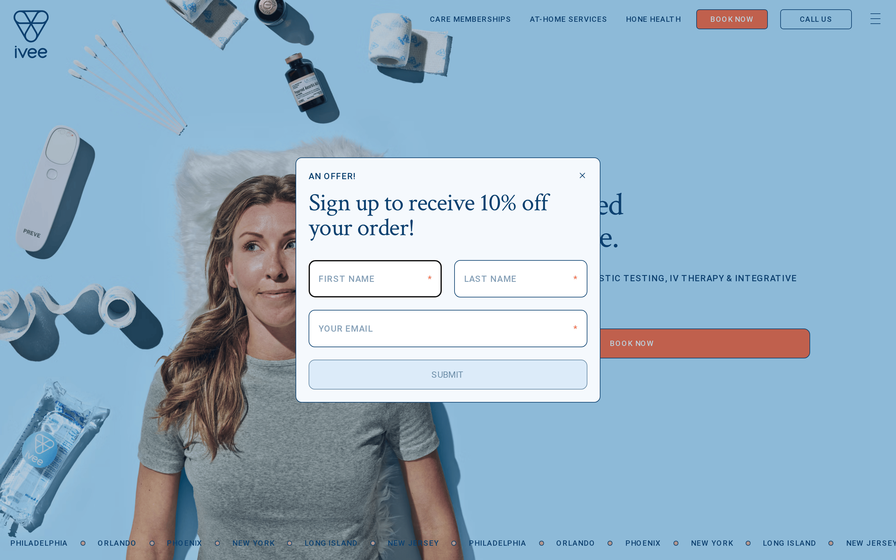
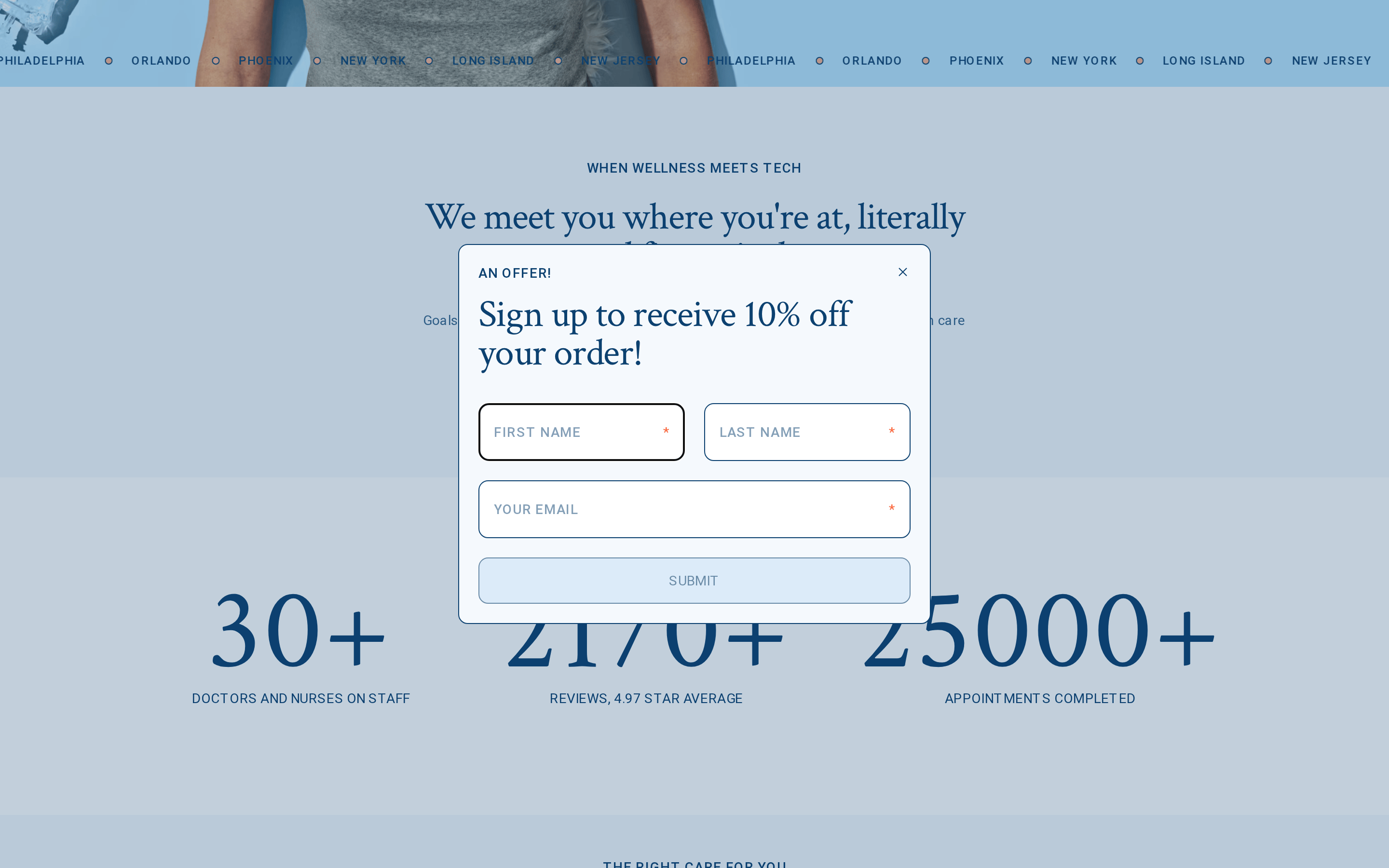
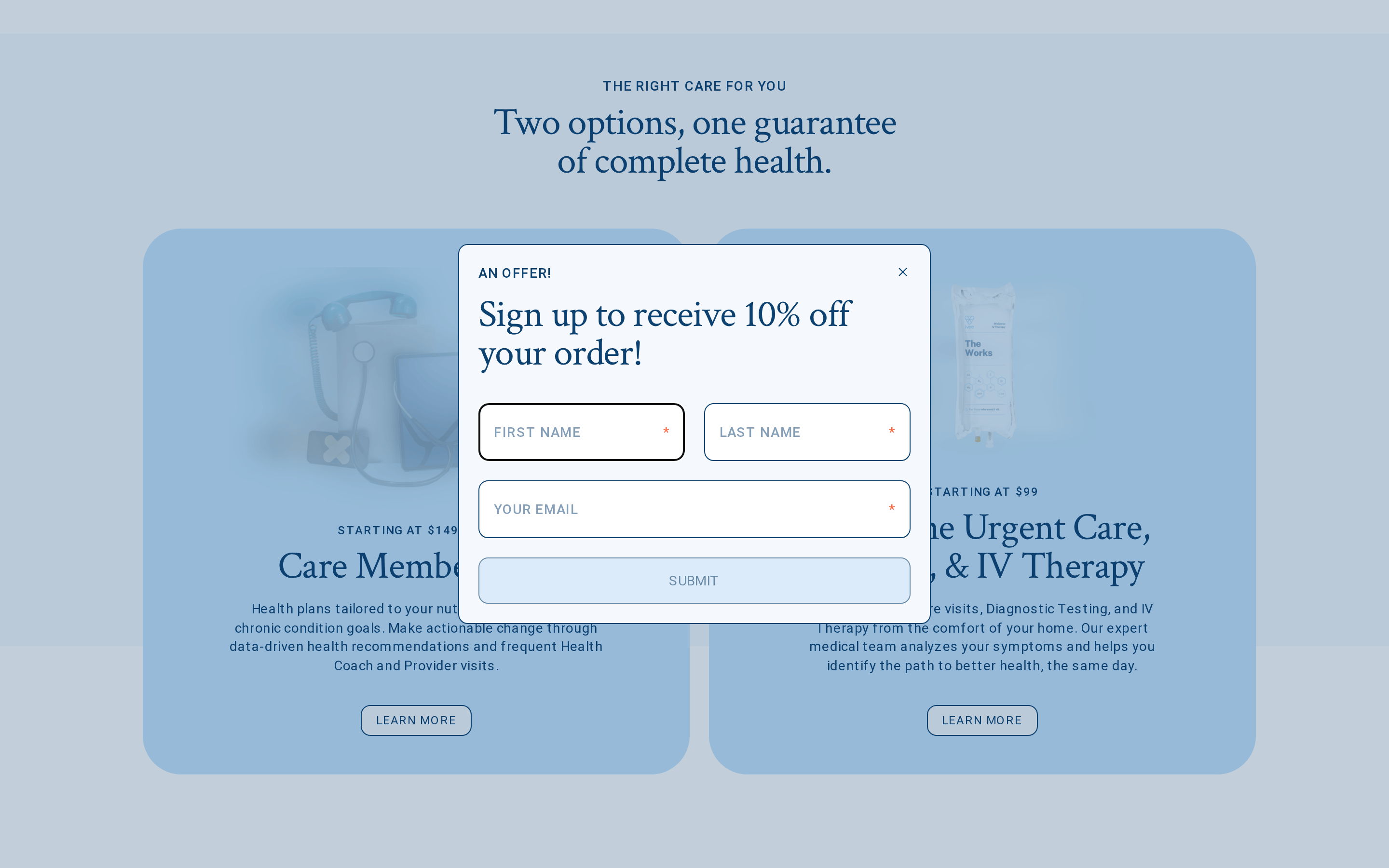
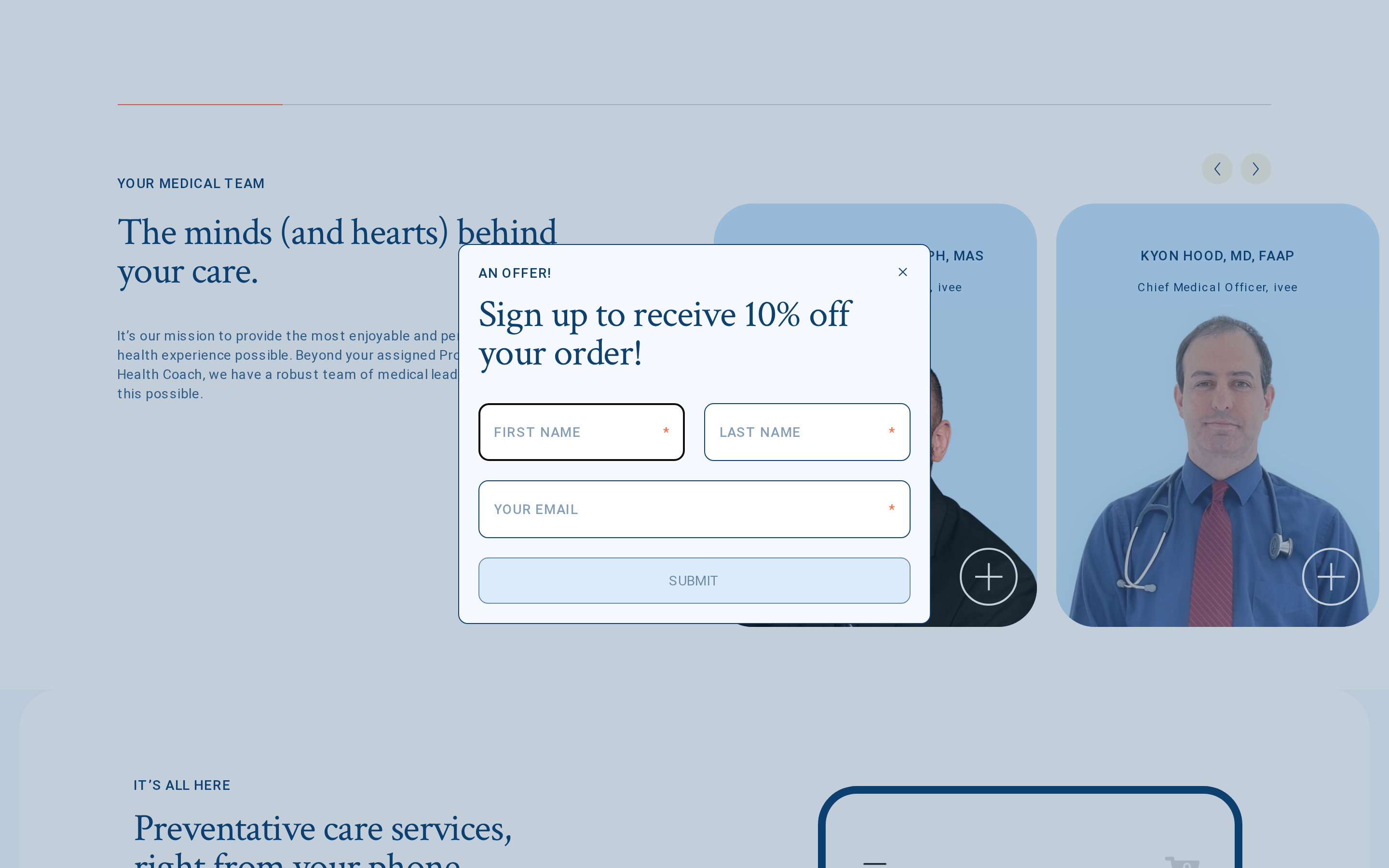
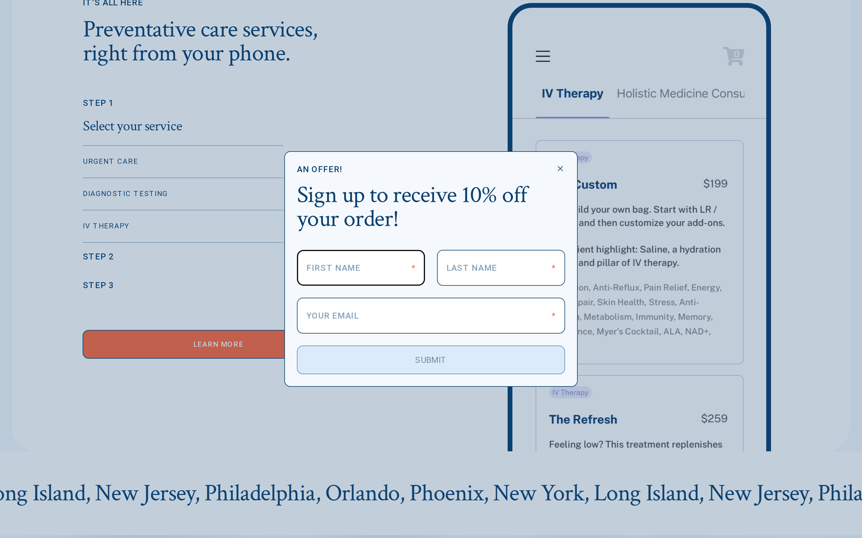
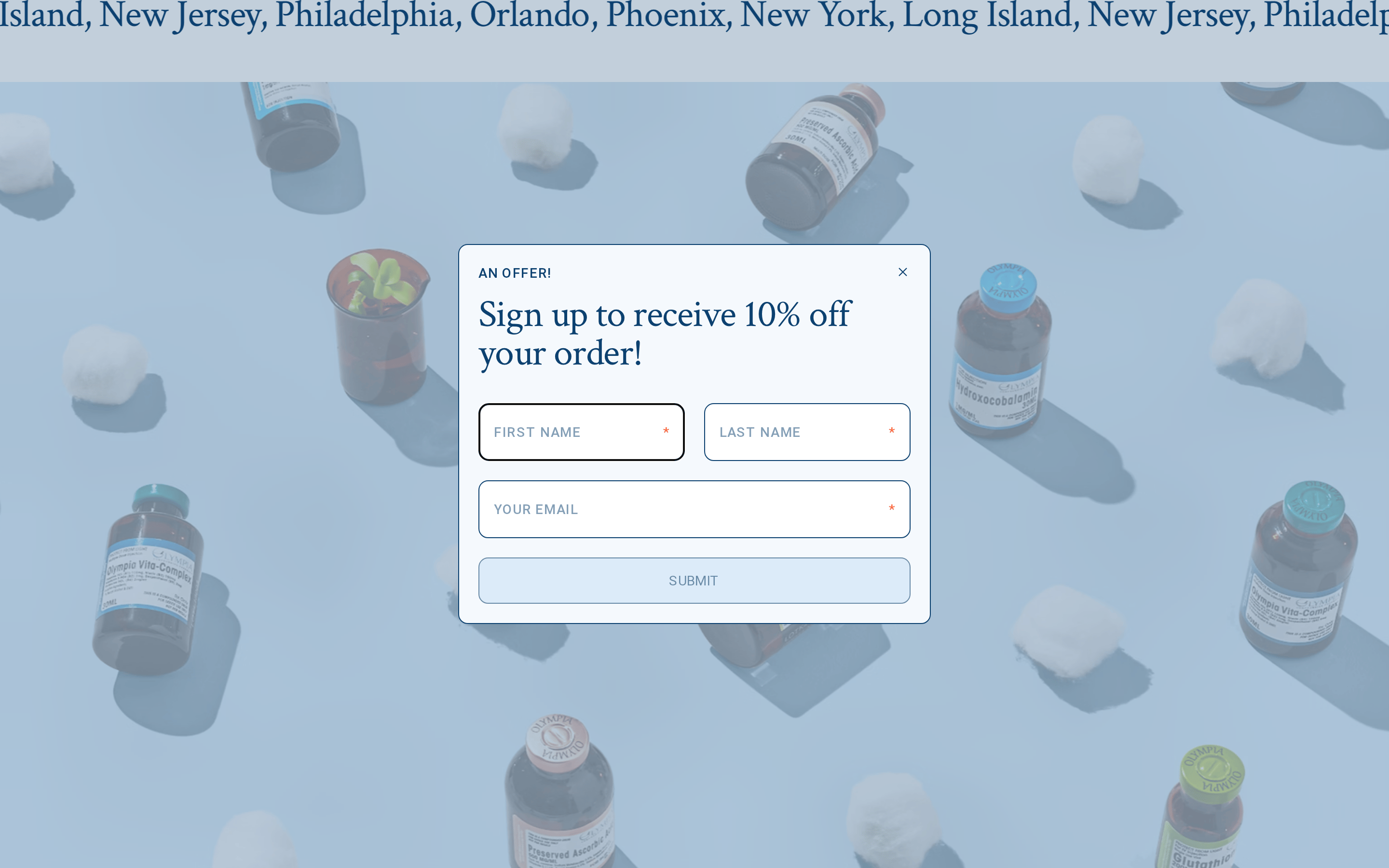
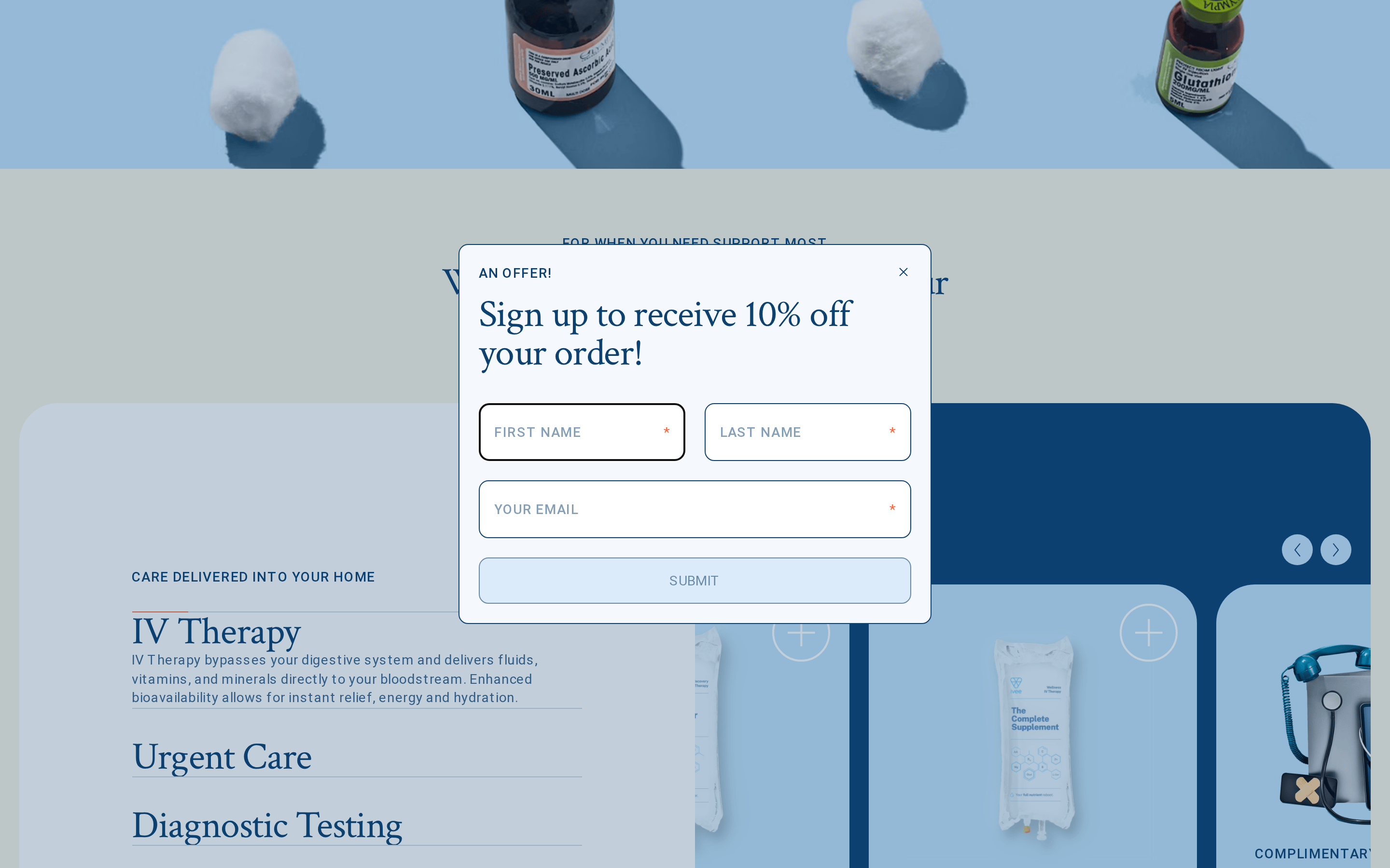
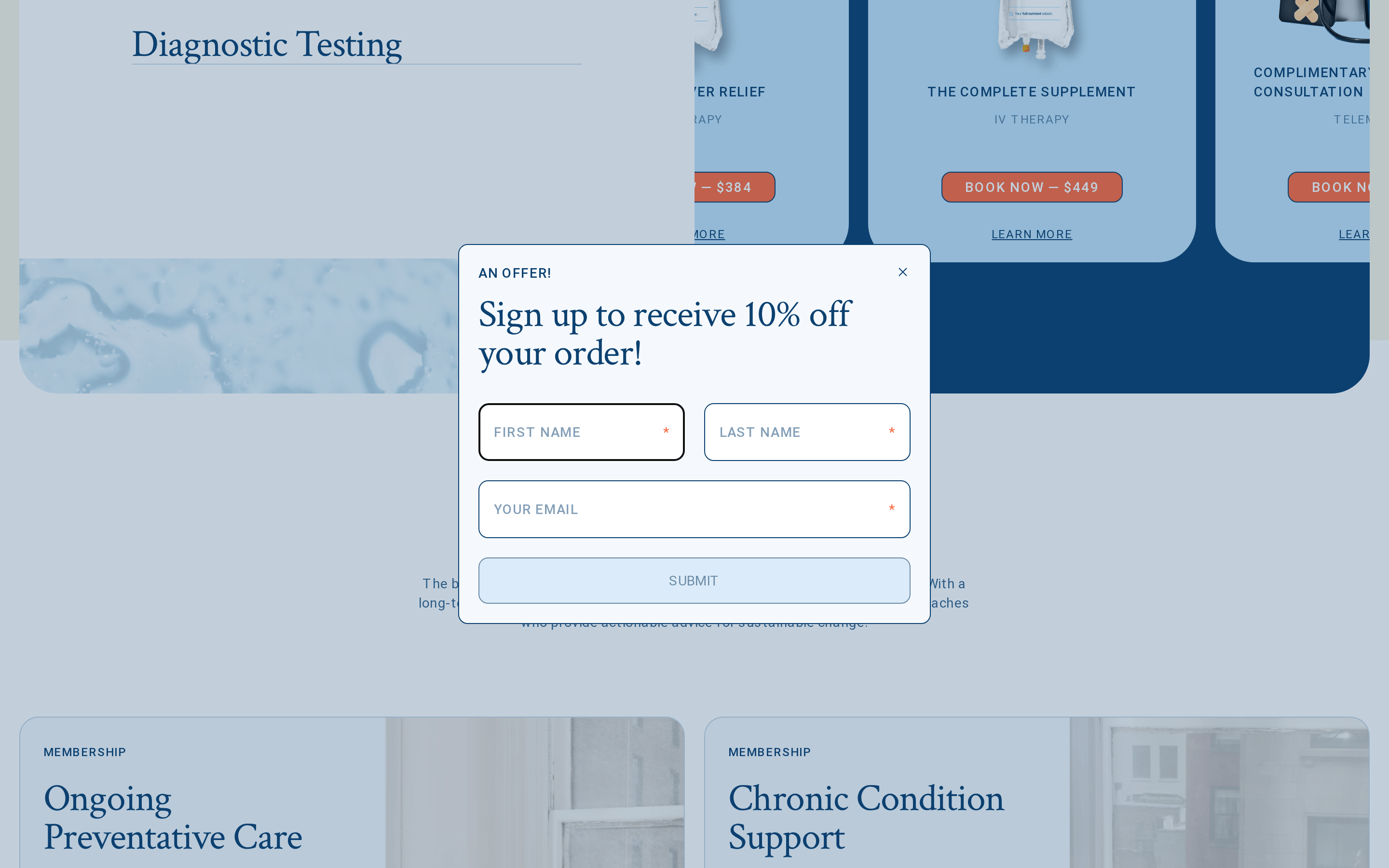
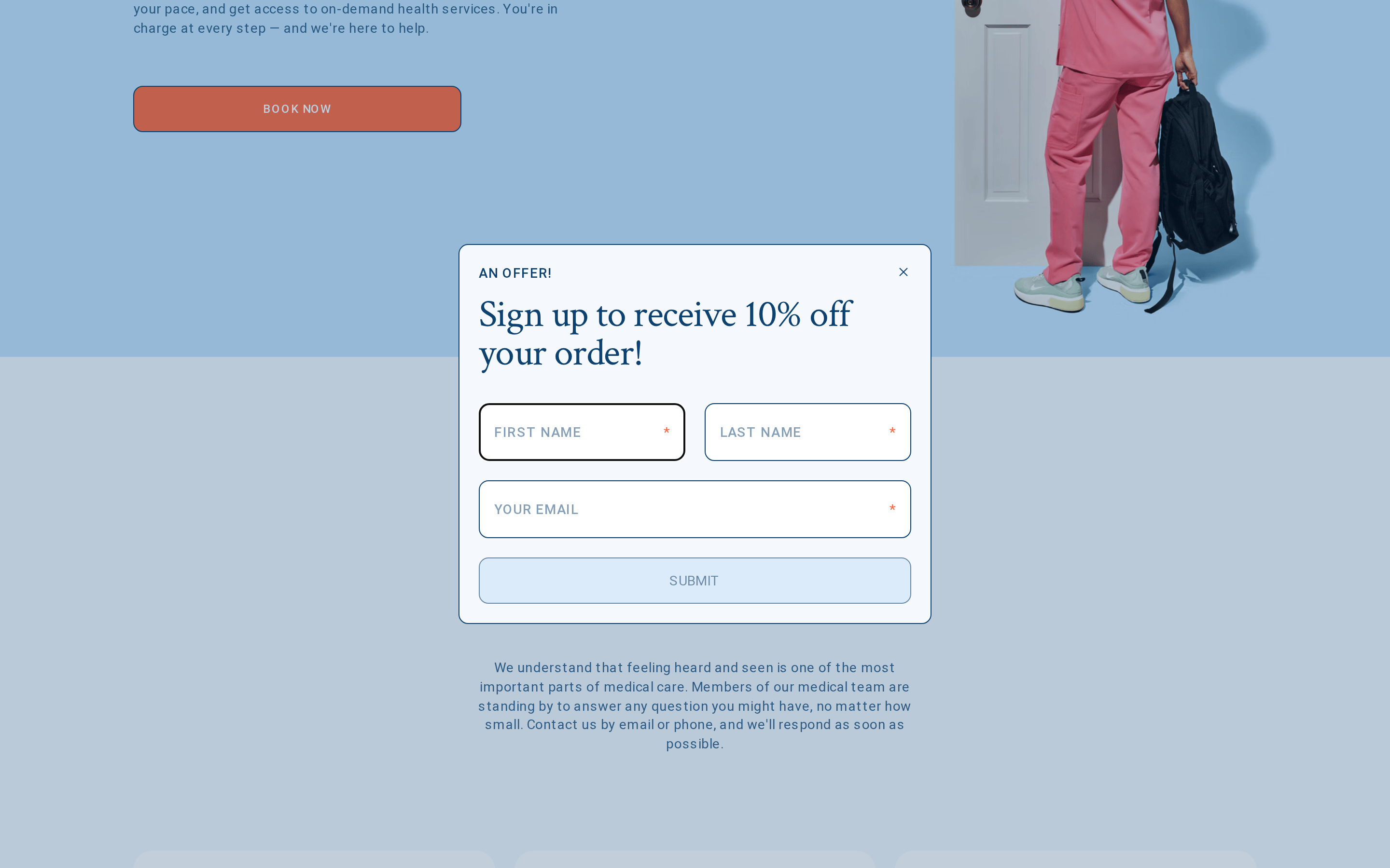
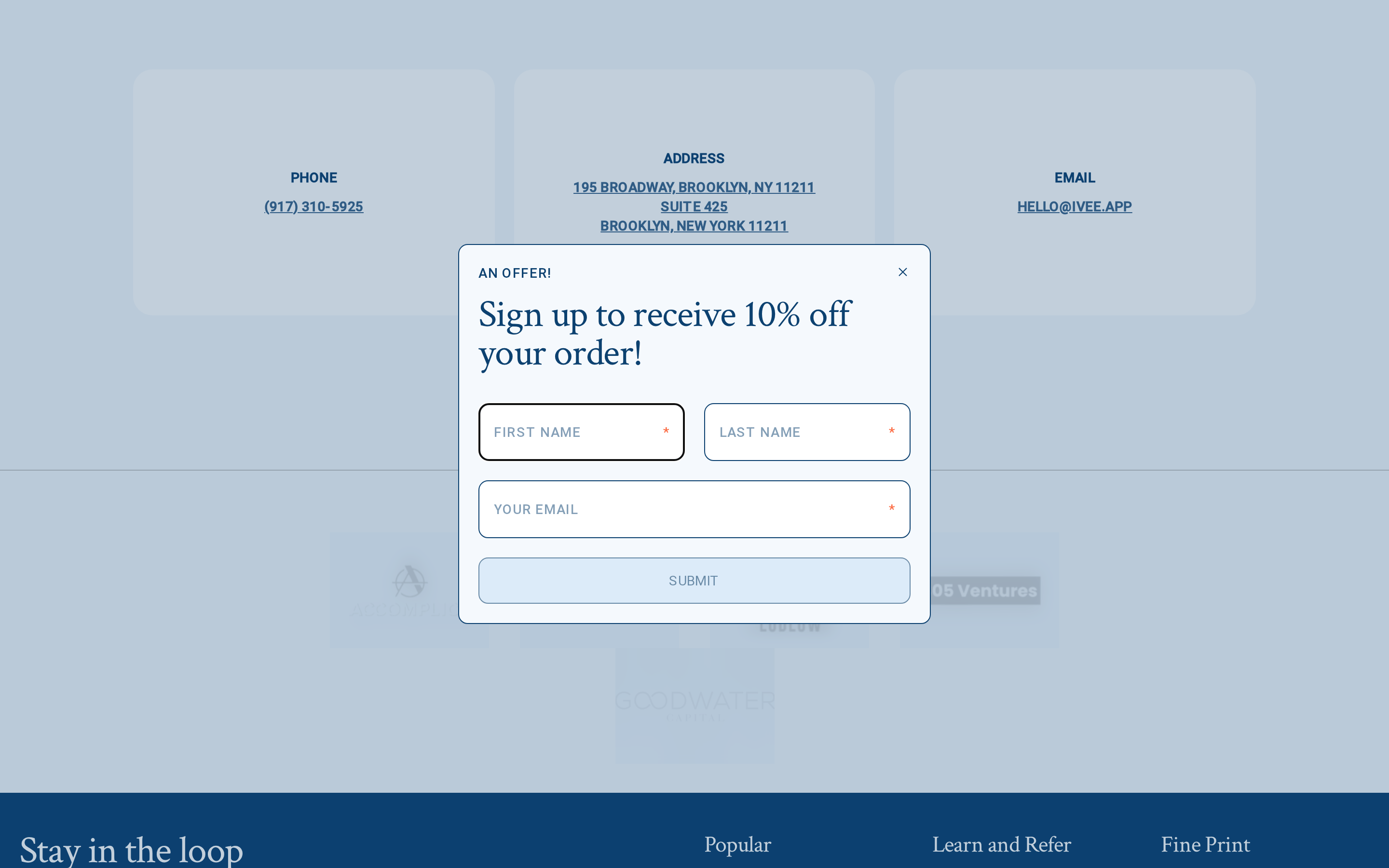
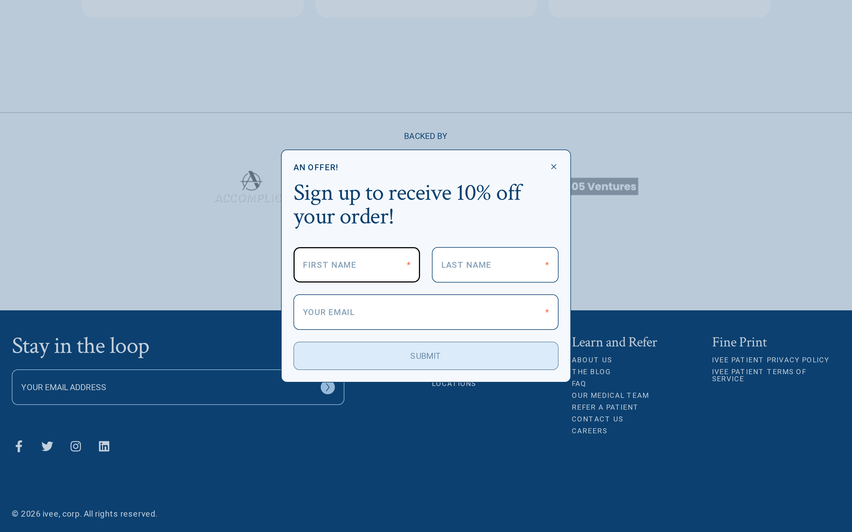
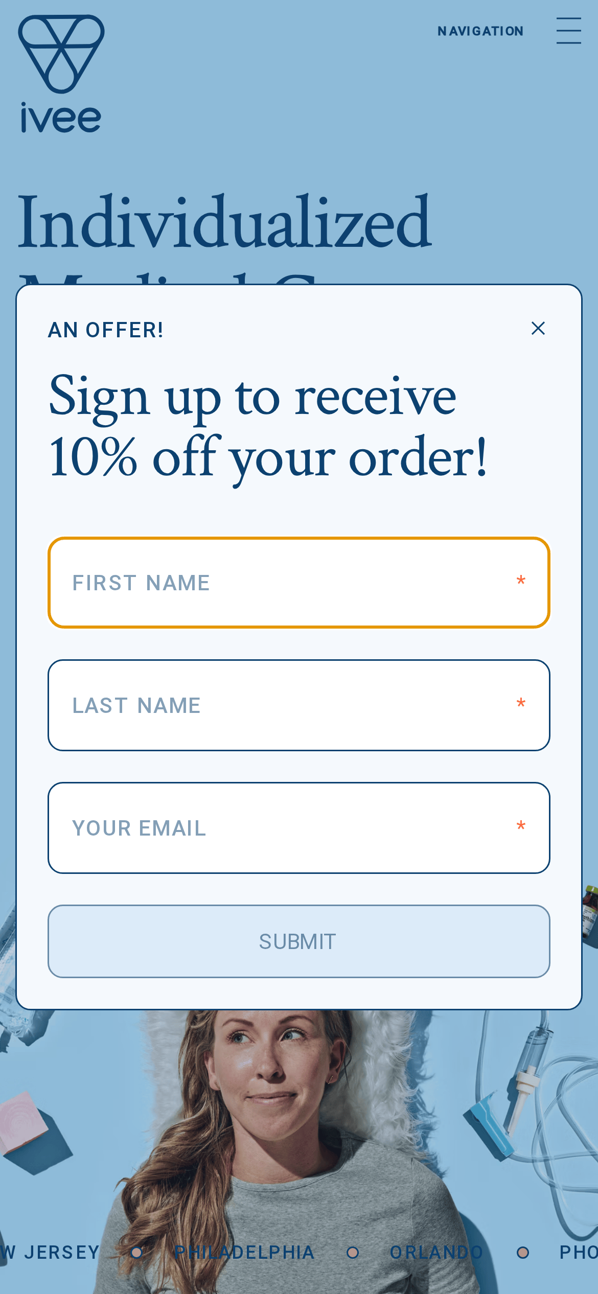
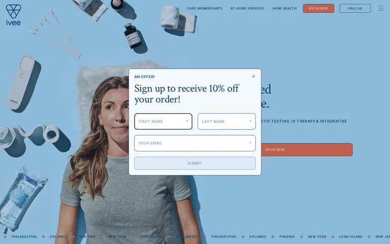
Clinical trust anchored by a soothing sky blue, punctuated by a warm coral action color.
03
Typography
transitional-serif · humanist-sans
display52px · 400
body14px · 400
label12px · 500
Use transitional-serif for all major headlines and pricing · Use humanist-sans for UI labels and navigation · Apply generous letter-spacing to uppercase labels · Maintain a clean, airy typographic rhythm
04
Spacing
4px
8px
16px
24px
32px
48px
64px
96px
Open spacing to emphasize a premium, unhurried feel
05
Surfaces
sm · 4px
md · 10px
lg · 20px
pill · 40px
Subtle 1px borders using primary ink color or transparent ink
0px 0px 30px 0px rgba(0,0,0,0)
06
Layout
1280container
12columns
24pxgutter
768 / 1024breakpoints
Standard full-width hero with centered modal overlay
07
Motion & Interaction
150msmicro
400mssmall
800msmedium
cubic-bezier(0.4, 0, 0.2, 1)easing
Smooth opacity transitions for overlays and modals · Gentle color and background-color transitions on hover
Subtle color shifts and opacity changes on interactive elements · Immediate visual response via transition properties
08
Components
buttonPill-shaped CTA buttons using accent or outline styles
cardClean cards with generous padding and subtle borders
chipSmall rounded badges for pricing or location details
inputClean inputs with clear focus states and required markers
heroFull-width photographic hero with high-quality lifestyle imagery
09
Voice & Don'ts
ToneProfessional, welcoming, and clear
HeadlinesDirect and benefit-driven using transitional-serif
CTAsAction-oriented and uppercase
Don't use neon or harsh colors — screenshot shows a calming palette of sky blue and coral
Don't use heavy geometric sans-serifs — screenshot shows a softer humanist-sans and transitional-serif pairing
Don't use dark backgrounds as the primary theme — screenshot is dominated by light blue and white
Don't use sharp, blocky UI elements — screenshot features rounded corners and pill-shaped buttons
Don't clutter the interface with too many colors — screenshot primarily uses a two-tone blue and coral scheme
Don't use small, cramped typography — screenshot displays generous letter-spacing and clear hierarchy
Captured from the live site · real computed styles
11
System prompt
This is a premium healthcare and wellness service website. The design DNA centers around a calming, clinical yet approachable aesthetic using a primary sky-blue background (#C4E3FA) and a vibrant coral accent (#FC6B42) for calls to action. The typography pairs a classic transitional-serif for impactful headlines with a clean humanist-sans-serif for UI elements and body text, creating a sophisticated and trustworthy feel. Critical design constraints: avoid overly dark or clinical color palettes; do not use harsh geometric typography; ensure all interactive elements use rounded corners and pill shapes to maintain a friendly, premium atmosphere. The layout should remain airy with generous white space to reflect the high-end nature of the services offered.
Bring this taste to your agent
Hand your AI agent a machine-readable spec of this design — tokens, type, motion, the whole DNA.