← OpenDesign CURATED · OPEN · FREE
OH no Type Co
An expressive type foundry showcasing bold, experimental typography and graphic design.
type foundry
01
Identity DNA
type foundry expressive bold graphic experimental
A loud, confident gallery of experimental typography and graphic design.
02
Color
#000000Ink
#ffffffBG
#999999Muted
rgba(0, 0, 0, 0.1)Line
Strict, high-contrast monochrome relying on bold typography and graphic elements for visual interest.
03
Typography
geometric-sans · monospace
display 48px · 400body 16px · 400caption 12px · 40004
Spacing
4px
8px
16px
24px
32px
48px
64px
96px
Flexible and dictated by the scale of the graphic elements rather than a strict vertical rhythm.
05
Surfaces
sm · 0px
md · 0px
lg · 0px
pill · 0px
None. Relies on typography and solid blocks for separation.
06
Layout
1280 container
12 columns
32px gutter
768 / 1024 breakpoints
Asymmetrical grid with large graphic blocks and text elements placed expressively.
07
Motion & Interaction
250ms micro
400ms small
800ms medium
linear easing
Opacity transitions for interactive elements · Horizontal sliding for carousel elements
Pointer cursor change on interactive elements. · Immediate state changes.
08
Components
button Text links with arrow indicators or underlines. card Solid blocks (often black) containing text and graphic elements. chip None observed. input None observed. hero Large, expressive typographic compositions with overlapping elements. 09
Voice & Don'ts
Tone Confident, expressive, and slightly rebellious. Headlines Large, bold, and often experimental typography. CTAs Simple text links with arrows or underlines. Don't use rounded corners — screenshot shows sharp, rectangular shapes. Don't use drop shadows — screenshot relies on solid black and white blocks. Don't use a colorful palette — screenshot is strictly monochrome (black, white, grey). Don't use thin, delicate typography — screenshot features heavy, bold typefaces. Don't use complex gradients — screenshot uses flat, solid colors. Don't use small, timid headlines — screenshot features large, expressive typography. Avoid: Subtle or muted typography Avoid: Colorful palettes Avoid: Rounded corners or soft shadows Avoid: Small, timid headlines 10
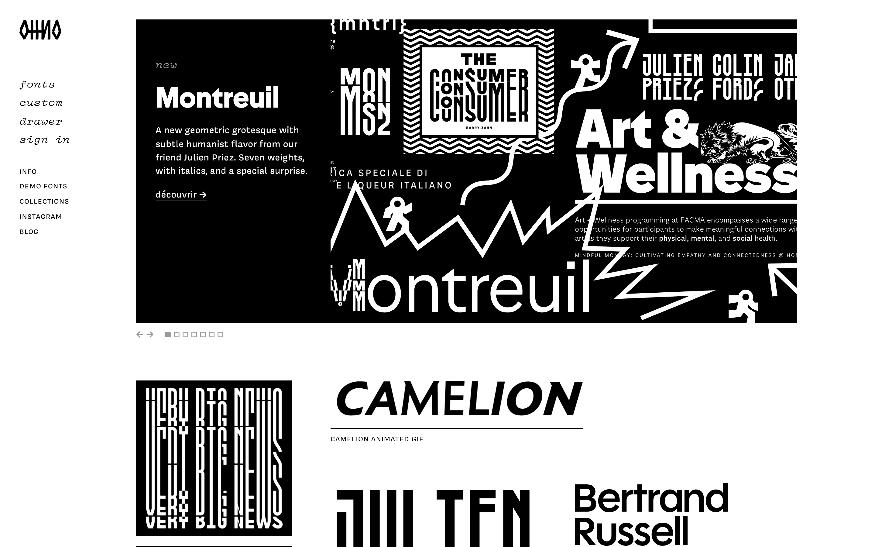
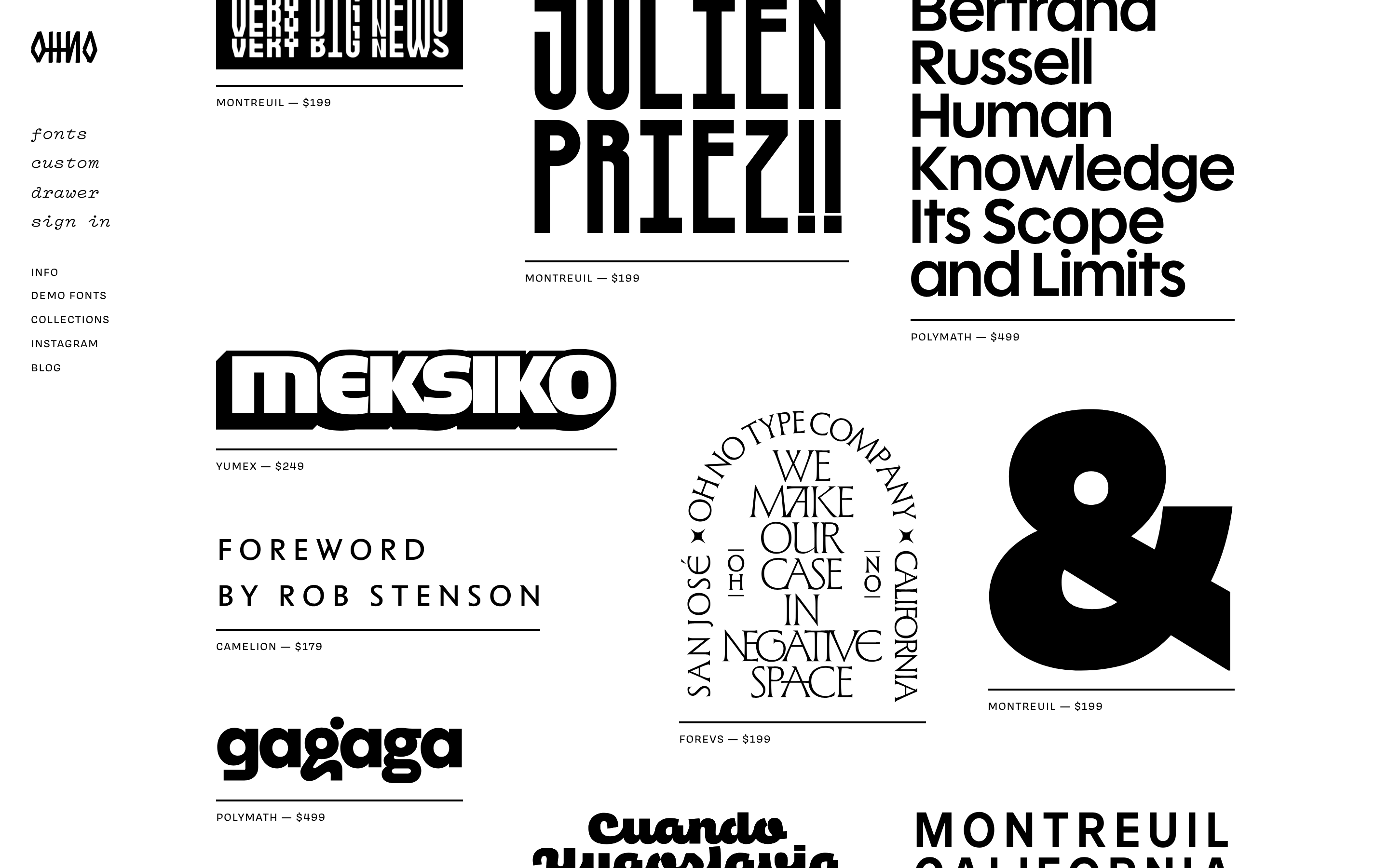
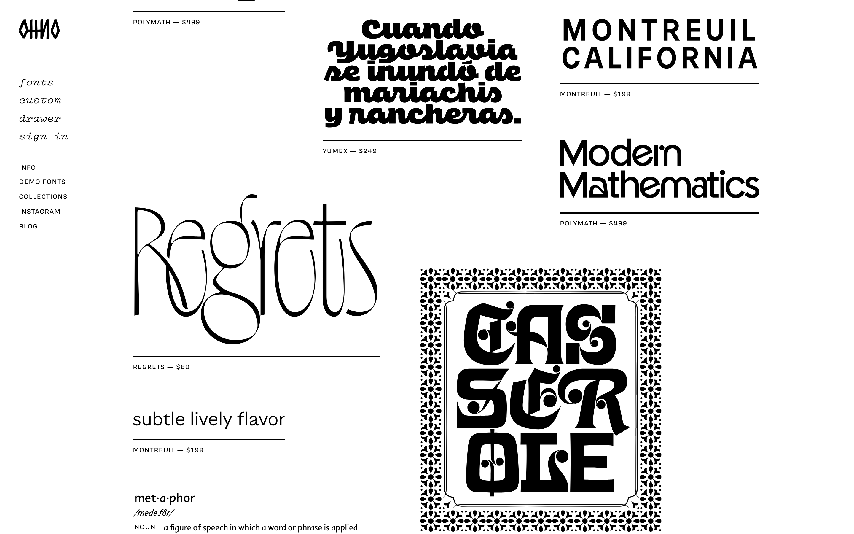
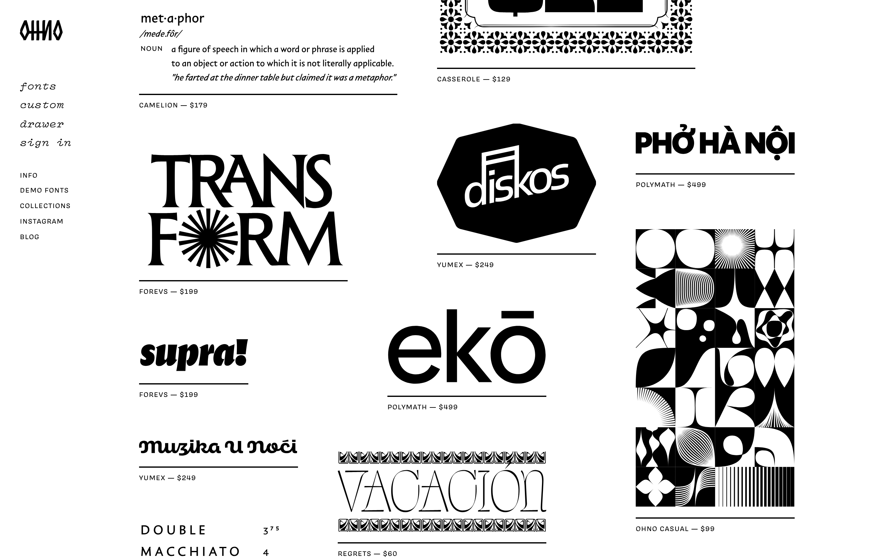
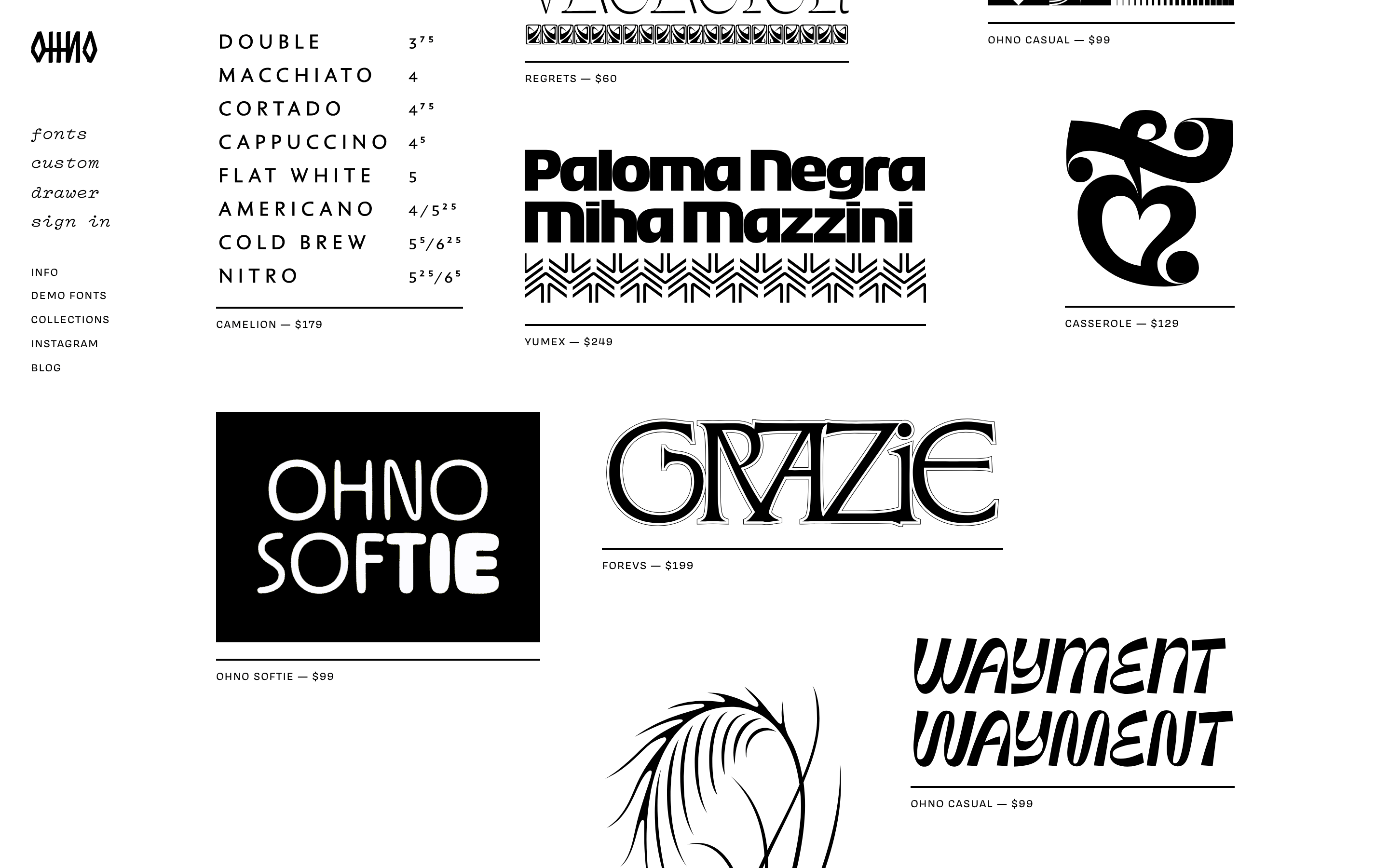
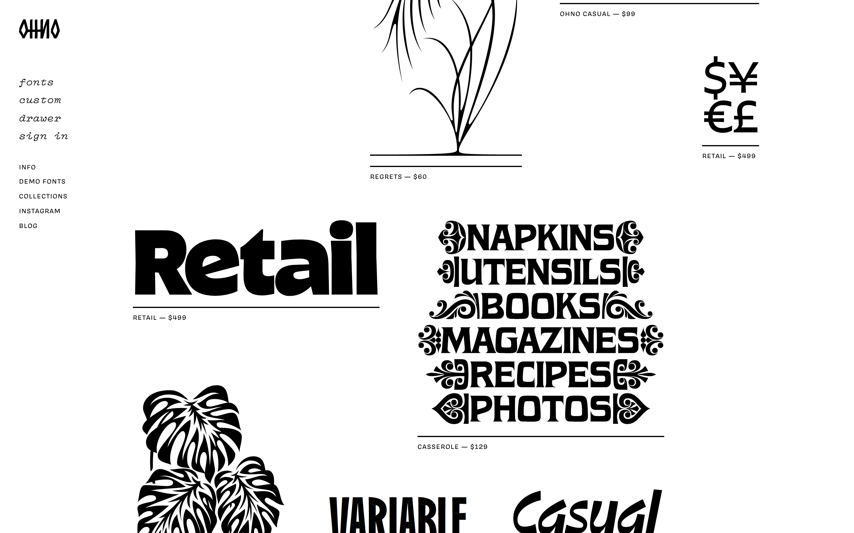
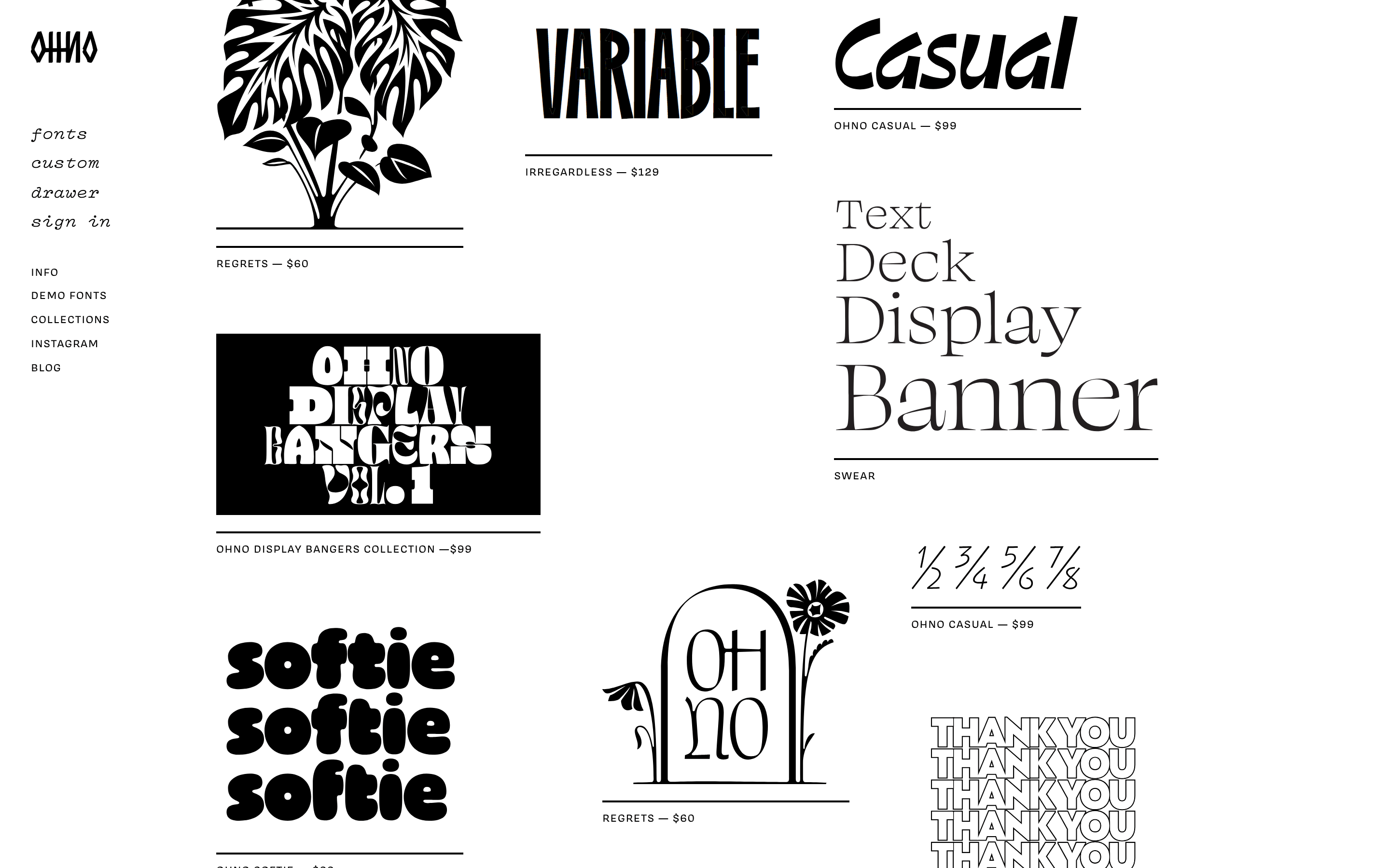
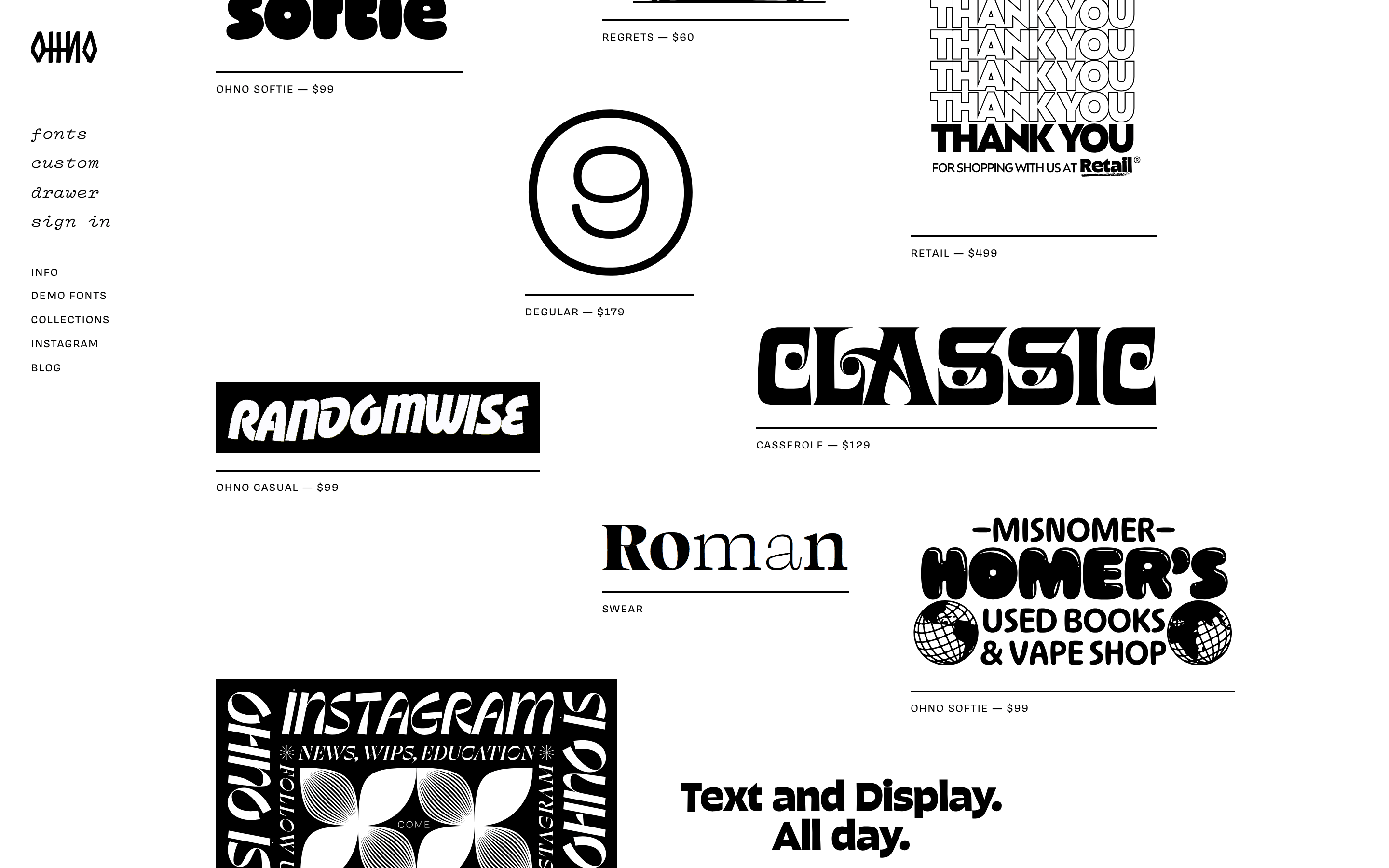
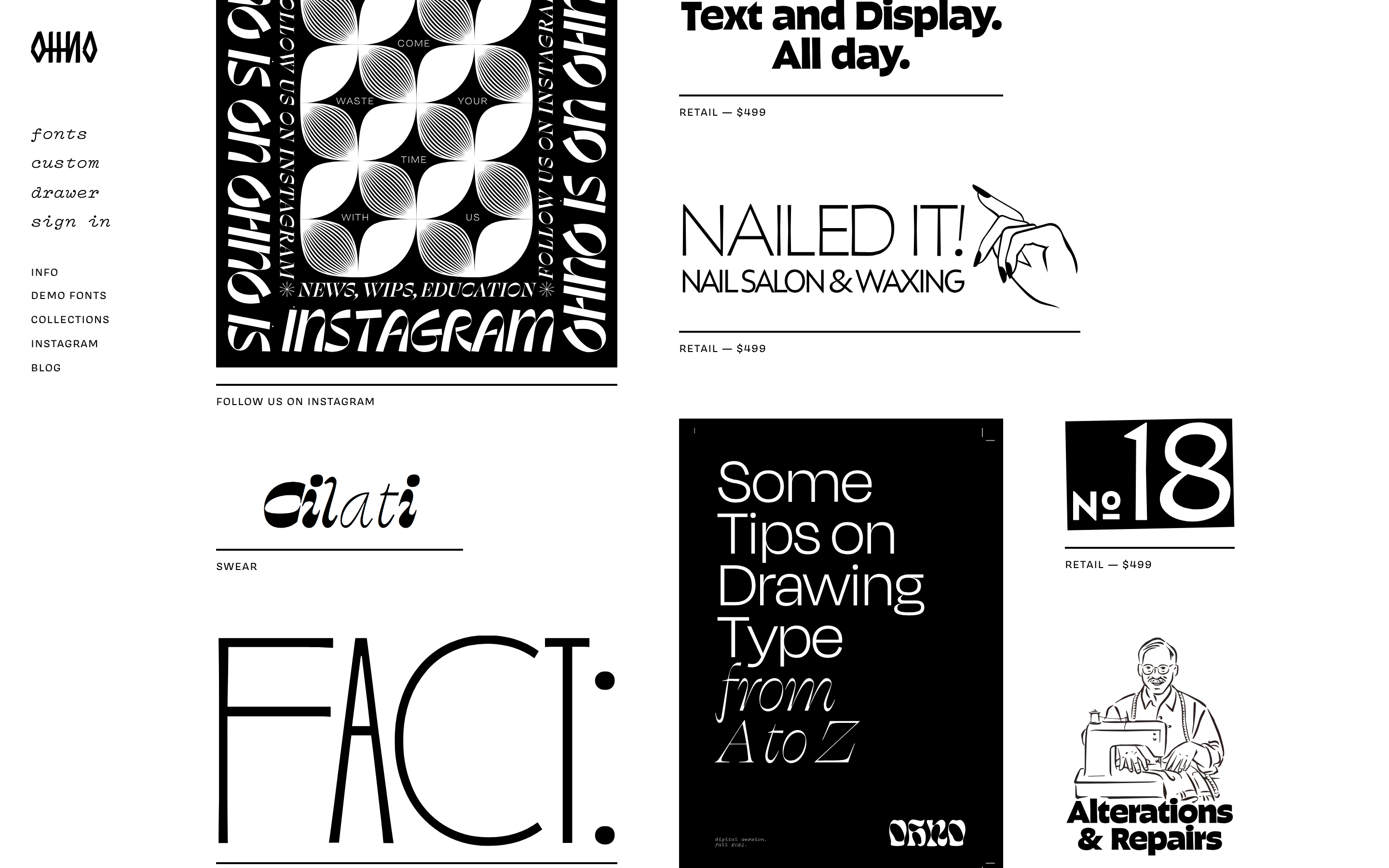
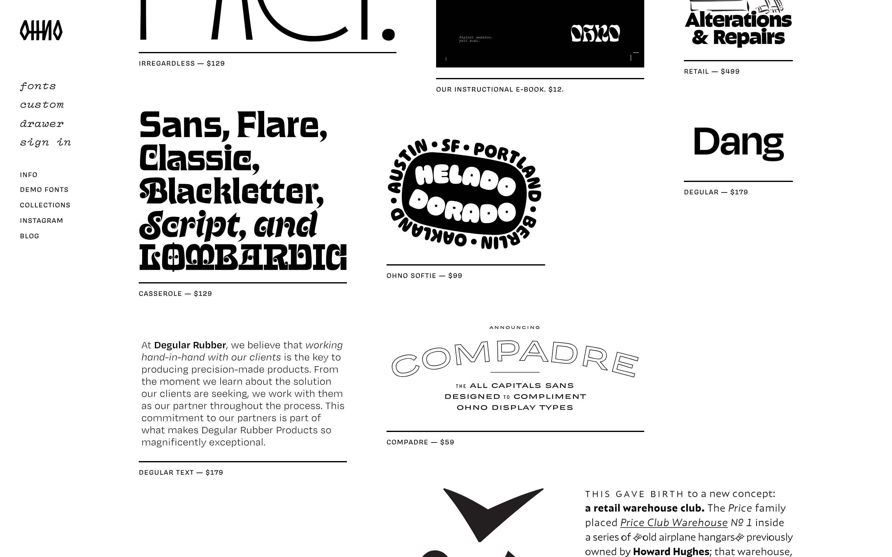
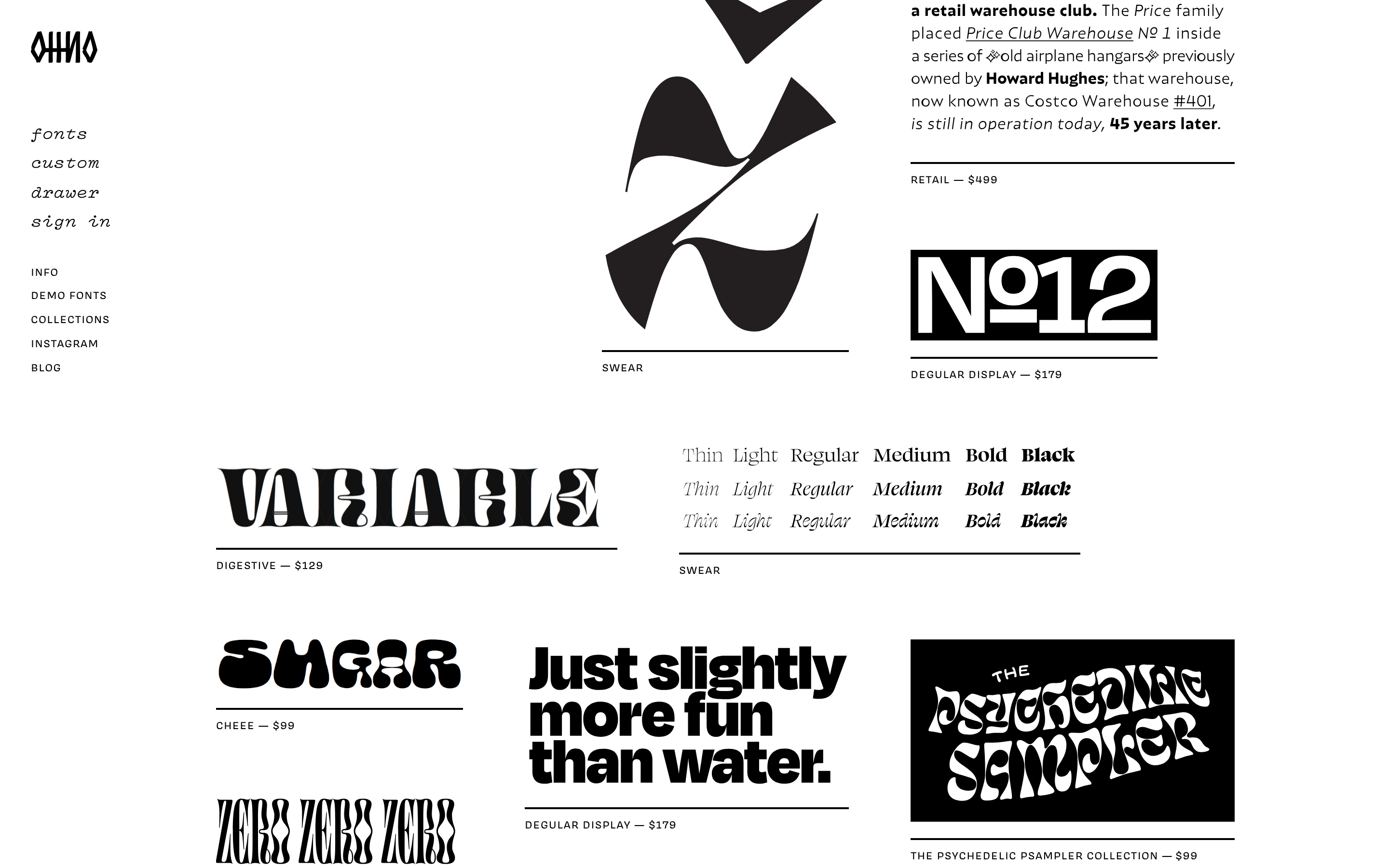
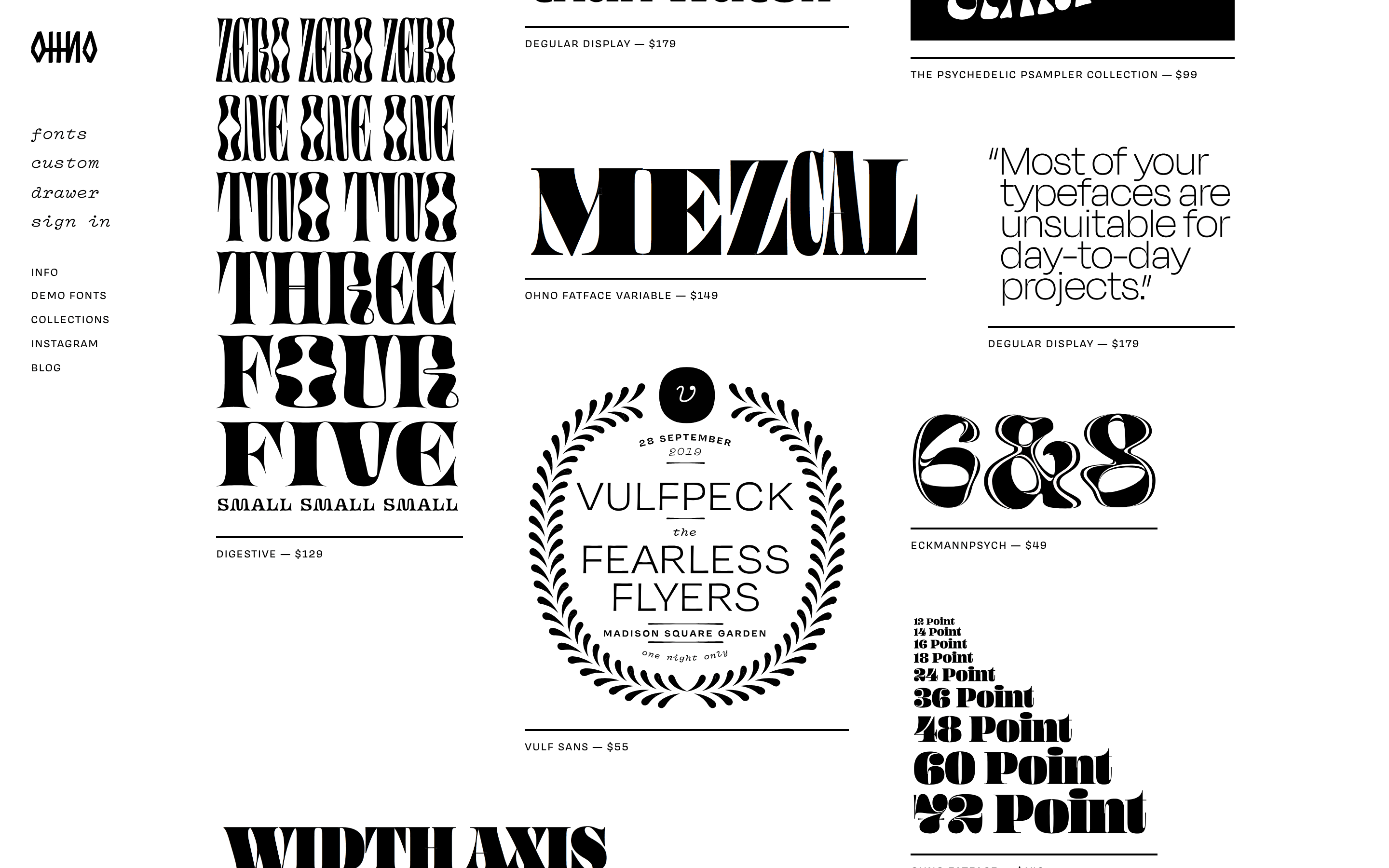
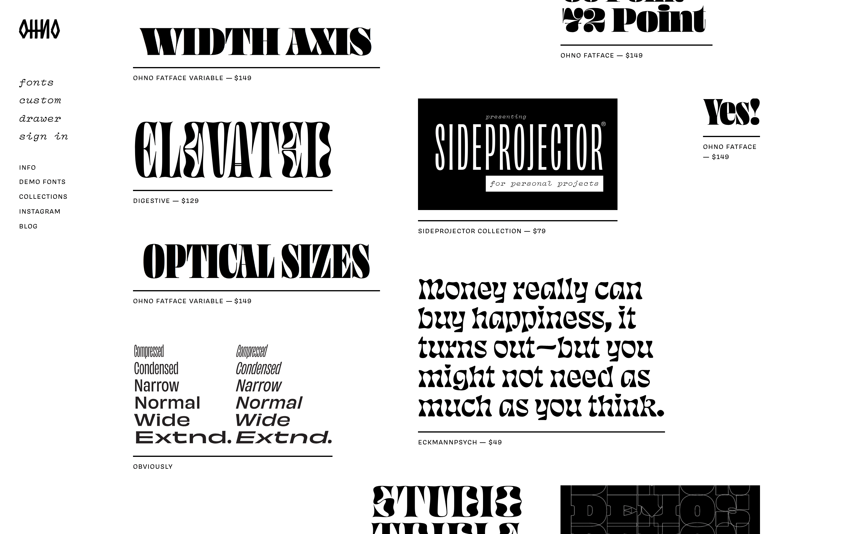
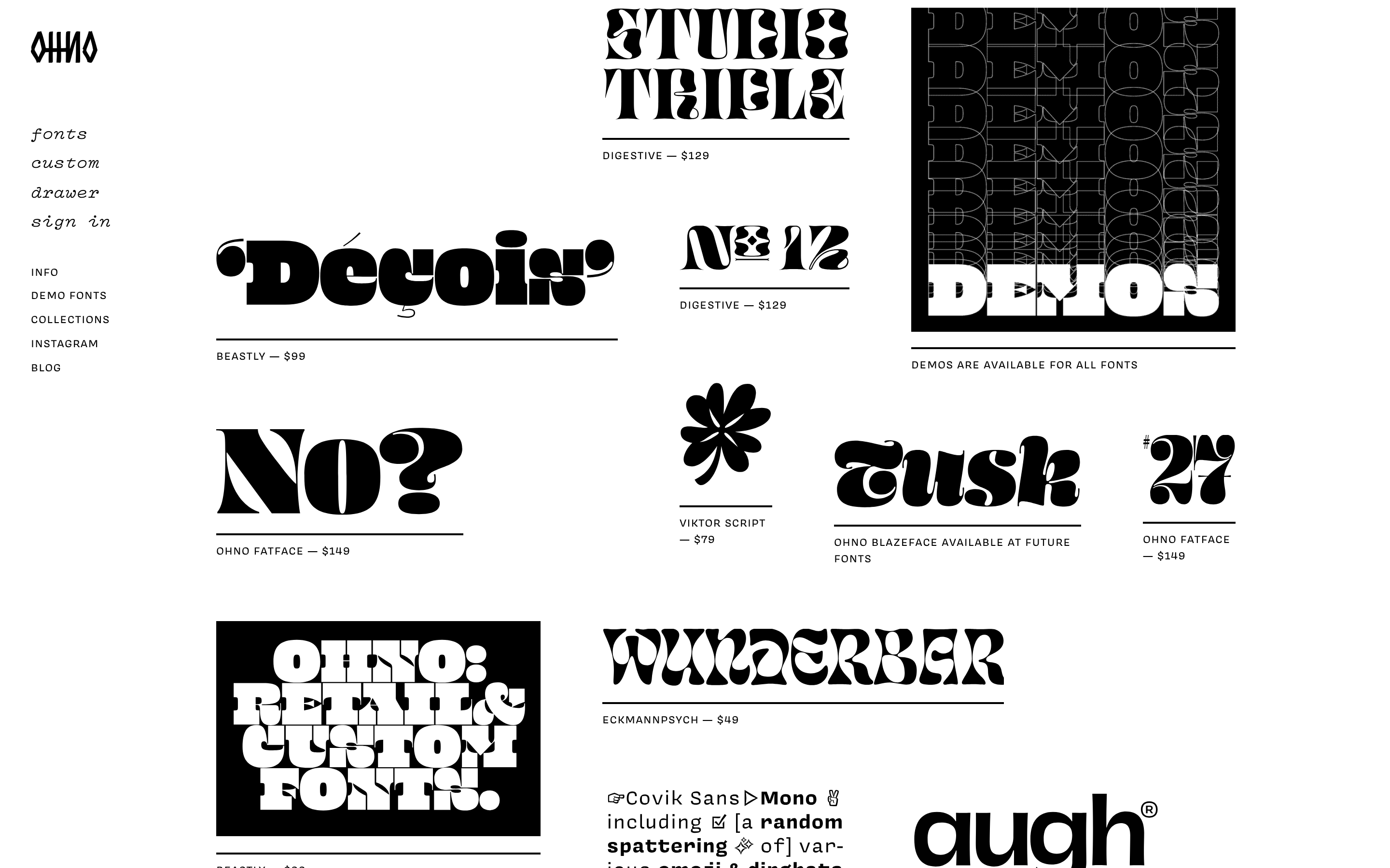
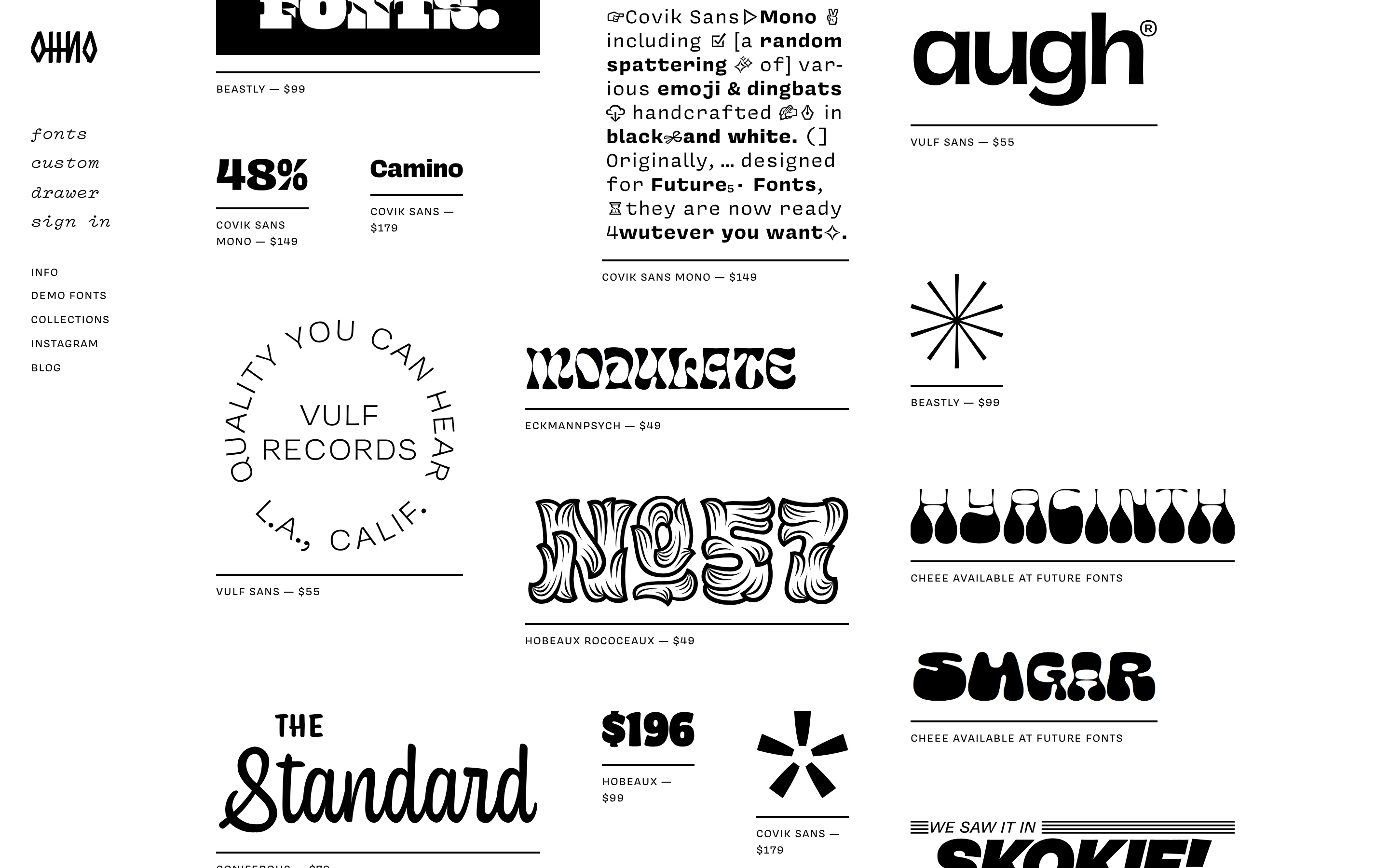
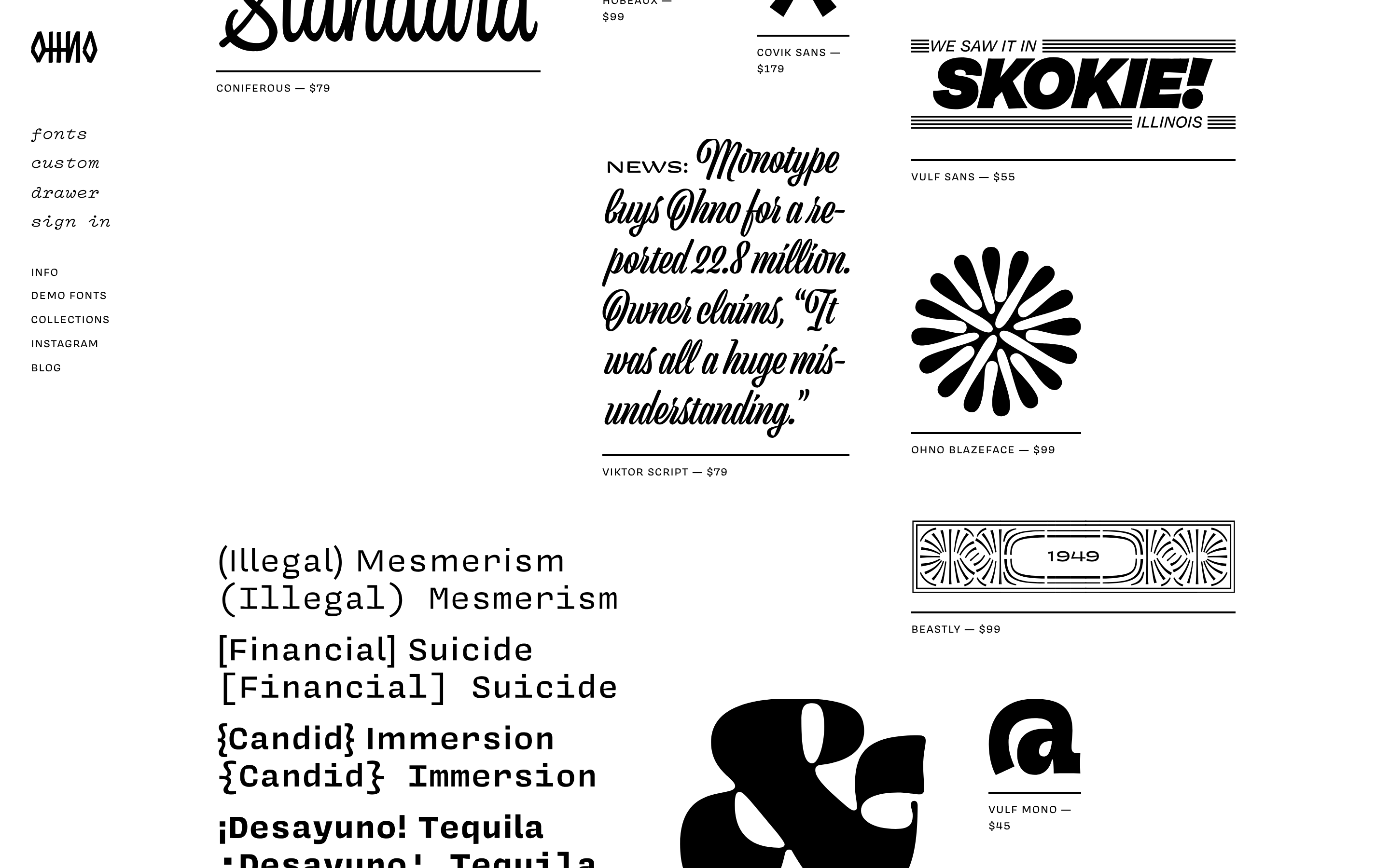
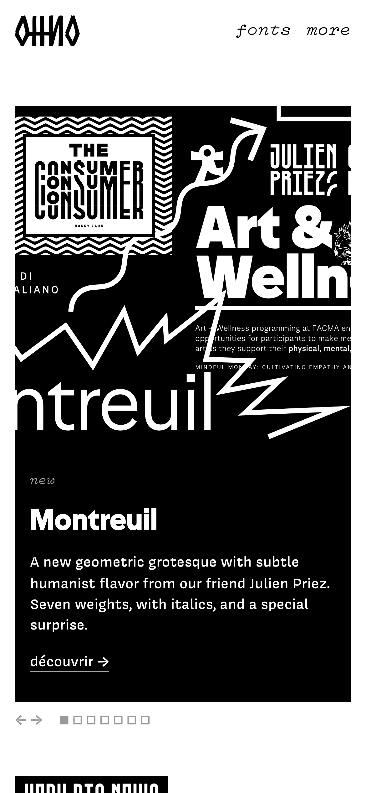
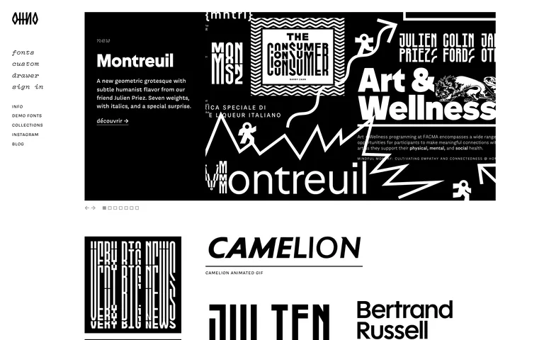
Inside the pack — real screenshots
桌面首屏(hero) 桌面滚动分段(90% viewport 步进,作为视觉证据) 桌面滚动分段(90% viewport 步进,作为视觉证据) 桌面滚动分段(90% viewport 步进,作为视觉证据) 桌面滚动分段(90% viewport 步进,作为视觉证据) 桌面滚动分段(90% viewport 步进,作为视觉证据) 桌面滚动分段(90% viewport 步进,作为视觉证据) 桌面滚动分段(90% viewport 步进,作为视觉证据) 桌面滚动分段(90% viewport 步进,作为视觉证据) 桌面滚动分段(90% viewport 步进,作为视觉证据) 桌面滚动分段(90% viewport 步进,作为视觉证据) 桌面滚动分段(90% viewport 步进,作为视觉证据) 桌面滚动分段(90% viewport 步进,作为视觉证据) 桌面滚动分段(90% viewport 步进,作为视觉证据) 桌面滚动分段(90% viewport 步进,作为视觉证据) 桌面滚动分段(90% viewport 步进,作为视觉证据) 桌面滚动分段(90% viewport 步进,作为视觉证据) 移动首屏 Captured from the live site · real computed styles
11
System prompt
A bold, expressive type foundry website featuring experimental typography and graphic design. The design relies on a strict, high-contrast monochrome palette (black #000000, white #ffffff, grey #999999) and geometric sans-serif typography. It uses an asymmetrical grid with large, overlapping graphic blocks and text elements. Critical donts: never use rounded corners or drop shadows, never use a colorful palette, and never use small, timid headlines. The design is driven by the scale and weight of the typography itself.
More from the library en · zh-CN · zh-TW · ja · ko
OpenDesign · curated web aesthetics for AI-readable design DNA · opendesign.cc
Why we curated this: This site is a masterclass in expressive typography, demonstrating how bold type and strict monochrome can create a powerful, memorable design without color or complex UI patterns.