cultural institutionaccessiblemoderngallerycurated
A minimalist gallery catalog with bold editorial photography.
02
Color
#FFDB23Accent
#1A1A1AInk
#313131Ink soft
#FFFFFFBG
#F8F8F8BG soft
#767676Muted
rgba(26,26,26,0.1)Line
High-contrast neutrality (black/white/gray) punctuated by a single bold yellow for focus, allowing photography to provide the primary visual richness.
03
Typography
geometric-sans · humanist-sans
display46px · 400
h222px · 400
body17px · 400
caption14px · 400
nav14px · 400
Section titles use wide tracking (uppercase) to establish hierarchy. · Body text remains at a comfortable 17px size for readability. · Hero titles are large but maintain a regular font weight.
04
Spacing
4px
8px
12px
16px
24px
32px
48px
64px
96px
Generous vertical rhythm with consistent 16px/32px padding between content blocks.
05
Surfaces
sm · 2px
md · 4px
lg · 0px
pill · 999px
Minimal use of borders, primarily for subtle underlines (1px) on navigation items or interactive elements.
rgb(128, 128, 128) 0px 0px 5px 0px
06
Layout
1280container
12columns
24pxgutter
768 / 1024breakpoints
A rigid 12-column grid system with a centered maximum-width container.
07
Motion & Interaction
220msmicro
400mssmall
800msmedium
cubic-bezier(0.58, 0, 0.38, 1.01)easing
Standard hover transitions for interactive elements. · Subtle fade transitions for mobile menu visibility.
Subtle background-color or color shifts on links and buttons. · Standard button press feedback.
08
Components
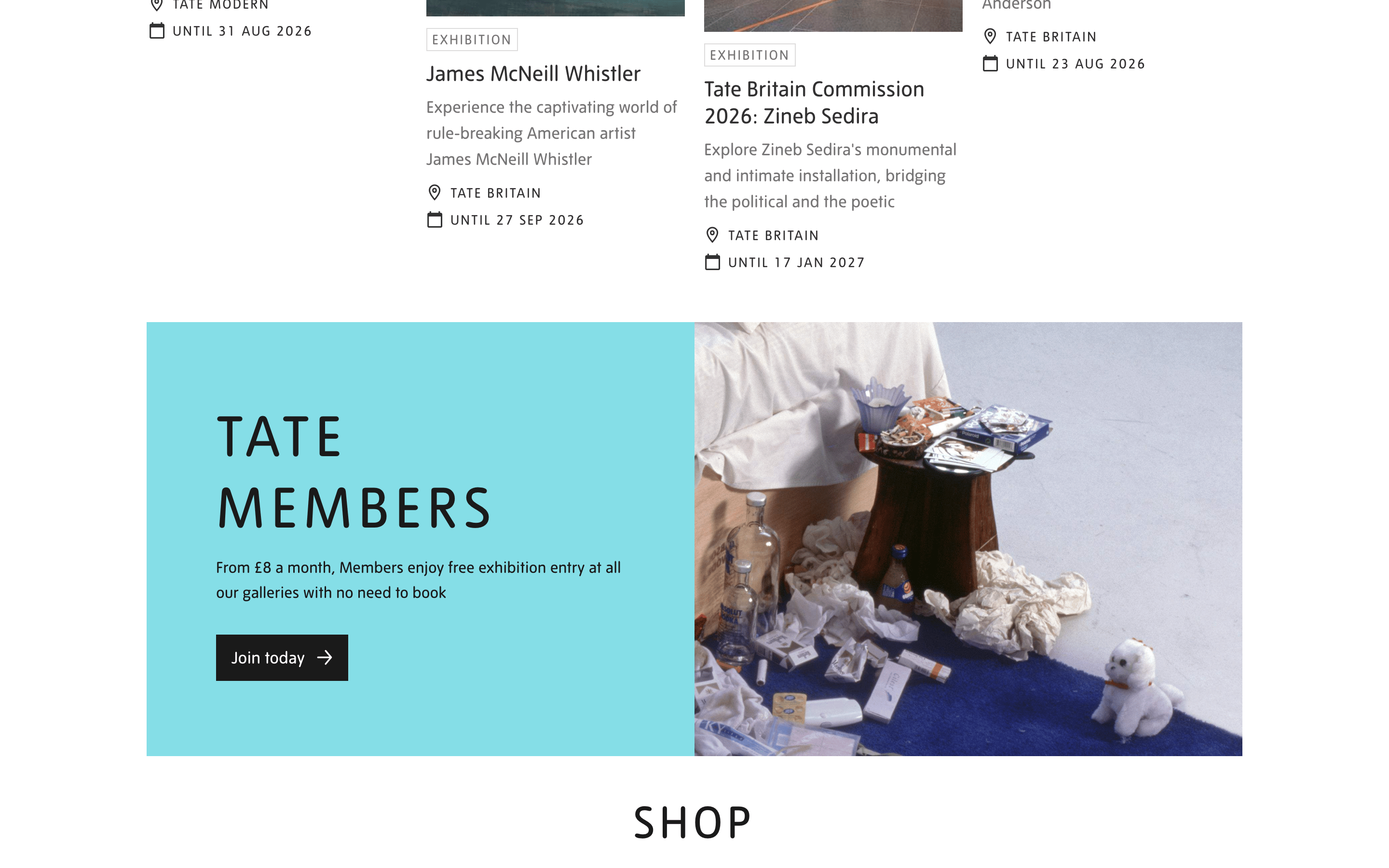
buttonSolid black or teal blocks with white text and right-pointing arrows, emphasizing clear calls to action.
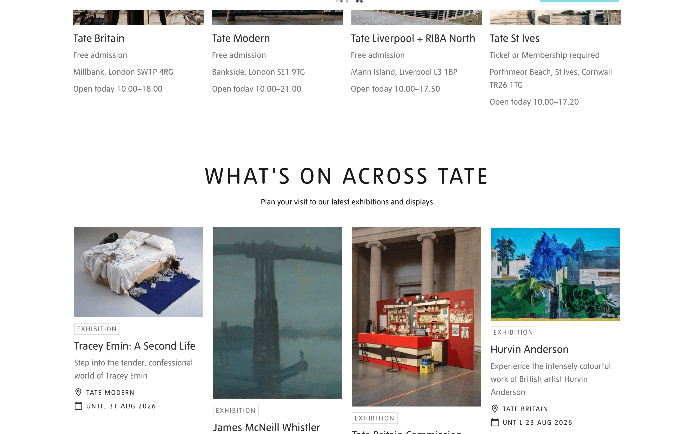
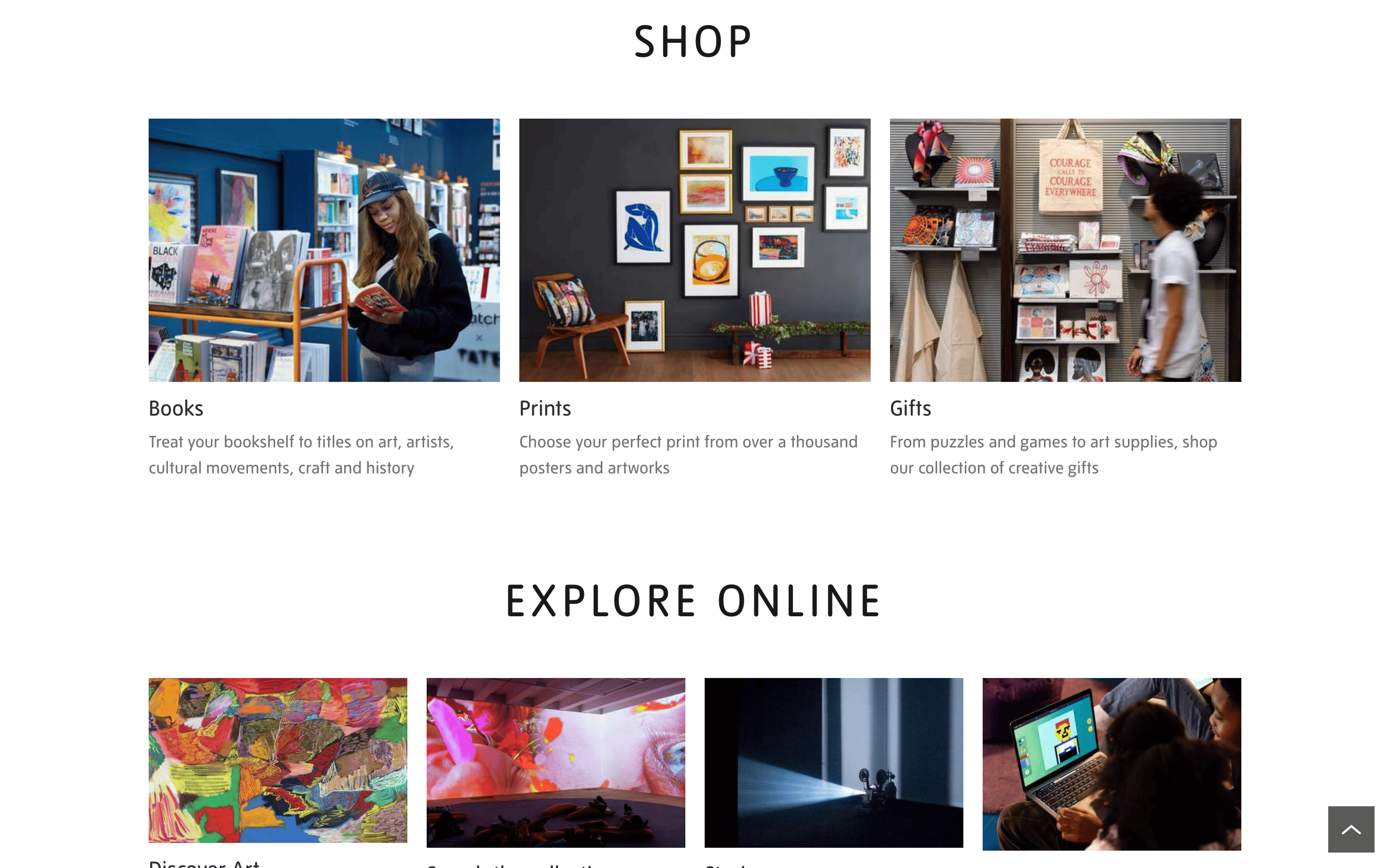
cardImage-forward cards with minimal or no background styling, relying on generous white space between grid items.
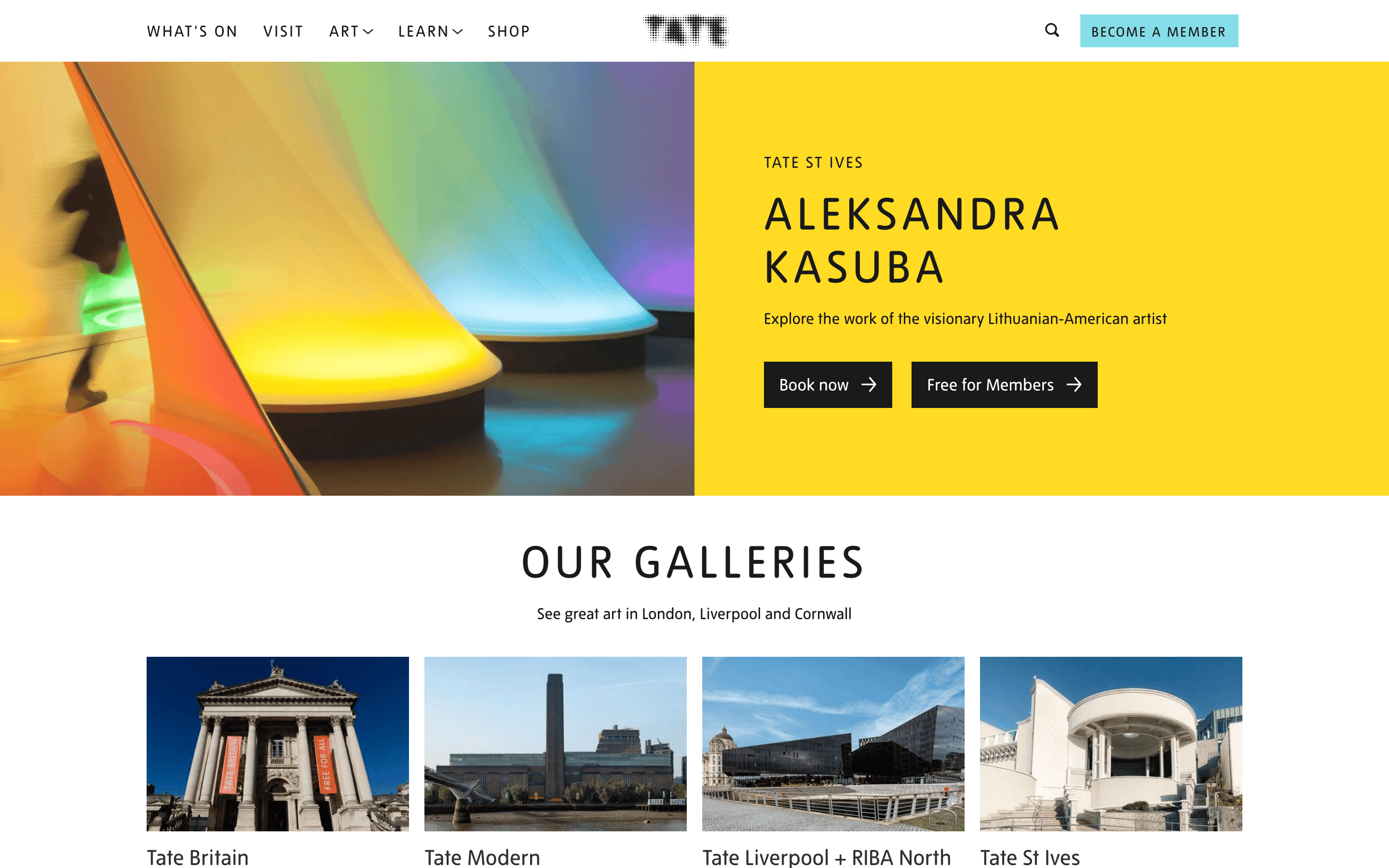
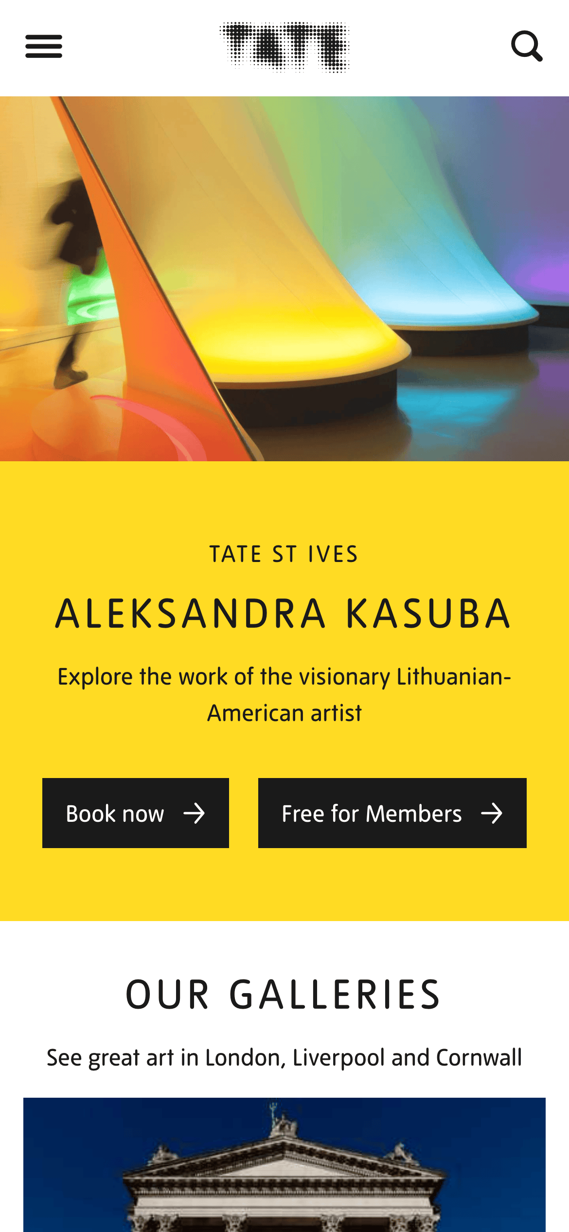
heroA split-layout hero featuring a vibrant, full-bleed image on one side and a solid-colored block (e.g., yellow) with high-contrast typography on the other.
09
Voice & Don'ts
ToneInstitutional, educational, yet welcoming and accessible.
HeadlinesBold, uppercase, and descriptive, focusing on the subject or location.
CTAsDirect and action-oriented, often paired with '→' arrows to indicate forward movement.
Don't use drop shadows for elevation — the design relies on flat color blocks and white space for hierarchy.
Don't use multiple competing accent colors — the palette is strictly black, white, gray, and one specific yellow/teal.
Don't use serif fonts — the typography is strictly sans-serif, emphasizing a modern, clean aesthetic.
Don't use heavily rounded corners — buttons and cards use minimal or sharp corners.
Don't clutter the layout with dense text blocks — maintain generous spacing and focus on imagery.
Don't use bold font weights — even the largest display text uses a regular (400) weight.
Captured from the live site · real computed styles
11
System prompt
A refined cultural website for Tate galleries, prioritizing clarity, accessibility, and a clean, grid-based editorial layout. The visual identity is built on high-contrast neutrals (black #1A1A1A, white #FFFFFF, gray #767676) punctuated by a bold yellow accent (#FFDB23). Typography is strictly sans-serif (humanist for body, geometric for display) with generous tracking for headers. Critical donts: avoid serif fonts, do not use multiple accent colors, and maintain the generous white space that allows photography to dominate the visual hierarchy.
Bring this taste to your agent
Hand your AI agent a machine-readable spec of this design — tokens, type, motion, the whole DNA.