An enterprise-grade developer platform that feels as approachable as a consumer app, blending high-end editorial photography with clean, technical documentation.
02
Color
#FA5E53Accent
#1F1F23Ink
#4B5563Ink soft
#FFFAEABG
#FAFAFABG soft
#F3F4F6BG quiet
#9CA3AFMuted
rgba(0,0,0,0.1)Line
A warm, creamy base palette anchored by high-contrast dark ink and a single high-chroma red accent for primary actions.
03
Typography
geometric-sans · humanist-sans · monospaced
display56px · 500
h240px · 500
h324px · 500
body16px · 400
caption14px · 400
Tight letter-spacing (negative) for large display text to create a modern, punchy feel. · Uppercase and tracked-out styles for category labels and 'eyebrow' text. · Consistent use of a primary geometric sans-serif for headlines to establish a bold, technical identity.
04
Spacing
4px
8px
16px
24px
32px
40px
48px
64px
72px
96px
Generous, even spacing with a strong preference for 24px and 40px gaps to maintain clarity in dense feature grids.
05
Surfaces
sm · 6px
md · 8px
lg · 12px
pill · 999px
Minimal 1px solid borders used for subtle containment and card definitions.
A standard 12-column grid system with generous outer padding that collapses into a single-column mobile stack.
07
Motion & Interaction
150msmicro
220mssmall
400msmedium
cubic-bezier(0.4, 0, 0.2, 1)easing
Smooth color and background transitions on interactive elements. · Opacity and visibility fades for dropdown and overlay reveals. · Subtle transform movements for state changes.
Subtle color transitions and background shifts on buttons and links. · Immediate visual feedback with slight transform or opacity changes.
08
Components
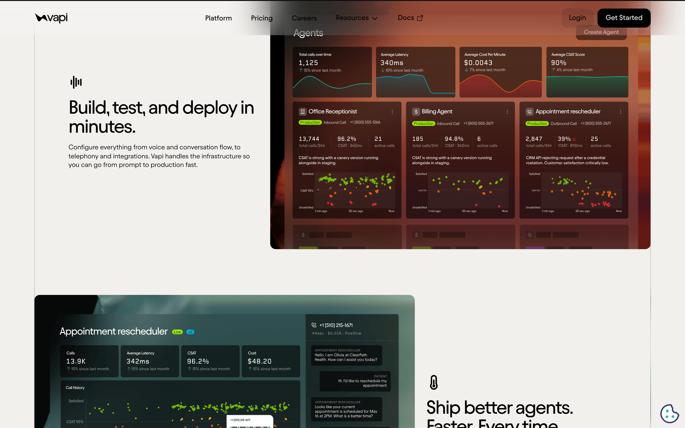
buttonPrimary uses a dark pill shape with white text; secondary is a transparent ghost button with a subtle border.
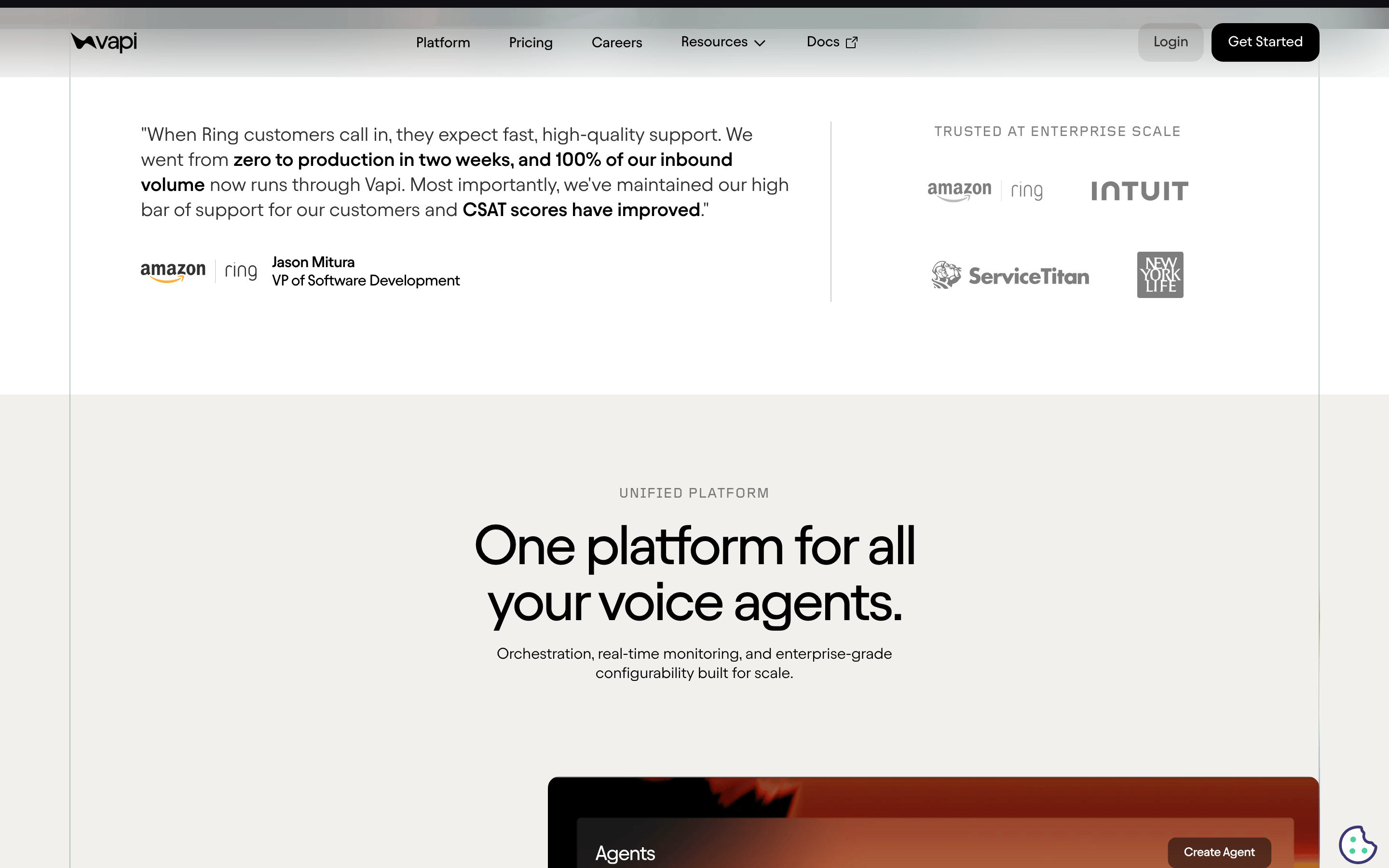
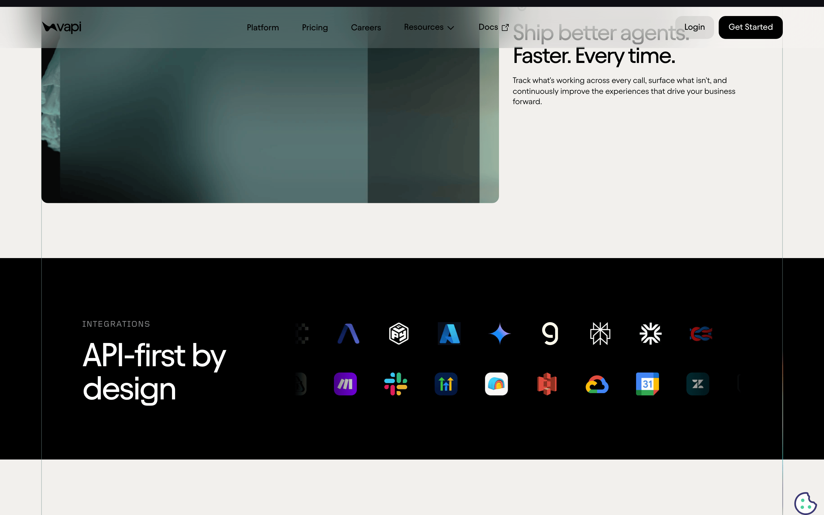
cardClean, mostly borderless sections separated by generous whitespace and subtle horizontal dividers.
chipFunctional dropdowns and status pills with subtle grey borders and 6px to 8px border radii.
inputStandard text inputs with 8px border radius, subtle borders, and internal padding.
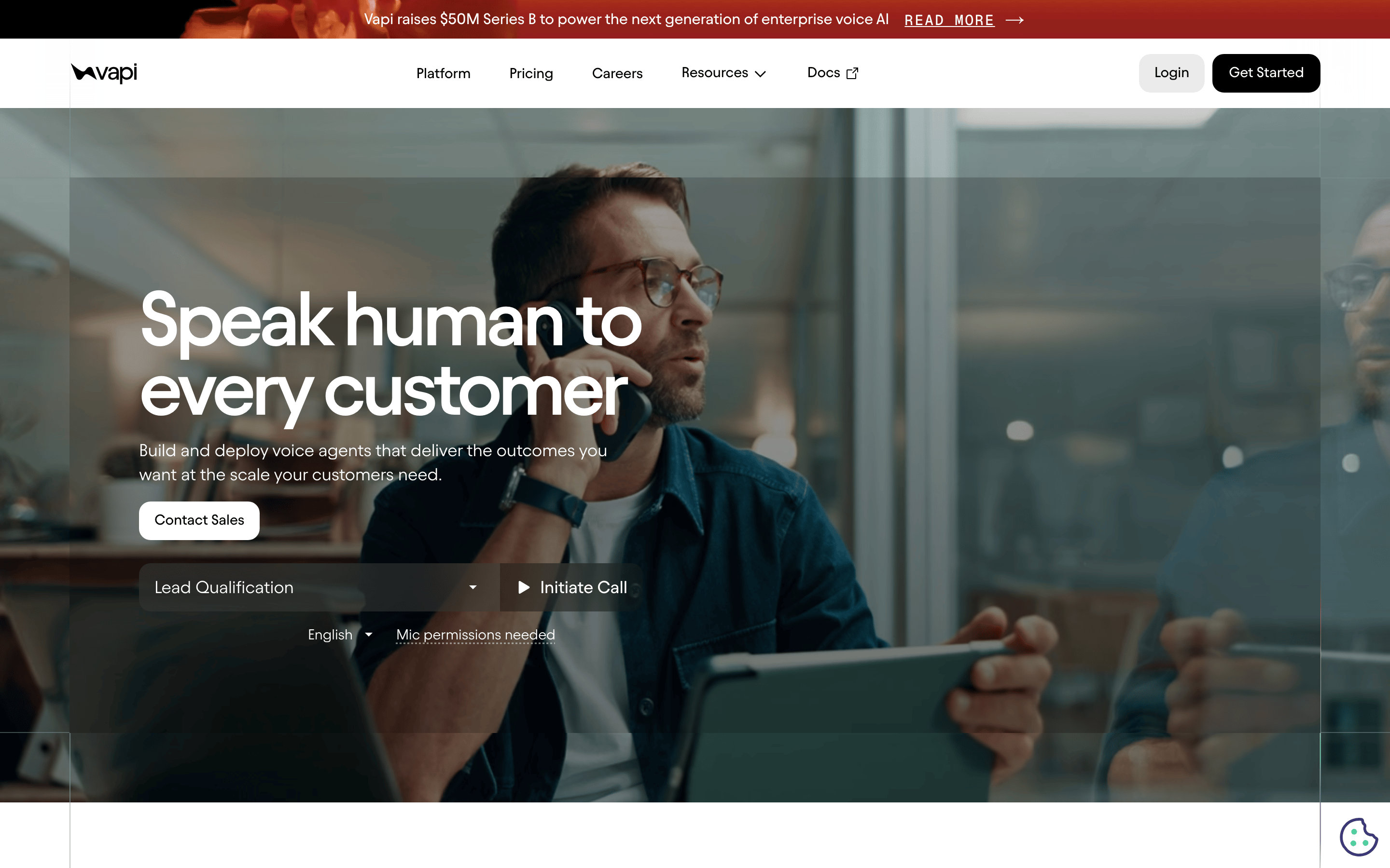
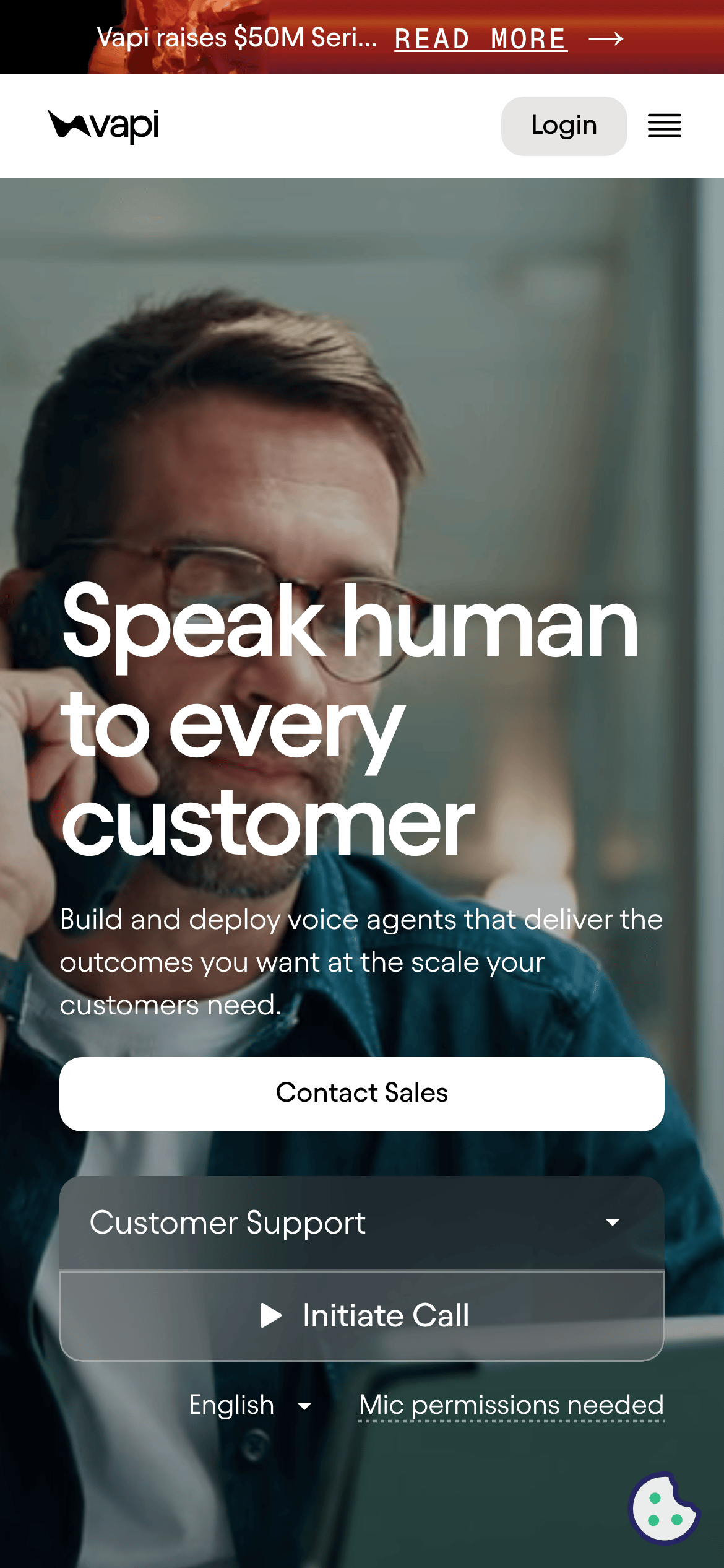
heroFull-width cinematic photography with a dark gradient overlay to ensure high legibility for the white display text.
09
Voice & Don'ts
ToneConfident, technical, and enterprise-focused.
HeadlinesShort, punchy, and human-centric (e.g., 'Speak human to every customer').
CTAsDirect and action-oriented (e.g., 'Get Started', 'Initiate Call').
Don't use a pure white (#FFFFFF) background — the screenshot uses a warm, creamy off-white (#FFFAEA) instead.
Don't use decorative serif fonts — the screenshot relies entirely on clean, geometric, and humanist sans-serif categories.
Don't use bright neon or multi-colored gradients — the palette is strictly restrained to cream, black, and a single red accent.
Don't use heavy drop shadows — the screenshot uses very subtle, almost invisible box-shadows for depth.
Don't clutter the layout with borders — the screenshot uses generous whitespace and horizontal lines for separation.
Don't use large, multi-line blockquotes — the screenshot uses highly compressed, large display type for maximum impact.
Captured from the live site · real computed styles
11
System prompt
Vapi is an enterprise voice AI platform designed for developers. It features a sophisticated yet highly legible aesthetic built on a warm cream background (#FFFAEA), stark black typography (#1F1F23), and a singular red accent (#FA5E53) for primary calls to action. The typography system is strictly sans-serif, utilizing bold, geometric display fonts with tight letter-spacing for headlines and clean humanist sans-serif for body text. The layout is spacious, using a 12-column grid with generous padding. Critical design constraints include avoiding pure white backgrounds, avoiding decorative serifs, avoiding heavy visual clutter, and maintaining a restrained, professional color palette that prioritizes readability and enterprise trust.
Bring this taste to your agent
Hand your AI agent a machine-readable spec of this design — tokens, type, motion, the whole DNA.