A crisp, architectural exhibition catalog brought to the web.
02
Color
#d7ff2dAccent
#000000Ink
#212121Ink soft
#ffffffBG
#949494Muted
rgba(0,0,0,1)Line
High-contrast monochrome palette with a single, aggressive high-chroma accent used sparingly for primary calls to action.
03
Typography
geometric-sans · grotesque-sans
display65px · 700
headline35px · 400
body16px · 400
caption15px · 400
Headlines frequently use uppercase text transformation · Body copy relies heavily on clean, left-aligned grotesque fonts · Line heights are relatively tight for display sizes but standard for body copy
04
Spacing
4px
8px
16px
24px
32px
48px
64px
96px
Generous vertical spacing between content blocks and clean horizontal gutters maintain an orderly, uncluttered grid.
05
Surfaces
sm · 2px
md · 6px
lg · 0px
pill · 0px
Sharp 1px solid black borders define navigation elements and primary buttons, with occasional 2px variations for emphasis.
rgba(0, 0, 0, 0.3) 0px 32px 68px 0px
06
Layout
1280container
12columns
24pxgutter
768 / 1024breakpoints
A strict, highly structured grid layout with clear horizontal rule dividers and distinct content columns.
07
Motion & Interaction
100msmicro
100mssmall
200msmedium
ease-outeasing
Subtle opacity and color transitions on interactive elements with very fast micro-durations.
Subtle opacity changes or background-color shifts on interactive elements. · Immediate visual response via background color or opacity adjustments.
08
Components
buttonButtons are starkly divided into two primary styles: solid black blocks with white uppercase text, and white blocks with black borders and black uppercase text.
cardContent is presented in clean, borderless image-and-text blocks separated by consistent horizontal dividers.
chipSimple rectangular labels with thin black borders and uppercase text.
inputClean, rectangular fields with sharp borders and simple styling.
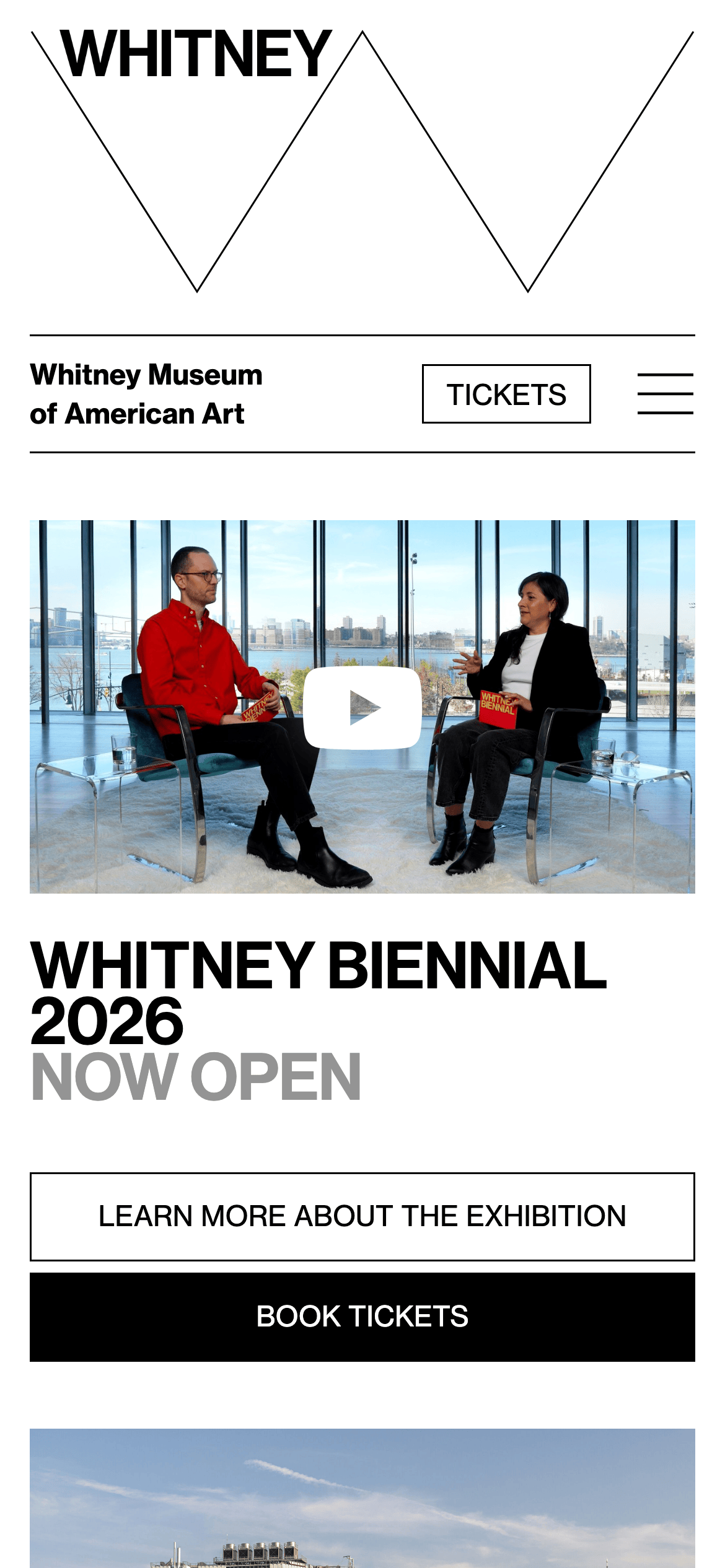
heroA bold, split-hero layout featuring a large typographic logo treatment on one side and photographic or video content on the other.
09
Voice & Don'ts
ToneAuthoritative, clear, and culturally significant.
HeadlinesBold, often uppercase, and highly descriptive, focusing on exhibition titles and primary actions.
CTAsDirect, uppercase, and highly visible, utilizing stark color contrasts.
don't use soft shadows — screenshot shows sharp borders or single deep box shadows instead
don't use muted pastel backgrounds — screenshot shows stark white or pure black backgrounds
don't use rounded corners broadly — screenshot shows mostly sharp, 0px or 2px corners
don't use decorative serif fonts — screenshot shows exclusively geometric and grotesque sans-serifs
don't use gradients — screenshot shows flat, solid blocks of color
don't hide uppercase transformations — screenshot shows frequent use of uppercase for navigation and CTAs
Captured from the live site · real computed styles
11
System prompt
Design a stark, high-contrast editorial interface for a contemporary cultural institution. Use a pure white (#ffffff) background with absolute black (#000000) typography for maximum impact. Employ a bright, high-chroma accent color, specifically lime green (#d7ff2d), strictly for primary calls to action like ticket booking. Typography must rely on geometric and grotesque sans-serif categories, utilizing bold uppercase transformations for navigation and headings to establish a strong hierarchy. Layout should be highly structured, clean, and spacious, utilizing sharp 1px borders and generous white space rather than soft shadows or rounded corners. Maintain an authoritative, direct tone. CRITICAL DONTs: avoid soft drop shadows (use sharp lines), avoid rounded corners (keep edges square), avoid decorative serifs (stick to sans), and avoid pastel backgrounds (keep it strictly monochrome).
Bring this taste to your agent
Hand your AI agent a machine-readable spec of this design — tokens, type, motion, the whole DNA.